The termination of LinkedIn carousel posts in late 2023 was a surprise for me, but the bigger surprise was that LinkedIn kept carousel ads available, showing numerous examples of LinkedIn carousel ads within the LinkedIn ad library. Moreover, they also allowed the use of documents as the ad creative, naming them "document ads", which was not there, again, until 2023.
Then my colleagues and I decided to dig deeper into LinkedIn carousels because we've also kept seeing some "LinkedIn carousel generator tools" around. Everyone got some part of it, and we ended up like this: They will be checking for some carousel post ideas and examples, and I'll be checking some of those carousel ads to see what the deal is with them.
Why did LinkedIn not remove carousels from ads also? And why did they add document ads on top of them? What's the practical difference between LinkedIn carousels and LinkedIn documents anyway? I'll try to talk a bit about these within this article, showing you some examples (not necessarily the best ones though, as this is also the reason why I haven't named this article "the best LinkedIn carousel ad examples", despite that I knew it would grab more attention and traffic).

Long intro, huh? Yeah, I just wanted to give a bit of a background story so that the rest of this article would make more sense to the readers. Anyways... Let's move on.
LinkedIn Carousel Ads vs. LinkedIn Document Ads
I used to work for a digital agency, where I managed many different digital ad campaigns, including LinkedIn ads. Hence, I can say that I'm a bit familiar with LinkedIn carousel ads. So, you'll be reading a lot of my comments and personal views.
On the other hand, the reason why this article includes both ad types is simple: They basically work the same for the end user as you swipe the content to see the rest of it. Plus, you can use both of these for almost identical purposes, such as brand awareness, lead generation, etc., as shown below.
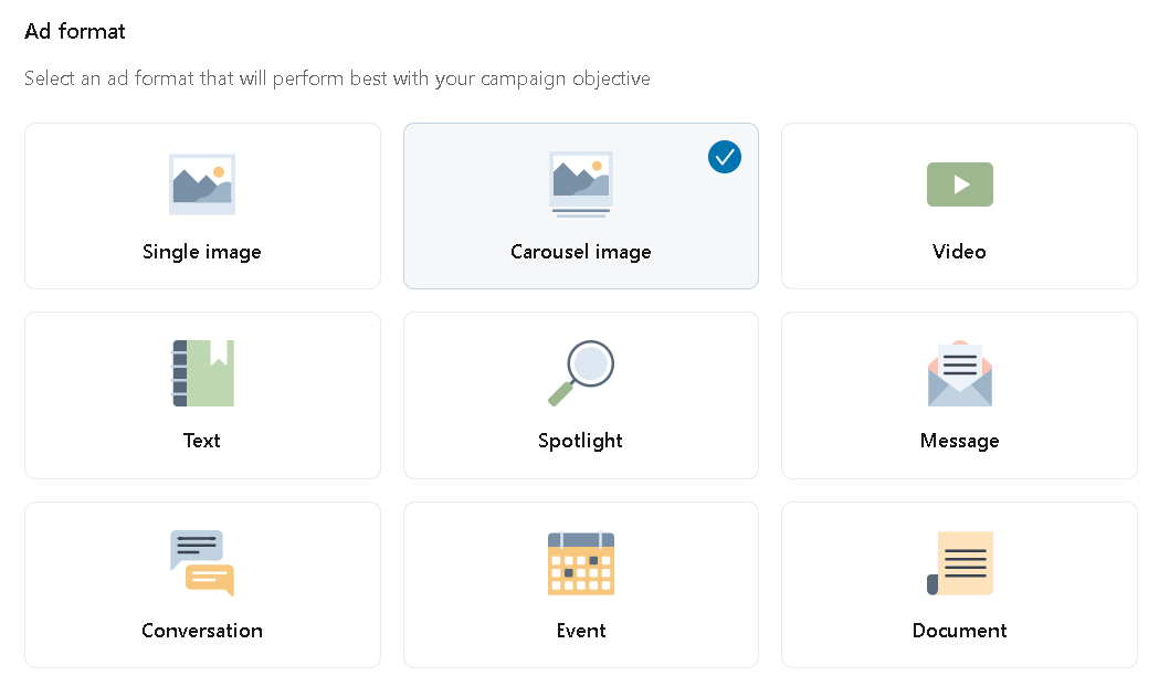
However, there are also a lot of differences between LinkedIn carousel ads and LinkedIn document ads. And in my understanding, two of them are critical:
- LinkedIn carousel ads are clickable. In fact, you can add different links to each carousel card. For document ads, however, you need to have a link included within your ad copy, or maybe add another call to action instead of driving users to the link clicks. You might also want to use document ads to raise awareness through ad impressions only.
- You can't have more than 10 cards for carousel ads, but the limit is quite higher for document ads: 300 pages making up for a maximum of a 100MB file.
- While you can "boost" your document posts on LinkedIn without needing a LinkedIn Campaign Manager, you cannot do the same with LinkedIn carousels as they are not available for organic posts. In other words, your LinkedIn carousels have to be "dark posts".
Having said all this, let's take a closer look at the examples of LinkedIn carousel ads and LinkedIn document ads, taking 10 from each.
LinkedIn Carousel Ad Examples
Learn LinkedIn Carousel Ads From the Best: LinkedIn Learning
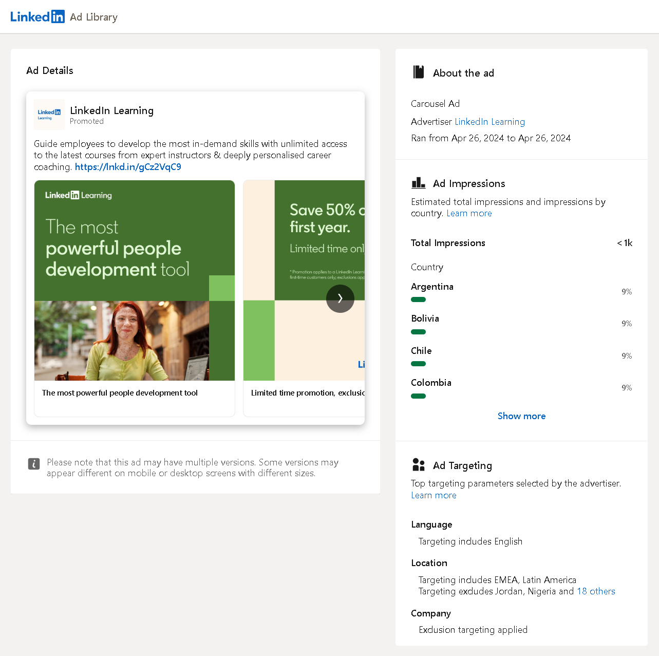
Who could have created a better LinkedIn carousel ad than LinkedIn itself? Starting with a lifestyle image and showing the first half of a discount offer for the users to swipe, this ad has different links embedded for each card and also has a link within the copy. All the best practices seem to be in place.
I've stumbled upon many different versions of this ad within the ad library, but it's interesting that they ran it for 1 day only, and with quite diverse targeting to include EMEA and Latin America together to get less than 1,000 impressions. I'd say they must have been testing something; maybe markets, maybe creatives... Who knows?
A LinkedIn Carousel Ad of a Retail Giant: Coca-Cola Europacific Partners
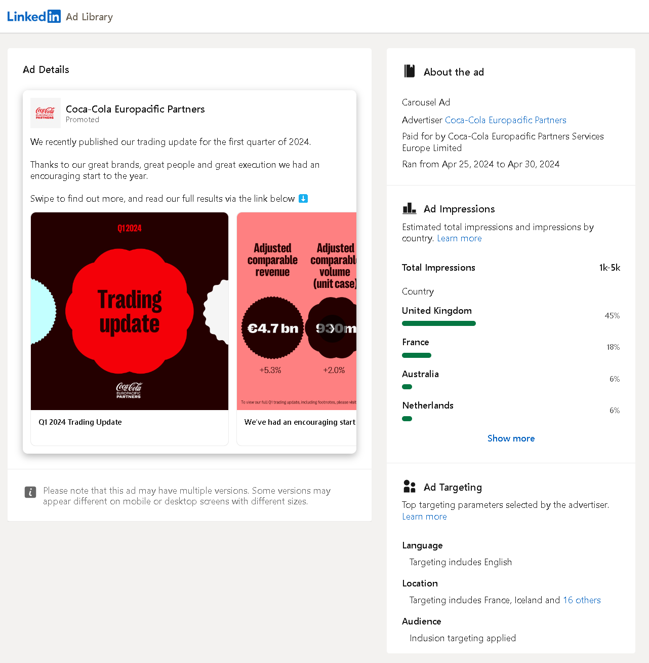
LinkedIn is known to be a B2B-oriented platform and many enterprises create business pages to become a part of it. But how can a retail giant actively promote itself?
Well, here's a perfect example of a retail-oriented corporation sharing how powerful it is through its B2B partners. Wish they hadn't forgotten to add a link after saying "link below", though.
"Think Global, Act Local" for LinkedIn Carousel Ads: Audi Dubai
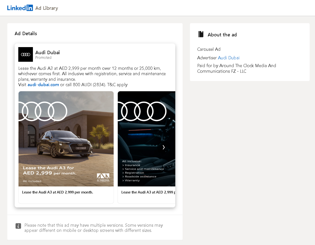
The iconic Audi logo, product demonstration, pricing information, and call to action—all these are direct to the point. The links on different carousel cards were also the same.
I can call this a fine sales-oriented campaign with identified focal points and little to no distraction, which is natural. People do not buy cars twice a week without giving much thought to the buying decision process.
LinkedIn Carousel Ads Work for Magazines Also: The Economist
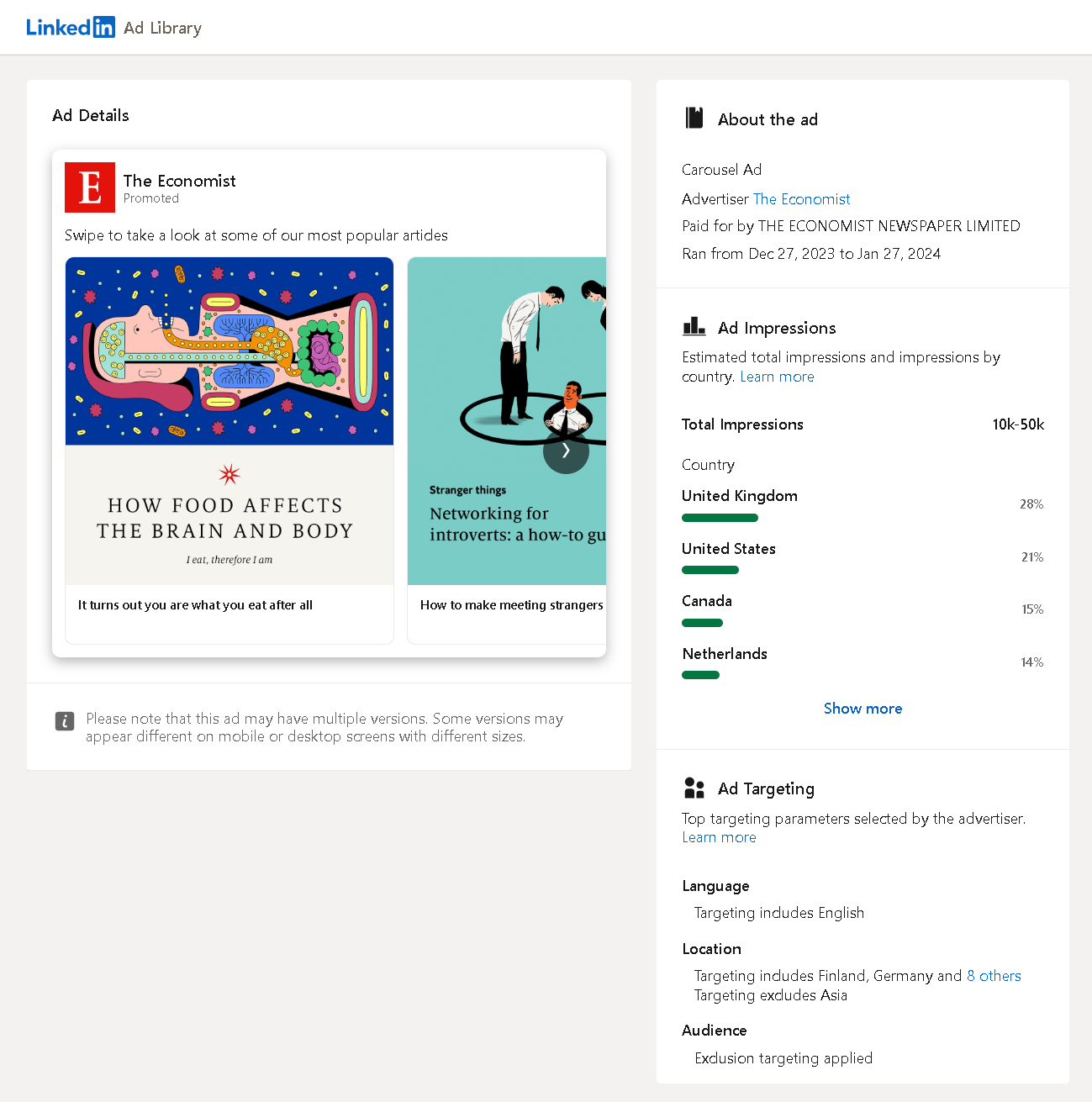
Directing traffic to some of your converting pages is a common practice actually, especially for a business that creates content (if not completely built on the content itself, like this magazine). This not only increases the number of views your articles get but also helps build a larger reader base and possibly contributes to your sales.
Plus, it's easier to create ads this way, as your article would already have a header image, and you won't have to create visuals for your ads from scratch. You see, not even the logos are added to the images... Well played, The Economist.
Promoting Content Through LinkedIn Carousel Ads: Cloudflare
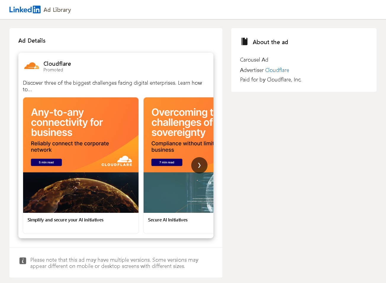
Like The Economist, Cloudflare also promotes content through LinkedIn carousel ads. Not just for the sake of content itself. This is helpful content aiming to educate its base and offer Cloudflare as a solution to these possible problems. Images are adorned with the brand's bright orange, and expected times to read are added to incentivize the users to read, telling them that it won't take too much of their time.
The caption, however, seemed to be too smart, as it expects the viewers to complete the unfinished sentence with what's written on carousel cards. I'd personally make it easier to understand, even if I'm sure that my audience is composed of geniuses.
Delivering Multiple Key Value Points with the LinkedIn Carousel Ads: Uber for Business
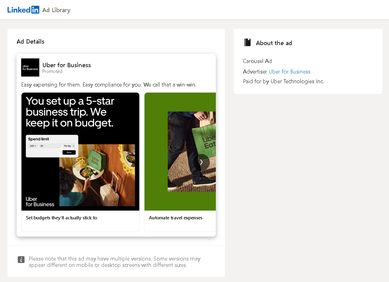
Why advertise if you won't provide any value, right? But adding value in multiple ways to multiple stakeholders of your audience is, of course, even better.
You can also use document ads to explain multiple value points, but they won't be clickable, so the next step of explaining these value points in detail might be a little harder to do.
Just a Decent LinkedIn Carousel Ad: Aircon Rentals
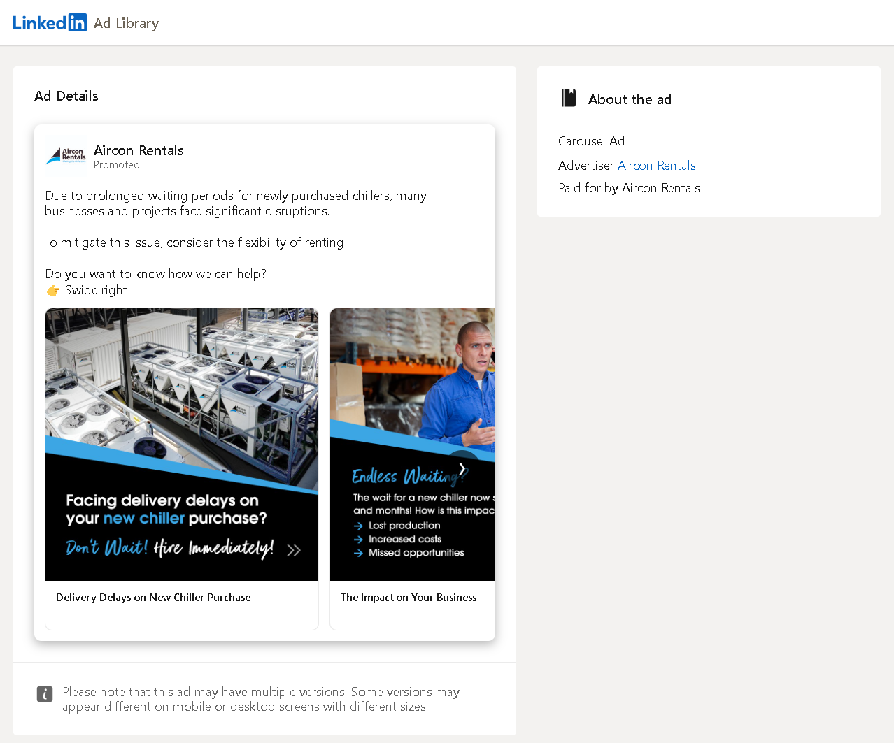
Addressing a problem: Checked. Grabbing attention on the first image: Checked. CTA: Checked. Lifestyle visuals: Checked. All seems just fine.
Though the company might not be as well-known as the ones mentioned above, this is just a decent LinkedIn carousel ad. And it also shows that you don't need to be that big to create good campaigns. Of course, I'm speaking in terms of how it's prepared and not in terms of the campaign budget or targeting - they're not visible anyway.
LinkedIn Carousel Ads for Head Hunting?: Enable Recruitment
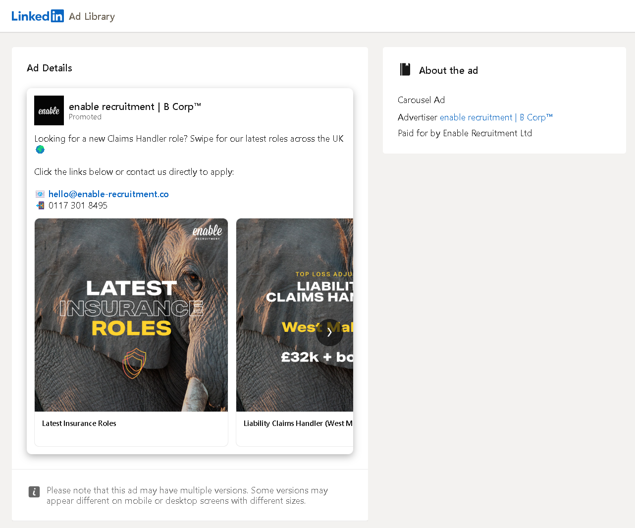
LinkedIn has dedicated job ads and even other job promotion methods, but it seems like creativity kicked in for Enable Recruitment. Put the details of the roles on each card, divert the clicks to the related job opening pages, add an elephant in the background (I don't know how this relates to the concept, but somehow it just doesn't seem off to me), and voila!
This might even be working better than LinkedIn job ads or other methods in terms of the costs to post a job on LinkedIn and even the cost to obtain a resume in your candidate pool.
Check the Accuracy of Your LinkedIn Carousel Ads: LABPLAS
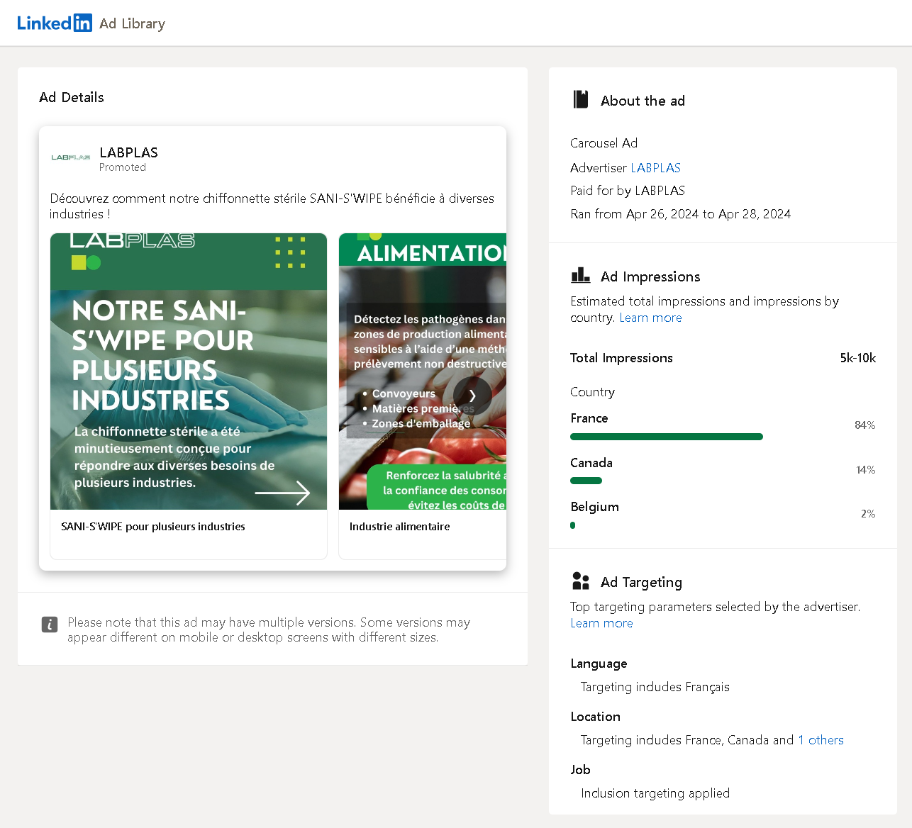
This example is from a Canadian medical technology company targeting French speakers with LinkedIn carousel ads. But there seems to be some room for improvement. In other words, as the title indicates, this example has some "don't"s.
First of all, the images don't seem to fit and are cut around (even the logo is barely seen), so they might want to re-check their designs, or maybe the specs of LinkedIn carousel ads (or their agency, or in-house team... Oops... Yeah, I just said it). Then, I can tell that the ads talk about the benefits offered for different industries, but dividing this into multiple creatives and using industry-based targeting on LinkedIn instead of putting all these in one ad might have been a more accurate approach.
How Many Words Can Fit on One Carousel Card?: Sonicsoft
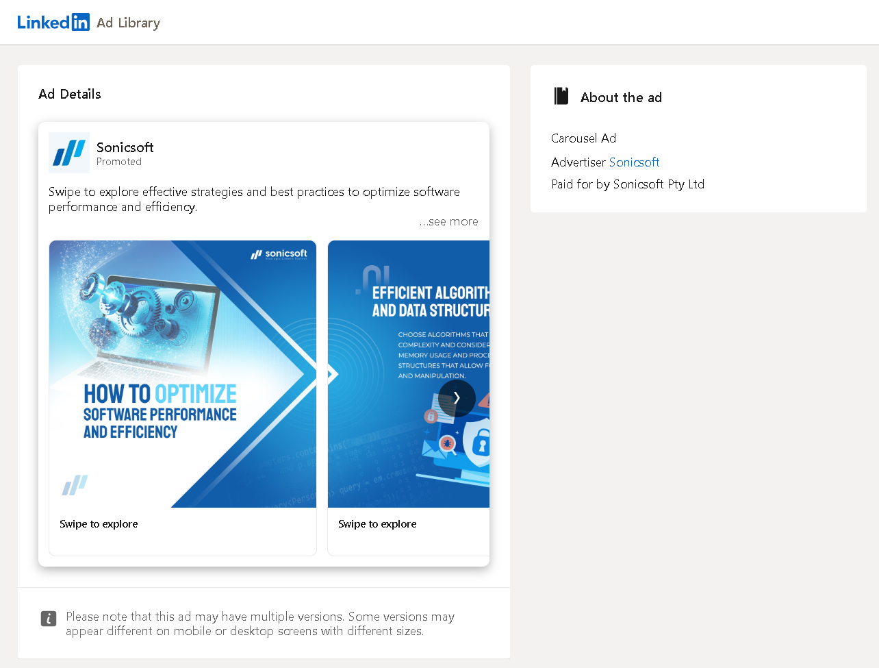
Even if you're targeting desktop users only, this is just too much text to put into one carousel card, and the situation is even worse for someone who gets to view this on a mobile device.
If you have so much text to share, do not torture your viewers and waste your well-earned marketing budget, and please just consider going for a document ad. But if you still want to use an image-like design for your document, you might want to check out what Circleboom has to offer.
Keep on Posting LinkedIn Carousels with Circleboom!
Yes, the actual LinkedIn carousel posts may be long gone, but Circleboom Publish still lets you share your images together on LinkedIn like a carousel. It's not only a rare feature when compared with other similar tools, but it's also pretty convenient to use.
Once you start creating a LinkedIn post on Circleboom Publish, you can choose to make it a "Carousel/Gallery Post" (other post types like document or LinkedIn poll are also available), as shown below.
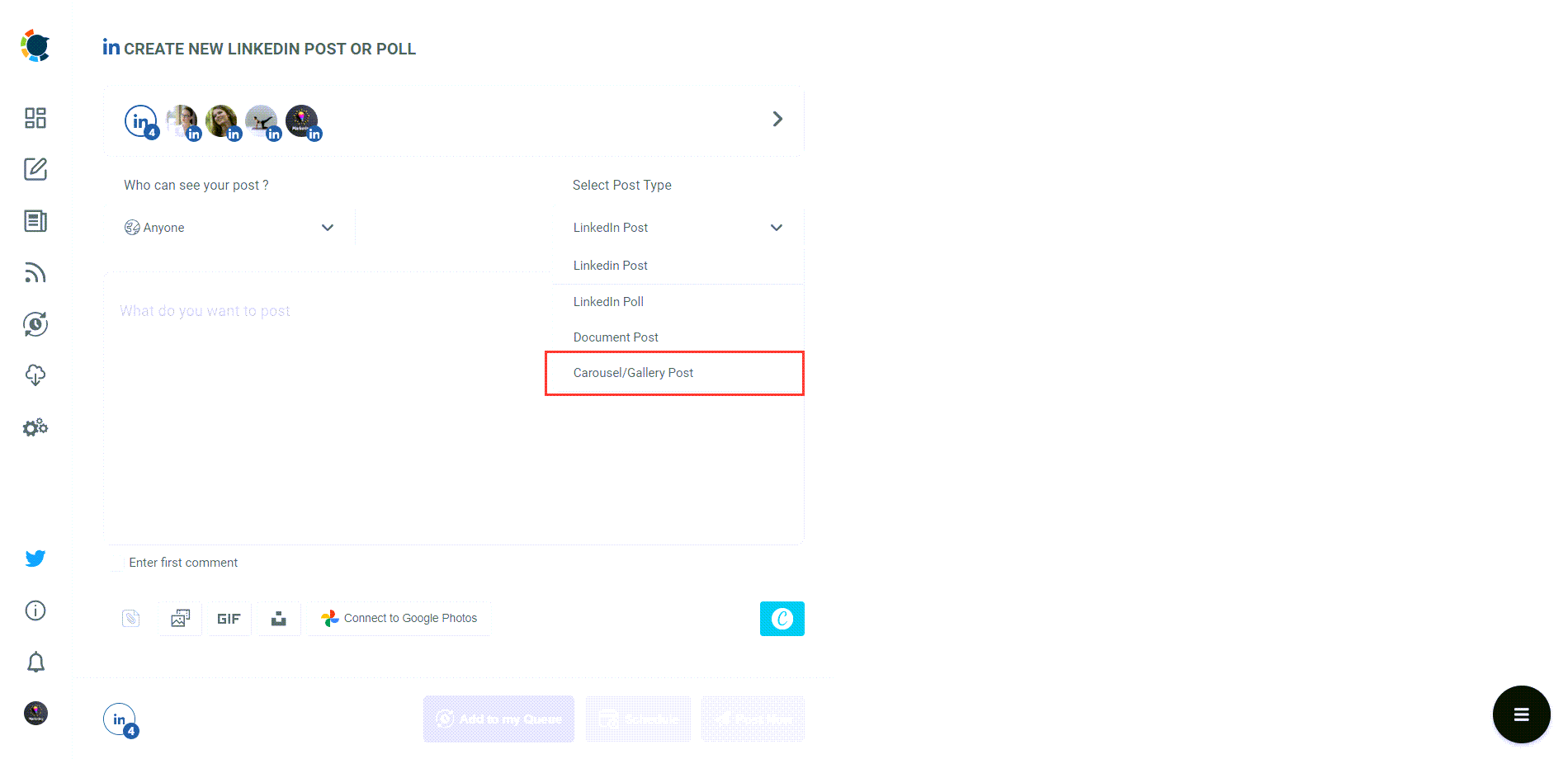
Then, you can upload several images from your computer, use Circleboom's design tools including ready-made post templates and access to stock visual directories, or even pick them from your Google Photos. This will give you the freedom to choose the visuals you'd like or create beautiful pro-level designs with the help of Canva.
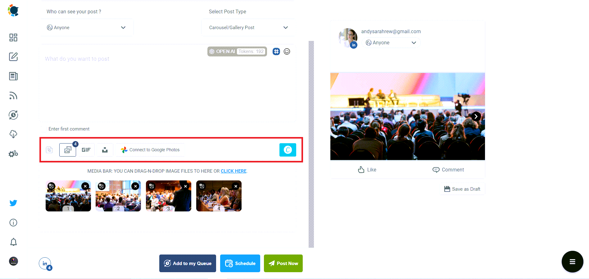
Not even mentioning other supportive features such as built-in AI to generate captions, the ability to schedule your LinkedIn posts, and utilizing all these features for multiple LinkedIn accounts or company pages.
Circleboom Publish
With Circleboom, you can practically keep on posting carousels on LinkedIn!
Now that you at least know how to close the gap between LinkedIn carousels and LinkedIn document posts, you might want to consider posting organic carousel-like LinkedIn documents and then boosting them instead of going for dark-post carousel ads. So, let's also go through some examples of LinkedIn document ads.
LinkedIn Document Ad Examples
Auditing the Auditor's LinkedIn Document Ad: KPMG
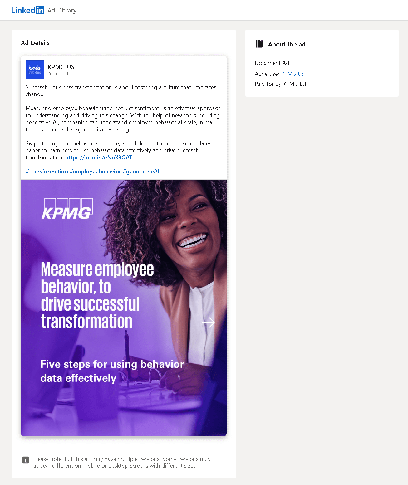
Do you have a whitepaper ready? Then you have a great asset for a document ad. Put a nice-looking person on the cover page, talk about popular stuff like AI and data, and don't underestimate the power of keywords such as "success" and "transformation". Way to manage PR, huh?
Jokes aside, and though a bit cliche, this combination still works. It delivers your message in a powerful way and demonstrates your expertise. And it's also safe as it's easy to align such content with your corporate identity.
An Ad Platform Using LinkedIn Document Ads: RTB House
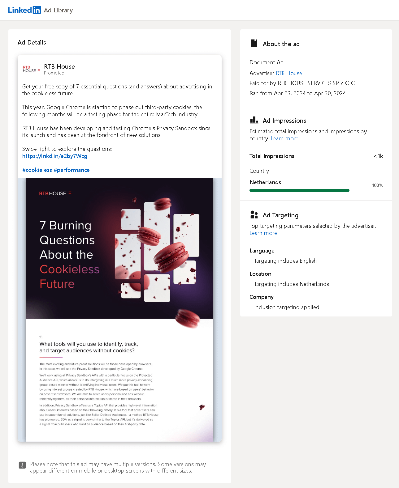
I always find a marketing service provider using others ironic. It's like promoting Twitter ads on billboards, you know. This is just how it feels like, though, and one more emotional comment: I loved the cookie image.
Rationally speaking, on the other hand, this document may serve as a fine tool to educate specific audiences. Running a 7-day campaign with company-level targeting in a relatively small market like the Netherlands, however, seemed a bit too narrow to me, generating less than 1,000 impressions.
One Document Ad for the Entire World: Volkswagen Group
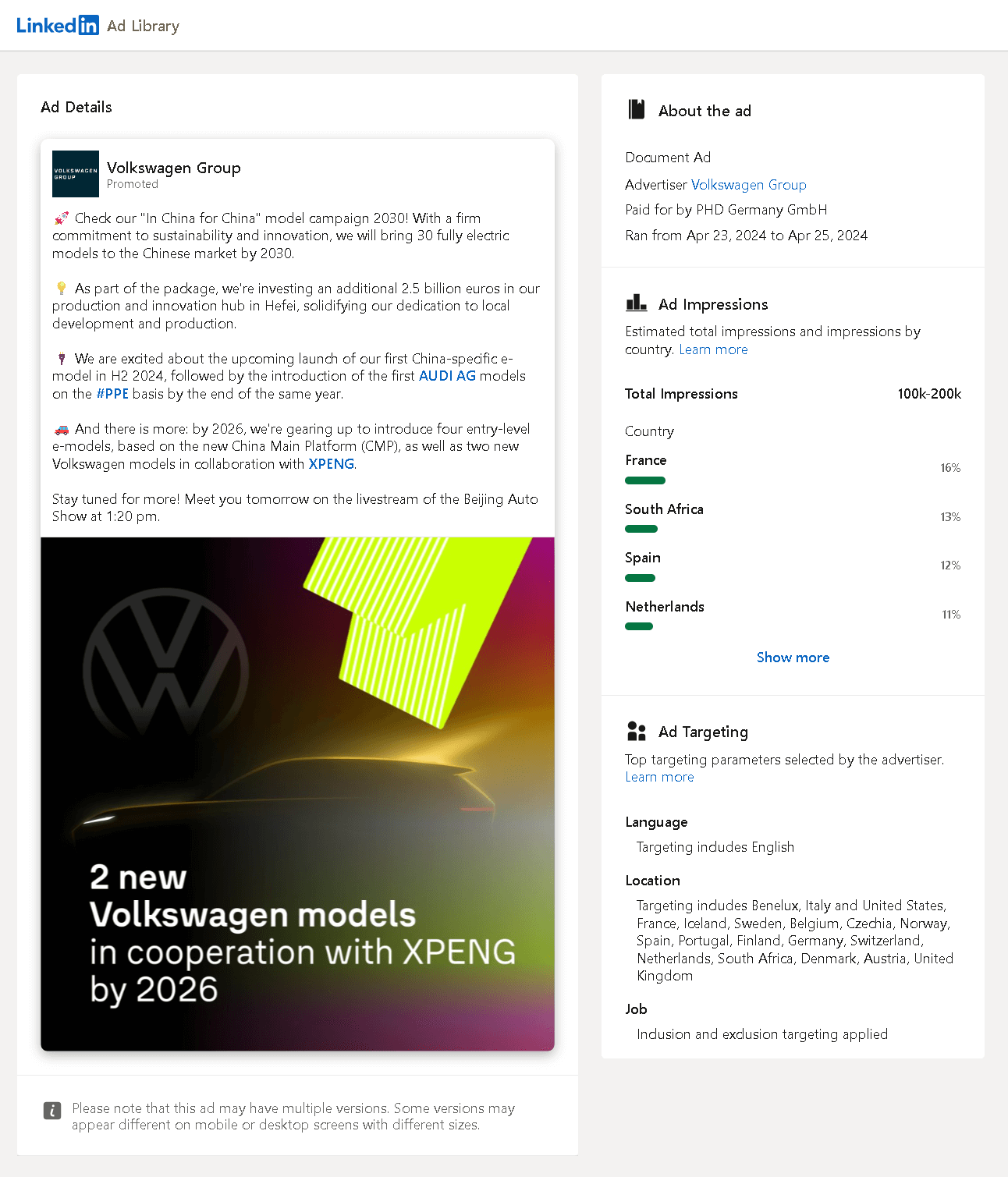
A giant with German roots advertising about their efforts in the Chinese market and two new models before the Beijing Auto Show, and showing this ad to people from many different countries and even continents to generate over 100k impressions in 3 days. Not only promoting new products but also combining online marketing efforts with offline ones.
It's so generic yet so powerful and impressive. I'd call this showing off just because I'm jealous. This, dear reader who has come this far, is a good example, I'd say.
LinkedIn Document Ad Goes Green: Bergner Europe
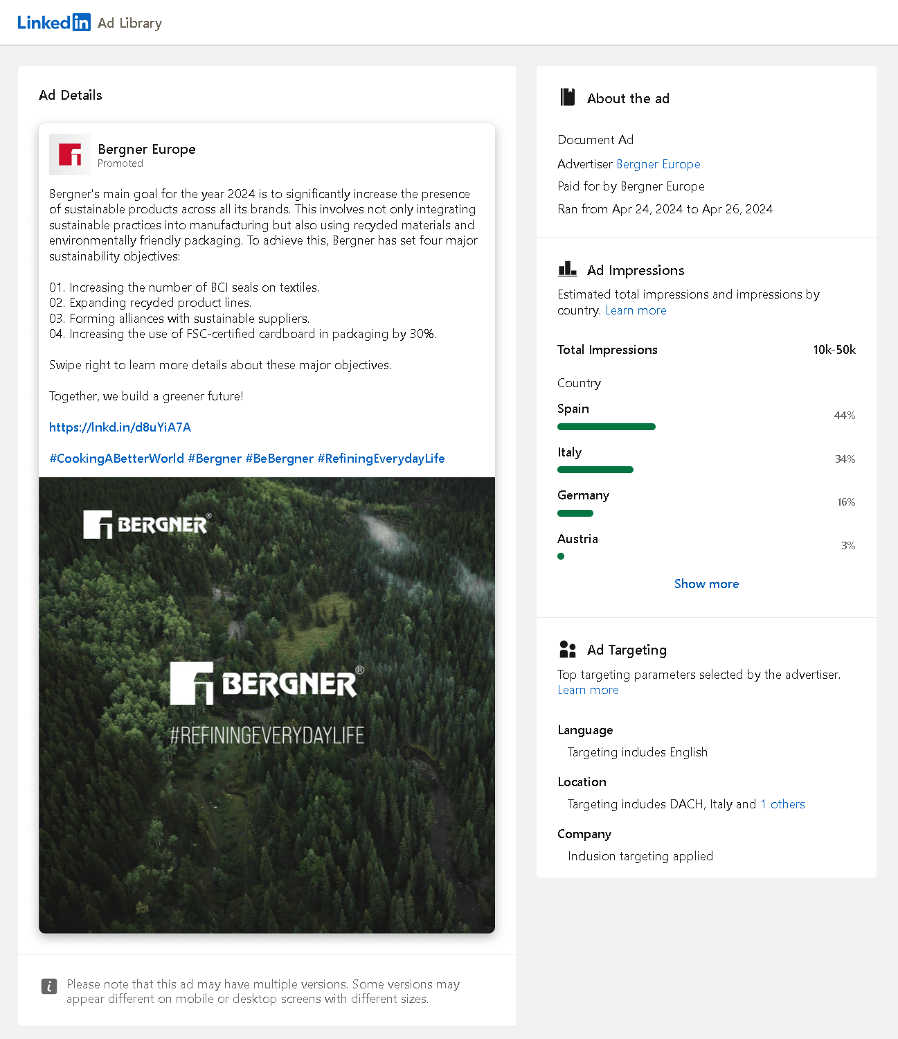
I have a friend who has a master's degree with a thesis on corporate social responsibility and its effects on people's investment decisions toward a company. The correlation is positive, especially for Gen Z.
Maybe Bergner did not attract thousands of new investors with this ad, but the way it's communicated with EU-based company-level targeting to generate over 10k impressions is a good example of the effort shown to inspire other individuals and companies for the good. Plus, they also seem to have their own branded hashtag on LinkedIn derived from a slogan.
Sustainability is the next big thing, So if you have any CSR reports or anything you can brag about in this field, dear reader, don't hesitate to share them. Even if you don't have that much of a budget to advertise for it on LinkedIn like Bergner does, at least share them as an organic post. Circleboom has you covered there.
LinkedIn Document Ads Can Be Striking Too: Parcel Panel
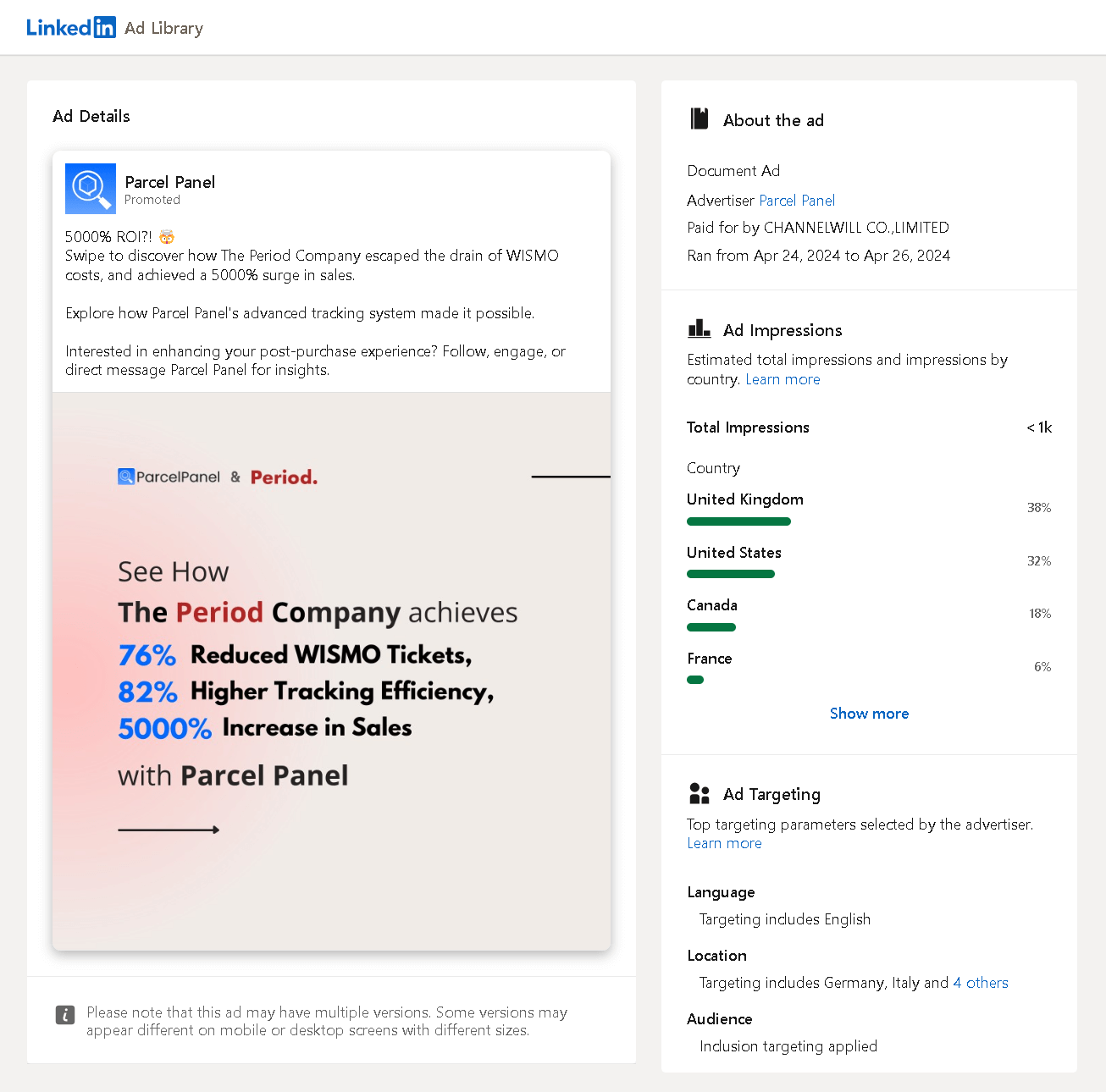
To be honest, I hadn't heard about this company before, and I stumbled upon this ad during my research on LinkedIn Ad Library. The bold stats grabbed even my attention, despite that I had just seen the term "WISMO costs" and had nothing to do with it.
Of course, there's a downside to sharing astronomical stats: It may be perceived as "too good to be true." To overcome this, Parcel Panel even teamed up with The Period Company so that the case looks as genuine as it is. The underlying message is simple: "We've achieved these results with a real company, so we are capable. Give us a chance, and we'll make it happen for you, too." If only they had a larger budget money to get more than 1,000 impressions...
A Brave LinkedIn Document Ad: ARE TOO
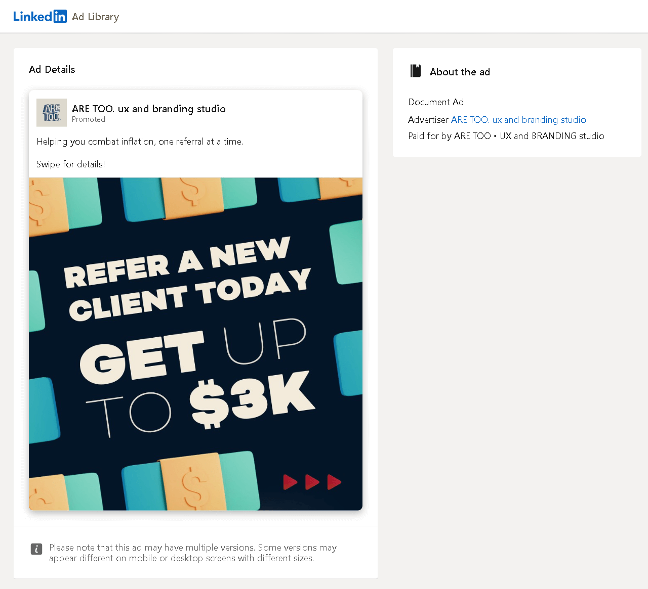
Speaking of being bold, this is also a good example of going straight to the point. On the other hand, I called this brave because once I checked the details, I saw that the company page on LinkedIn didn't have many followers, and neither did the other social accounts. So, with an educated guess, I assumed that this was from a small agency formed of creative and ambitious people. Yet, they use their marketing budget on an expensive platform like LinkedIn.
Maybe a bit too ambitious, though, with a claim to help people "combat inflation". The clickbait part is fine, but I didn't quite get why they went with document ads and not carousel ads so that the users who are after $3k can click on it right on. The ad copy could have had more details and been more related too.
Promoting Multiple Brands with a Single LinkedIn Document Ad: Olo
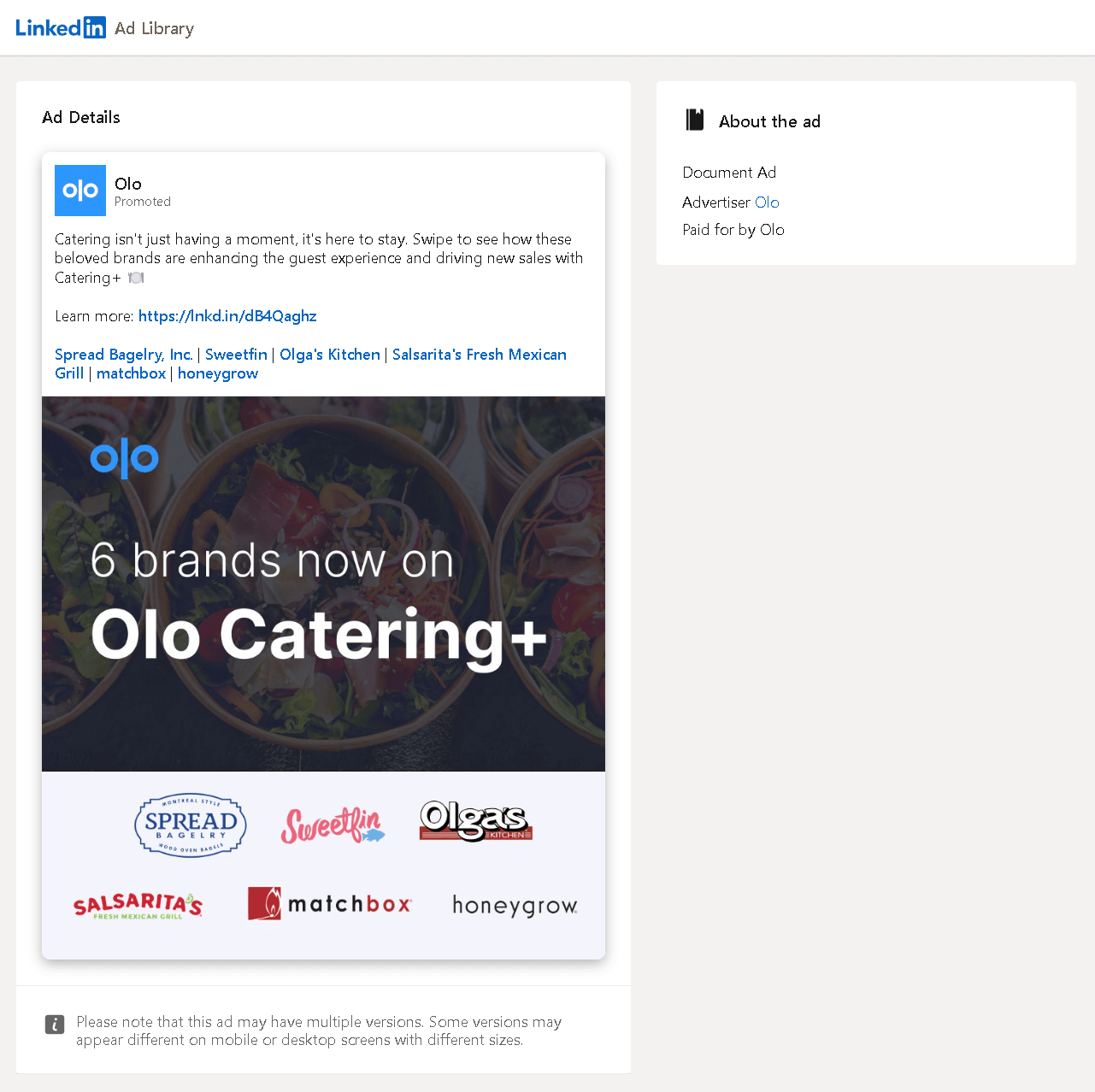
Way to talk about partnerships! A fine document informing users about different Olo clients not only promotes Olo itself but also demonstrates some successful examples through other brands.
The use of document ads here also seemed accurate to me, as the main aim here is not to drive traffic to seven different web pages but to provide small case studies and references for possible future partnerships. Not to mention the favor done to those 6 companies by promoting them within, possibly helpful to increase their loyalty to Olo.
A Two-Paged LinkedIn Document Ad: Commonwealth Associates
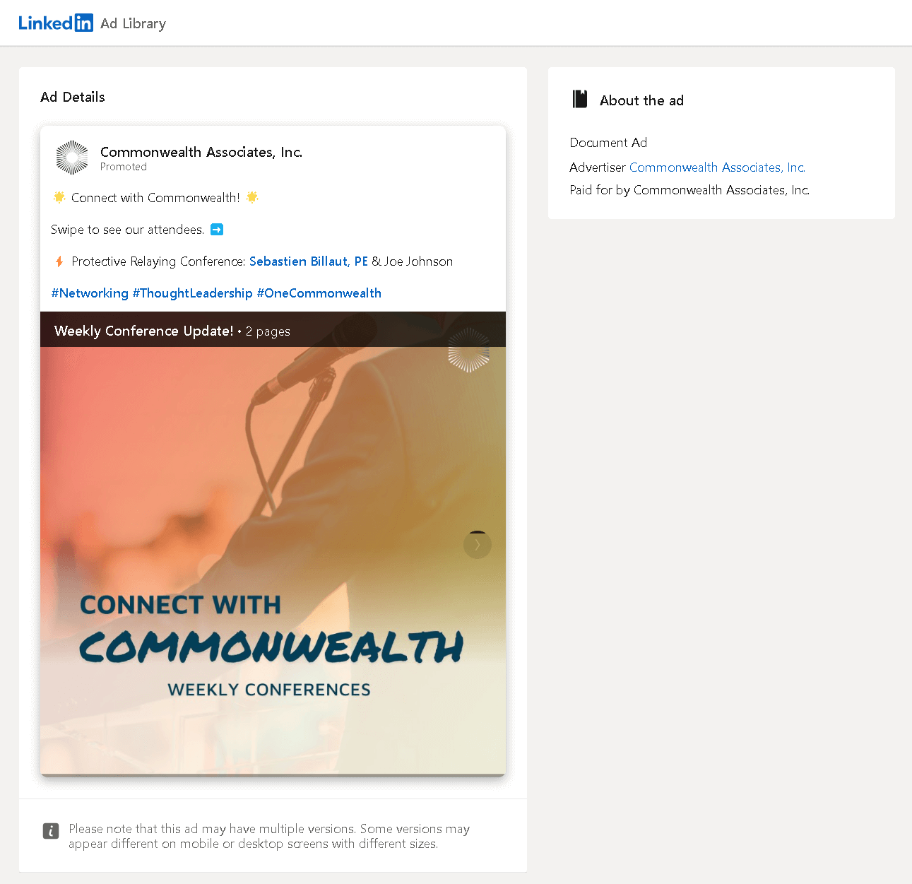
Promoting events and even its speakers is a common practice, and LinkedIn can serve as the correct medium for that. But if you have only two pages of content to show, you might want to consider squishing it into one and directly delivering your message.
In other words, I don't really understand why Commonwealth Associates used a document ad in this case. This could have been a single-image ad and could even have been used for easy, quick, and accurate lead generation with auto-filled forms. At least, that's what I'd do.
Photos Turned into a LinkedIn Document Ad: Sagacious IP
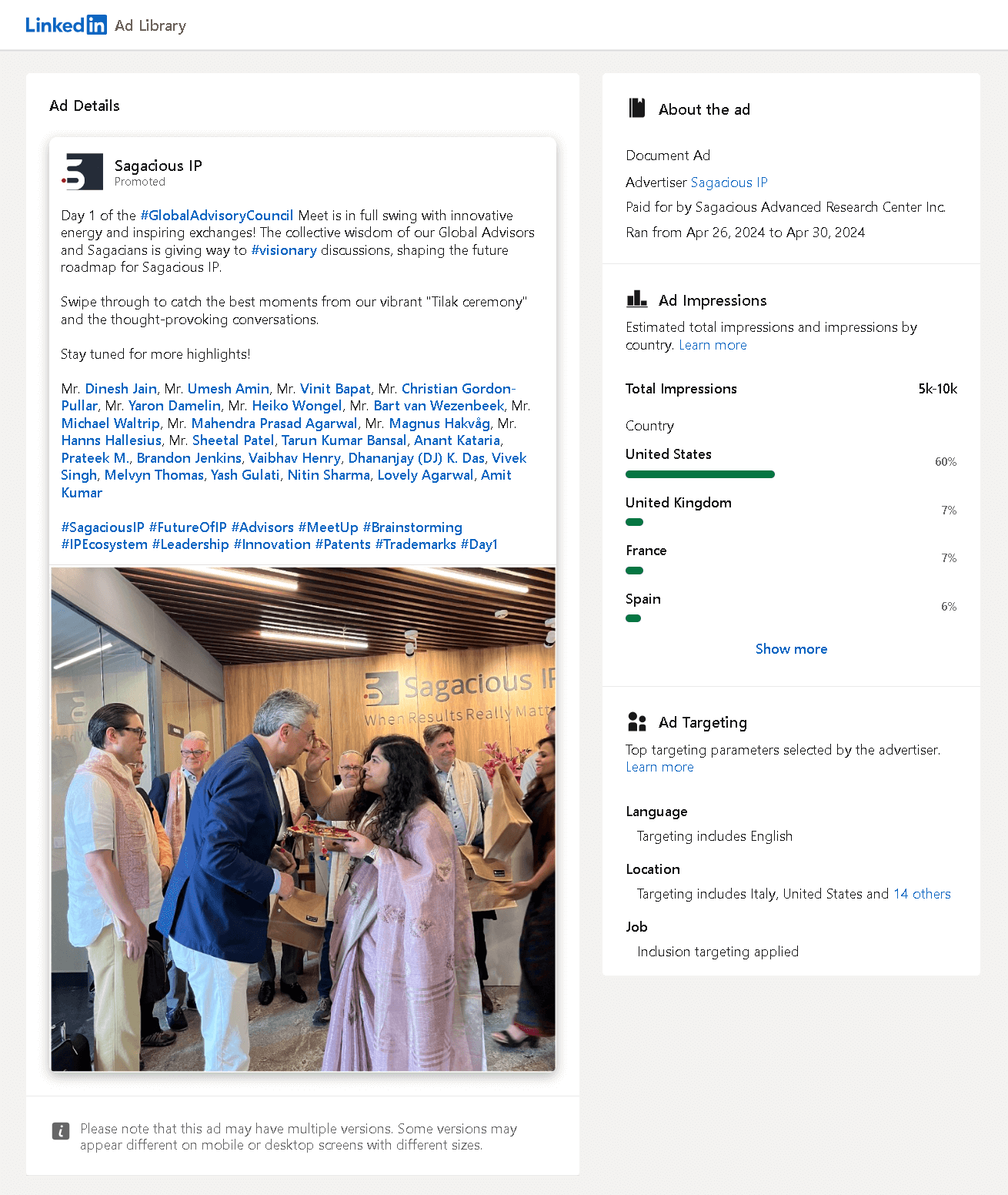
This is exactly what I've been talking about regarding the LinkedIn carousel generator feature of Circleboom: A LinkedIn document formed of real pictures to be shared like a carousel! Warm, inclusive, and real. More importantly, it is much easier to create than a fancy design with gradients, logos, and everything.
I hope they used Circleboom for this and did not waste a lot of their time turning pictures into a document manually. So if you liked what you see here, it's only a few clicks away from you, starting with the button just below:
Long story short...
Yeah, it has literally been a long story, so I'll try to keep this part short. I hope the inspiration and tips were worth it for you. I also hope that this article serves as a helpful guide on when and how to use LinkedIn carousel ads, switch to LinkedIn document ads, and get Circleboom's help along the way.


