

If you spend time on X (formerly Twitter), you’ve probably noticed posts where the text looks different—bold headers, italic highlights, or even more exotic styles like 𝓬𝓾𝓻𝓼𝓲𝓿𝓮, ⓒⓘⓡⓒⓛⓔⓓ, or 🅂🅀🅄🄰🅁🄴🄳. These fonts catch the eye, break the monotony of plain text, and make tweets feel more professional or creative.
At first, I thought these were available to everyone, but then I realized: native styling like bold and italic is only available for X Premium subscribers. Paying for Premium unlocks text formatting—but only in very limited ways.
I didn’t want to pay for Premium just to make my tweets bold or italic. So I looked for another way. That’s when I found Circleboom Twitter—a tool that doesn’t just let you write and schedule tweets, but also lets you style your text in dozens of fonts.
What X Premium Offers (and What It Doesn’t)
X Premium allows users to format their text in bold and italic when composing posts or long-form Articles. This can be handy if all you want is a bit of emphasis.
But here’s the catch:
🔴 Premium only gives you two basic styles: bold and italic.
🔴 It costs money every month.
🔴 You don’t get decorative styles like double-struck, circled, or fullwidth.
For many users—especially those who just want their tweets to look more unique—it’s not worth the subscription.
How Font Generators Work
Font generators don’t actually “create” new fonts. Instead, they replace standard characters with lookalike Unicode symbols.
For example:
- Normal A → 𝐀 (Double Struck)
- Normal B → 🅑 (Squared)
- Normal C → 𝓬 (Cursive Script)
X supports these characters, so when you paste them into a tweet, they appear as styled text. The catch is that hashtags and mentions don’t work properly if styled—so you should keep @handles and #hashtags in plain text.
Circleboom Twitter: A Safer, Easier Way
There are random font generator websites out there, but many feel clunky or unsafe.

Circleboom Twitter makes it simple and professional:
- It’s an official X partner, so it’s compliant and safe to use.
- It has a Font & Styling tool built into its tweet composer.
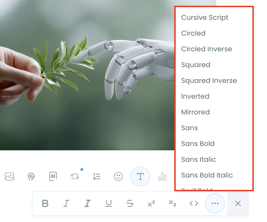
- Styles include bold, italic, fullwidth, fraktur, fraktur bold, double-struck, cursive script, circled, squared, inverted, and more.
- It also doubles as a full social media management platform—you can schedule posts, design graphics, and even use its AI Writer to generate content ideas.
So instead of copy-pasting from shady sites, you can compose, style, and schedule tweets in one trusted tool.
Step-by-Step: How to Use Circleboom Twitter’s Font Generator
Step 1: Go to Circleboom Twitter’s X Post Planner
Open Circleboom Twitter and click X Post Planner + AI Writer.
Then select Write & Plan Your Post to start creating your tweet.

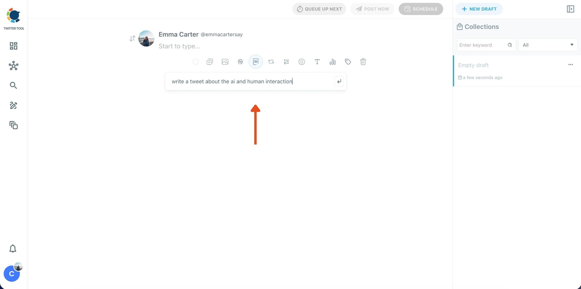
Step 2: Write your tweet (or generate one with AI)
You can type your tweet manually in the editor.
Or, if you want to move faster, click the AI option and let Circleboom generate a tweet idea for you based on your topic.
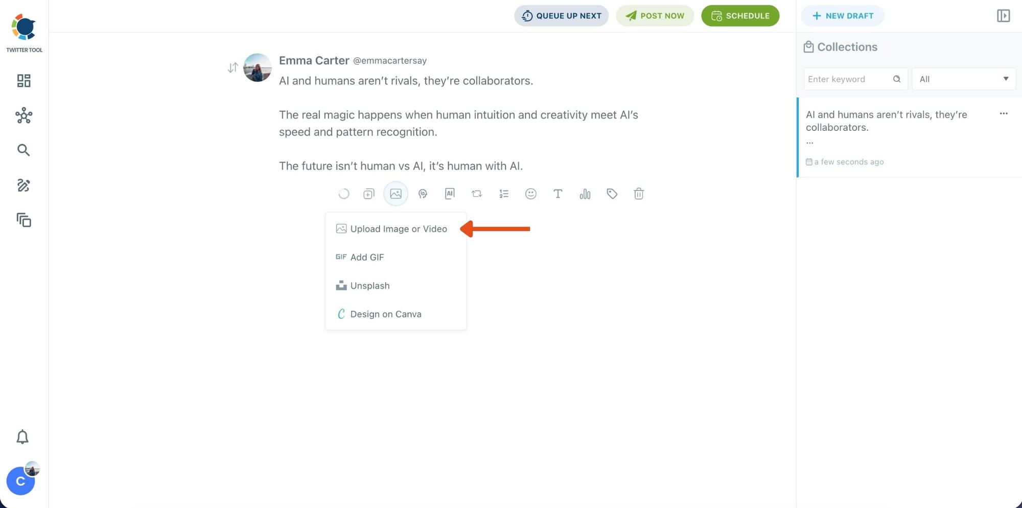
Step 3: Add an image to make the post more engaging
Once your text is ready, attach a visual to your tweet.
You can:
- Upload an image/video from your device
- Pick one from Unsplash
- Or design one instantly using Canva
Step 4: Style your tweet using Circleboom’s Font Generator
Now it’s time to make your tweet stand out visually.
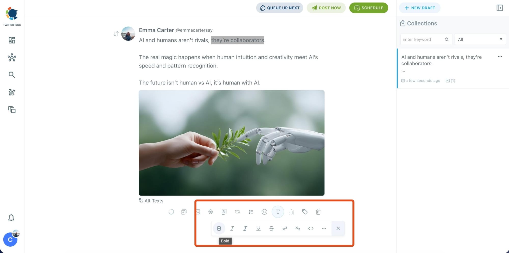
Select the part of your text you want to change, then open the Font Generator toolbar and apply styles like:
- Bold / Italic / Underline
- Different font variations
- Extra formatting options for a more “designed” look
This is perfect when you want key parts of your tweet to grab attention immediately.
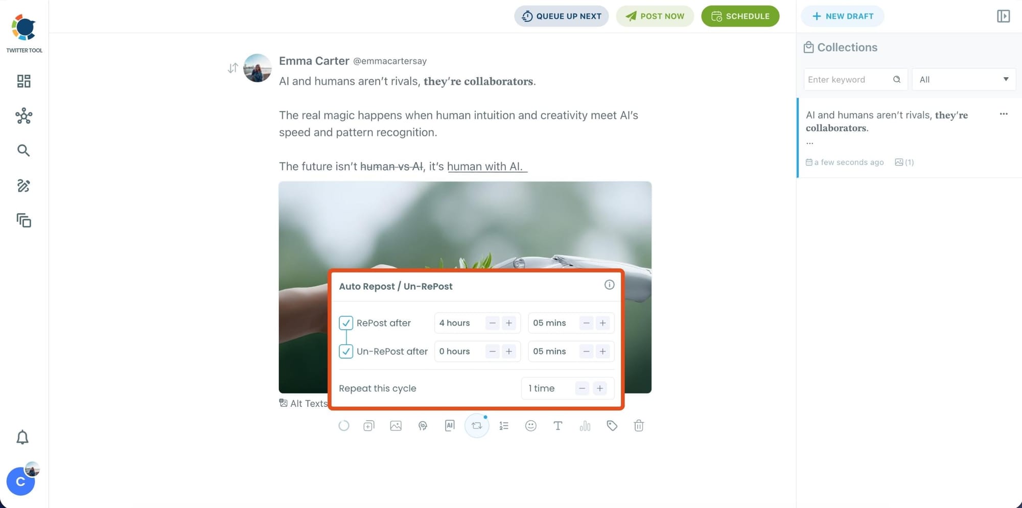
Step 5: Set Auto Retweets to boost visibility
After styling your post, you can increase reach by enabling Auto Repost / Un-RePost settings.
This lets you automatically:
- Repost your tweet after a selected time
- Remove the repost later
- Repeat the cycle if you want more than one repost
It’s a smart way to bring your tweet back into the feed without manually reposting it.
Bonus Tip: Cross-post your tweet to other platforms automatically
Before you publish, you can also enable Cross-Post to share the same tweet across multiple platforms in one go.
Circleboom lets you post your content to Instagram, Facebook, LinkedIn, Bluesky, and Threads automatically—so you don’t have to rewrite, re-upload, or repeat the same work on each platform.

Step 6: Schedule it for the best time to post
Finally, click Schedule and set your date and time.
You can also click Find your best posting time to see Circleboom’s suggested time slots based on follower activity.
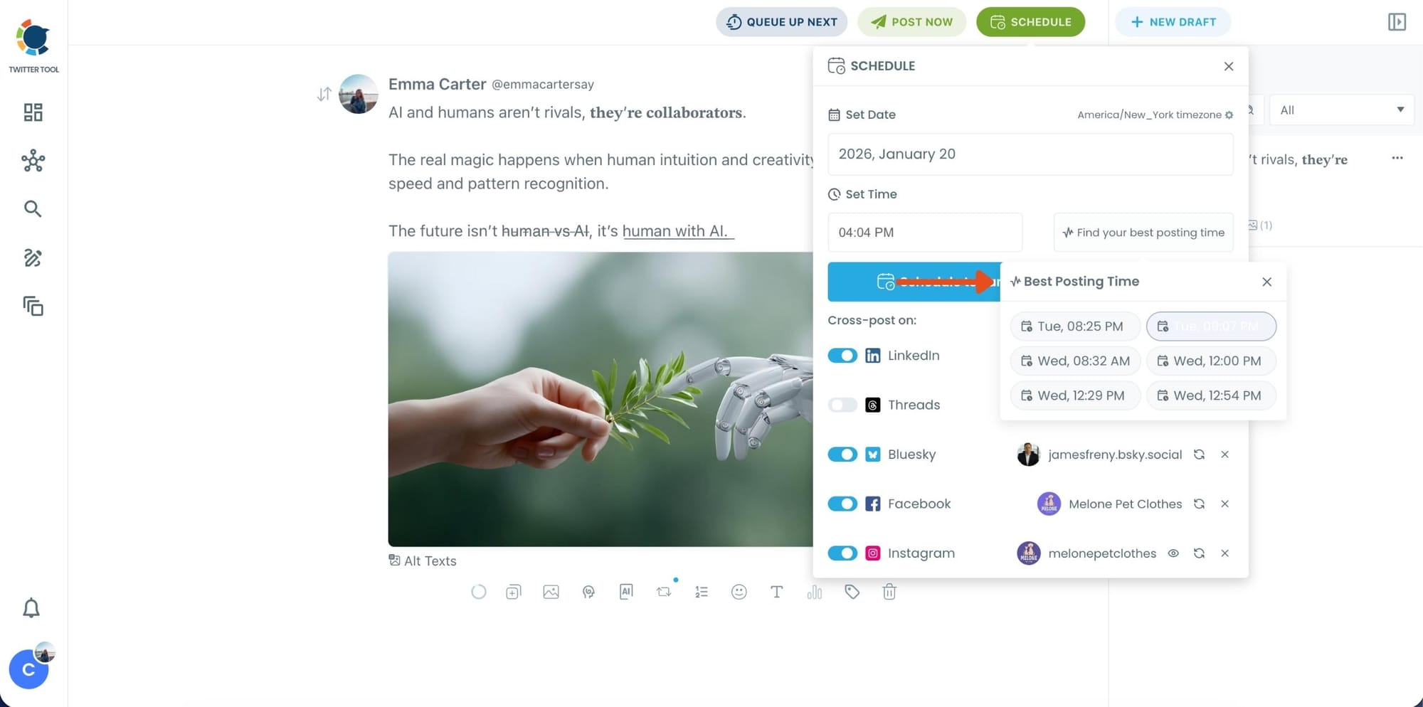
Once you pick the best option, schedule it and you’re done. Your tweet will go out at the time it has the highest chance to perform well.
Where Styled Text Works Best
Styled fonts are like seasoning in a dish—they work best when used strategically to enhance, not overwhelm. When placed in the right spots, they can make your tweets more scannable, engaging, and memorable.
Here are some places where styled text adds the most impact:
🟢 Thread headlines and section breaks.
Threads can be long, and readers often skim. Using bold, italic, or decorative fonts for section headers makes it easier for people to navigate.
Example: Part 1: Setup → Part 2: Results → Ⓒⓞⓝⓒⓛⓤⓢⓘⓞⓝ.
🟢 Highlighting key stats or data points.
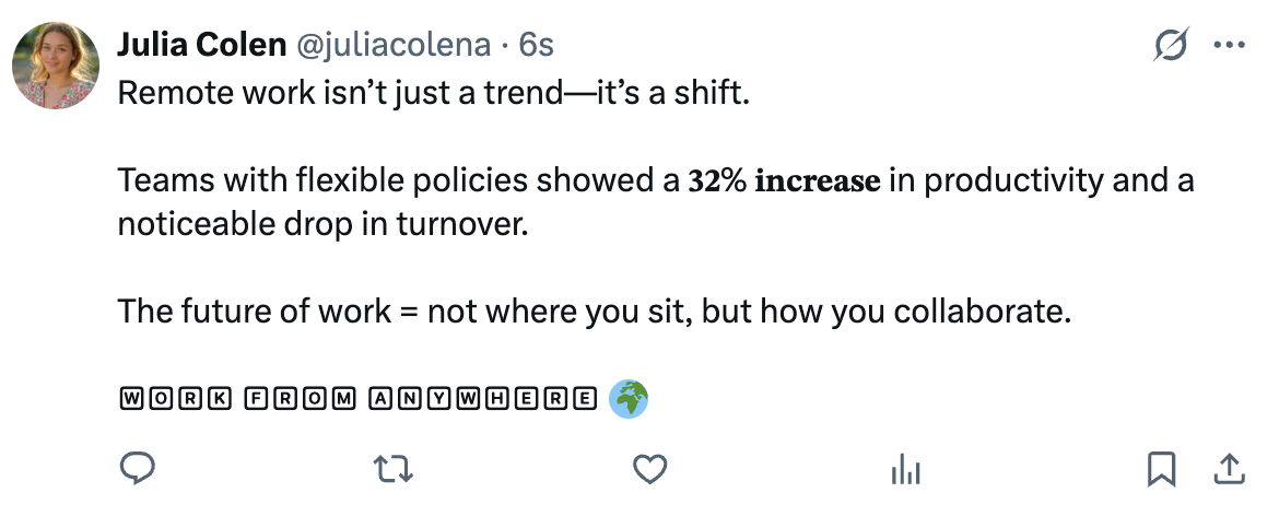
Numbers naturally draw attention, but styled numbers stand out even more in busy feeds.
Example: “Our test showed a 𝟒𝟓% 𝐢𝐧𝐜𝐫𝐞𝐚𝐬𝐞 in engagement when using styled headers.”
🟢 Calls to action (CTAs).
The last line of your tweet or thread should drive action. Styling CTAs helps them pop visually.
Example: Read more ↓ / Sign up today → / 🅲🅻🅸🅲🅺 🅷🅴🆁🅴.
🟢 Promotions, events, and launches.
Announcements benefit from visual emphasis. Adding circled or squared text creates urgency and a “poster-like” vibe.
Example: 🅽🅴🆆 🆁🅴🅻🅴🅰🆂🅴 / Ⓔⓥⓔⓝⓣ ⒯ⓞⓜⓞⓡⓡⓞⓦ.
🟢 Quotes or punchlines.
If you’re sharing a quote or a memorable one-liner, styling part of it can create drama.
Example: “𝘐𝘯 𝘮𝘢𝘳𝘬𝘦𝘵𝘪𝘯𝘨, 𝘤𝘶𝘳𝘪𝘰𝘴𝘪𝘵𝘺 𝘣𝘦𝘢𝘵𝘴 𝘦𝘷𝘦𝘳𝘺 𝘰𝘵𝘩𝘦𝘳 𝘮𝘦𝘵𝘳𝘪𝘤.”
🟢 Lists and threads with multiple steps.
Instead of just “Step 1,” make it styled: ①, ②, ③ or 🅂🅃🄴🄿 ①.
Remember: styled fonts are attention grabbers, not the main dish. Overusing them makes a tweet harder to read and can feel spammy. The sweet spot is mixing normal text with styled highlights.
Best Practices for Using Styled Fonts
Using styled fonts is fun, but without discipline, it can backfire. To keep your tweets looking professional and engaging:
➡️ Use sparingly. Limit styling to 1–2 words or phrases per tweet. For threads, reserve styling for headlines, numbers, or CTAs.
➡️ Never style hashtags or @handles. Styled versions of #hashtags and @mentions won’t work in search or notifications. Keep them plain.
➡️ Prioritize readability. Not all devices display fonts the same way. Test your styled tweet on mobile and desktop before publishing.
➡️ Mind accessibility. Screen readers may skip or misread styled characters. Keep your main message in normal text, and use styled fonts as accents only.
➡️ Stay consistent with tone. Use bold/italic for professional emphasis, circled/squared for playful or promotional content. Overly decorative fonts may look off in serious contexts.
➡️ Combine with visuals. Styled text works best alongside images, GIFs, or infographics—it helps the caption “frame” the visual.
Troubleshooting Styled Tweets
Even with the best intentions, styled fonts sometimes behave unexpectedly. Here’s how to handle common issues:
- Unsupported characters. If a styled letter shows up as a square ☐ or empty box on someone’s device, it means that font isn’t supported. Switch to a simpler style like bold, italic, or circled, which are more universally supported.
- Broken hashtags and mentions. If your
#hashtagsdon’t trend or your@mentionsdon’t notify the tagged user, it’s because you styled them. Revert them back to plain text to make them functional again. - Tweets look cluttered. Too much styling can feel noisy. If your tweet looks messy, scale back. Use line breaks, spacing, and styled text only for the most important words.
- Accessibility concerns. Some followers may rely on screen readers. If you style critical words (like “free” or “register”), screen readers might not read them correctly. To avoid confusion, repeat the key idea in plain text.
- Testing before scheduling. Always preview your styled tweet in Circleboom. That way, you can check how it looks across different styles and make adjustments before it goes live.
✨ In short: Styled fonts are fantastic for headlines, CTAs, and promos, but they work best as accents. Use them with purpose, not decoration overload, and your tweets will stand out without sacrificing clarity.
Final Thoughts
Text styling on X should not be locked behind a paywall. While Premium gives you bold and italic, Circleboom Twitter gives you dozens of styles—and lets you schedule and manage posts at the same time.
With the Twitter Font Generator inside Circleboom, you can make your tweets stand out, catch attention in busy feeds, and present your ideas in a fresh way—without paying for Premium.
✅ Use it for headers, CTAs, or key stats. Style smartly, schedule wisely, and watch your tweets get noticed.