
Every published "best day to tweet" table describes an audience that is not yours.
Those charts pool engagement from millions of unrelated accounts and return one weekday winner, which is a statement about the biggest group in the sample rather than about the people who follow you.
The day your own tweets perform best is a property of your follower list, and it is readable.
The listicle answer: one weekday, averaged across millions of accounts, handed to every user on X. The Circleboom answer: Circleboom charts your own followers' activity by day and by hour on Twitter, so the peak you schedule against is the one your audience actually creates.
→ best day of week to tweet
The same chart also tells you when your account has no day effect worth chasing, which changes what you do instead.
Why a published best-day chart cannot answer your question
A platform-wide average is built by pooling accounts whose audiences have nothing in common.
Geography, working hours, language, and content category all move when a follower base is awake and scrolling.
Pooling flattens every one of those differences into one number.
The weekday that falls out of it describes whichever sub-population dominated the sample.
If your audience sits outside that group, you have been handed the wrong answer with a confident chart attached.
That is why the honest version of the advice always ends with "check your own analytics," and why almost nobody shows you how.
Circleboom closes that gap by reading the activity pattern of your specific followers on Twitter, and reporting your own best posting days instead of the internet's average.
Geography is usually the hidden variable behind a weekday result.
For a globally spread account, the most engaged time zones on Twitter explain more of the pattern than any weekday ranking will.
What a day-of-week signal on Twitter actually is
A weekday pattern is two rhythms stacked on top of each other.
The first is the work-and-leisure cycle: people check the app at different points on a Wednesday than on a Saturday.
The second is time zone spread, because the same local evening lands in different hours depending on where your followers live.
Those two rhythms are entangled in any timing report you read, including your own.
A weekday that looks strong can be a genuine behavioural difference, or it can be an artifact of one regional cluster whose local peak happens to fall inside your posting habit.
Sorting one from the other decides whether you should change your day or change your hour.
X's own documentation on For You timeline recommendations lists recency and early interaction among the ranking inputs. That is the mechanical reason a mistimed post underperforms even when the writing is good.
The post is not competing on quality alone, it is competing on how many people were available to react in its first hour.
How to find the best day of week to tweet with Circleboom
Two minutes on the grid: what the day-by-hour bubble chart looks like once a real follower base is loaded into it.
https://www.youtube.com/watch?v=RVf9Pk5pgIk
The process, in order.
Connect the account and open the audience analytics
- Log in to Circleboom Twitter and connect the X account whose calendar you are about to rebuild.

- Open the Follower & Following Management and Analytics menu, which is where every audience report on the account lives.
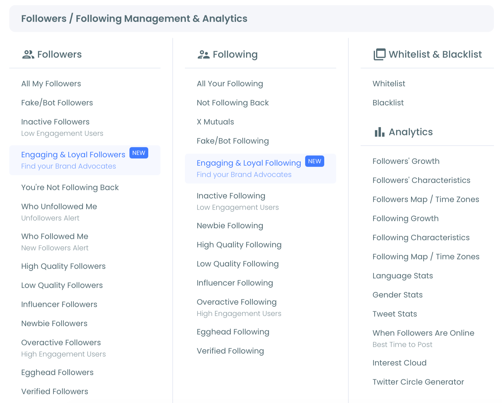
- Select our When Followers Are Online report to load the "When Followers Are Online: Best Times To Post" bubble chart.
Read the grid before you change anything
- Scan the whole grid, not just the biggest bubble. Days of the week run down the vertical axis, hours of the day run across the horizontal axis, and bubble size shows how concentrated follower activity is in that slot.
- Adjust the scrollable time range control below the chart so a single unusual week does not decide your entire calendar.
- Note two to four candidate windows instead of crowning one winner, because a single slot cannot cover an audience that is awake in shifts.
Turn the reading into a posting schedule
- Click the "Pick All Best Times: Add to My Posting Queue Now!" button to send every identified peak slot to your Circleboom posting queue, then open the queue and confirm the new slots do not collide with anything already scheduled.
- Export the chart as a PNG, JPG, or PDF from the three-dot menu in the top right, so the calendar you hand to a teammate carries the evidence it was built from.
The sequence earns its shape.
Connecting first gives the report real follower data to work with, and reading the grid before acting stops you from over-fitting to one loud bubble. Widening the range smooths out a freak week.
Queueing before the export means the schedule is a consequence of the chart rather than a guess you decorate with it afterwards, and the exported image records what you decided from.
The short version:
- Connect the account and open the audience analytics menu.
- Load the bubble chart and read rows against columns.
- Widen the date range, then pick two to four windows.
- Queue the slots, review the queue, export the chart.
Move the day or move the hour: a two-part test
Almost nobody teaches this reading, and it decides whether your fix is a calendar change or a clock change.
Because the chart plots days down one axis and hours across the other, a two-part test separates the variables.
Test one: do the big bubbles sit in the same column on most rows? If they do, your followers peak at roughly the same hour every day, and shuffling content to a different weekday will change nothing. Fix the clock and keep the calendar exactly as it is.
Test two: do the weekend rows peak in a different column from the weekday rows? If they do, the same people are running a different routine on Saturday and Sunday. Give the weekend its own time slot rather than its own content plan.
Two noes leave you with the case everyone assumes they have.
One or two rows genuinely carry bigger bubbles than the rest at their own peak hour, and those are the days worth reserving for launches, threads, and anything you only get one shot at.
Running the test costs one careful look. Skipping it is how an account mistakes a time-zone artifact for a weekday winner, stacks everything onto one day, and starves the other six.
That is the fastest way to make a good week look like a bad one.
To see the geography underneath the pattern, the Twitter Followers and Friends Map shows where the clusters producing it actually sit.
Is one best day enough for Twitter?
No, and treating it as enough is the common mistake.
A single weekly peak concentrates all of your reach into one window and leaves the rest of the week posting into an empty room.
Six days out of seven produce almost none of the early interaction that carries a post past your own followers.
Two to four windows spread across different rows of the grid cover more of the activity curve than one window ever can.
That is also the shape most content calendars need anyway, since you rarely have one piece of content per week worth defending.
Circleboom is an official X Enterprise Developer company, so the follower activity behind that chart is pulled through sanctioned, policy-compliant access rather than scraped from the timeline.
That matters when you are about to rebuild a publishing schedule on top of it, because a schedule is only as trustworthy as the data underneath it.
Once the windows are chosen, bulk schedule tweets into them so the calendar survives a busy week without manual babysitting.
What to do when there is no clear best day
Some accounts open the chart and find an even spread: seven rows of similar bubbles, no row obviously ahead.
That is a real result, not a failed reading, and it is more common than the listicles admit.
An even spread means your audience is not organised around a weekly rhythm. Usually that points to one of two situations.
Either the follower base is spread widely enough across time zones that the weekly cycles cancel each other out, or it is small enough that the pattern has not separated from the noise yet.
Either way, the answer is the same: stop chasing the day and work on the hour.
Read the columns, find the two or three hours that hold up across most rows, and build a consistent daily slot instead of a special weekly one.
Consistency is the lever available to you when the calendar refuses to pick a favourite.
It is worth re-reading the chart after your next growth period, because a spread pattern often resolves into a shaped one as the audience concentrates.
Working through determining your best posting time on Twitter alongside the weekday question keeps both variables in view instead of trading one guess for another.
That combination is what our best day of week to tweet on Twitter report is built to give you.
A day axis and an hour axis sit in the same picture, so you never answer one without seeing the other.
What changes once your week is calibrated
The first change is that underperformance becomes diagnosable.
When timing was random, a weak tweet could be blamed on the writing, the topic, or the algorithm, and none of those guesses were testable. With a fixed set of windows, timing stops being a variable and everything else becomes measurable against it.
The second change is planning.
A calibrated week tells you which slots deserve your best work and which ones are fine for lighter replies and reposts. That split is exactly the input creating a social media calendar based on follower activity needs.
The third is durability.
Follower bases shift as they grow, so the pattern you read today is a snapshot rather than a permanent setting. Recheck it after a spike in growth, a cleanup, or a campaign that pulled in a new region, and the calendar stays honest.
None of this replaces good content.
Timing improves the odds that early interaction happens at all, and early interaction is what decides how far a strong post travels. That is why accounts working on increasing Twitter impressions usually get more out of fixing the schedule than out of rewriting the copy.
Where to start on your own grid
You now have a way to answer the weekday question with your own data instead of somebody else's average. Work through it in this order:
- Load the bubble chart and screenshot it before you touch the schedule.
- Decide whether the pattern is a day effect, an hour effect, or a weekend shift.
- Pick two to four windows and queue them, rather than crowning one day.
- Diary a recheck after your next significant growth period.
Do those four and your calendar stops being an inherited assumption. Start with the chart itself: → your best tweeting day on X
Weekday-timing questions the grid tends to raise
How much follower history does the chart need before it's useful?
Enough that the pattern stops moving when you widen the date range.
Use the time range control under the chart and compare a narrow window against a broader one, and if the strong rows stay strong in both, the pattern is stable enough to schedule against.
Do the times shown match my followers' local time or mine?
Neither, strictly.
The hours are drawn against the time zone set on your Circleboom account, so a globally spread audience will always be reading the chart through your clock rather than theirs. Translate before you diarise.
Will the one-click best-times button overwrite my existing schedule?
No.
It adds the identified peak slots to your Circleboom posting queue rather than writing directly to your calendar, so open the queue straight afterwards and check the new slots against what you had already planned.
How often should I re-run this?
Whenever your audience composition changes rather than on a fixed date.
Big follower growth, a large cleanup, or a campaign that attracted a new regional audience are all reasons to reload the chart, since the peaks move with the people producing them.