

Most people believe their posting routine is consistent because they remember posting often. Memory of effort is not the same as a record of actual output. X gives you no chart, no aggregate trend, nothing that confirms whether the consistent routine you believe you have actually happened that way or whether a few good weeks are doing all the work in your memory of it.
Posting frequency is not a feeling. It is measurable data that already exists in your account history, waiting for something to turn it into a trend you can actually look at.
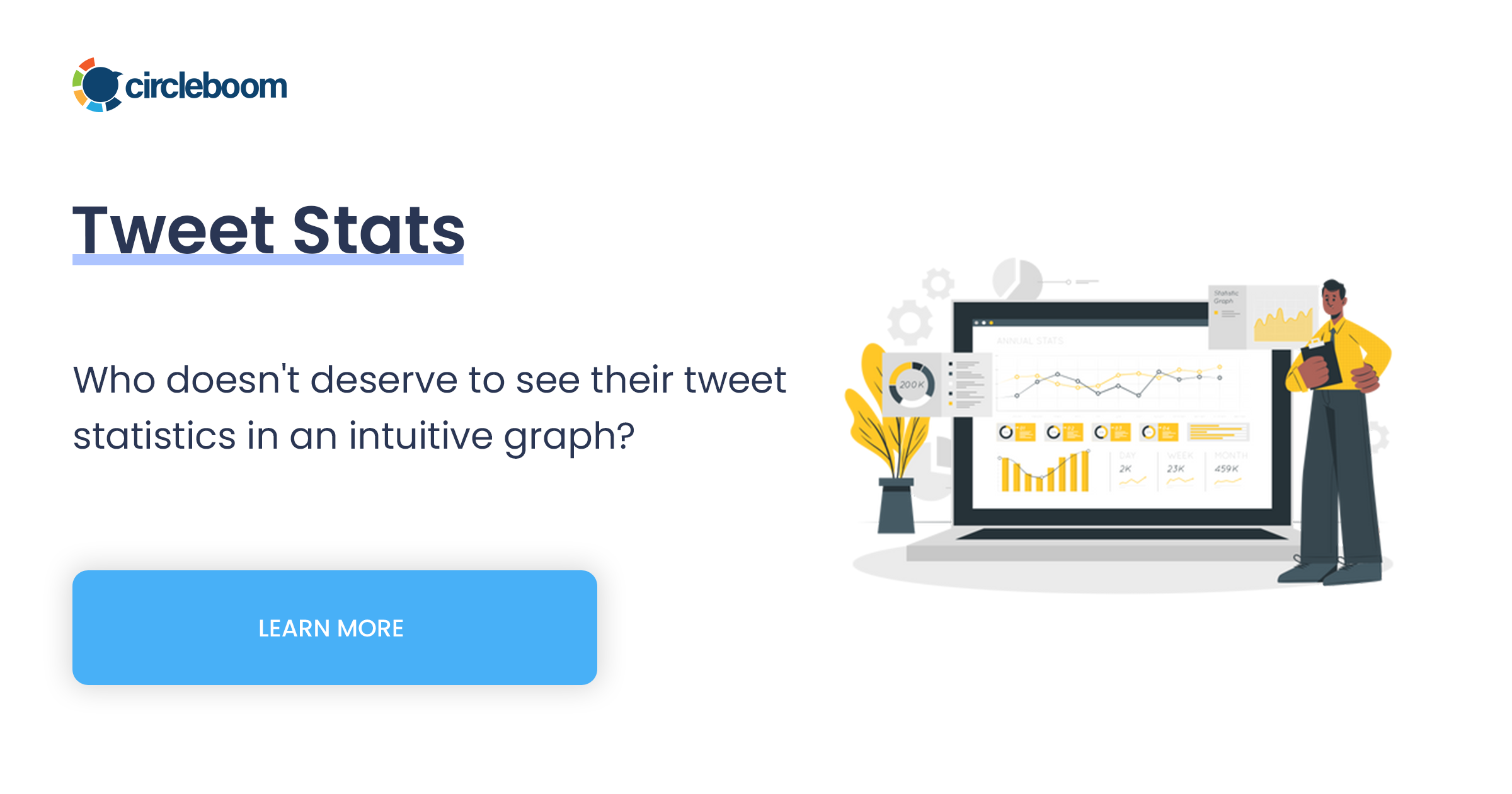
Circleboom's Tweet Stats charts your tweet volume over time in two views, a cumulative Performance chart and a Daily Change bar chart, turning your actual posting history into a visible trend instead of a remembered impression.
→ see your Twitter posting frequency trends
Why posting frequency feels consistent even when it isn't
X shows your tweets as a chronological feed and nothing else. There is no chart of volume over time, no aggregate view of how many posts went out in a given week versus another, no native way to confirm a pattern beyond scrolling and counting manually, which almost nobody actually does.
Memory fills that gap badly. Understanding the full picture of your tweet activity requires more than a general sense of "I post pretty often." A productive week sticks in memory more than a quiet one, which means most people's internal sense of their own posting frequency skews toward their best stretches rather than their actual average.
The cost of that distortion shows up whenever posting frequency actually matters: setting a new schedule, diagnosing a growth slowdown, or explaining output in a report. Without an actual record, the only available answer is a guess dressed up as a memory.

What the two trend views actually show
Tweet Stats presents posting frequency through two distinct charts, and reading them correctly means understanding what each one is built to answer.
- The Performance tab shows cumulative volume. Titled "Total Tweets Over Time," this chart shows your running total tweet count climbing across the selected period. A steadily rising line means regular output. Flat stretches mean gaps. Steep jumps mean short bursts of high-volume posting.
- The Daily Change tab shows day-by-day activity. Titled "Daily Changes in Your Tweet Activity," this bar chart shows exactly how many tweets went out on any given day. Bars above zero represent days with net new tweets; bars below zero represent days where more tweets were deleted than published.
- The two views answer different questions. Performance tells you the overall shape of your output across weeks or months. Daily Change tells you exactly which days carried the volume and which days were empty.
- Neither view measures engagement. Both charts track how much you posted, not how those posts performed. A high-volume week and a high-engagement week are not the same thing, and Tweet Stats only answers the first question.
Reading both views together gives you the full picture: the long-term shape from Performance, and the specific days driving that shape from Daily Change.
How to see your Twitter posting frequency trends
Because Circleboom is an official X Enterprise Developer, your tweet history is retrieved through sanctioned Enterprise API access, giving Tweet Stats a reliable record to chart from.
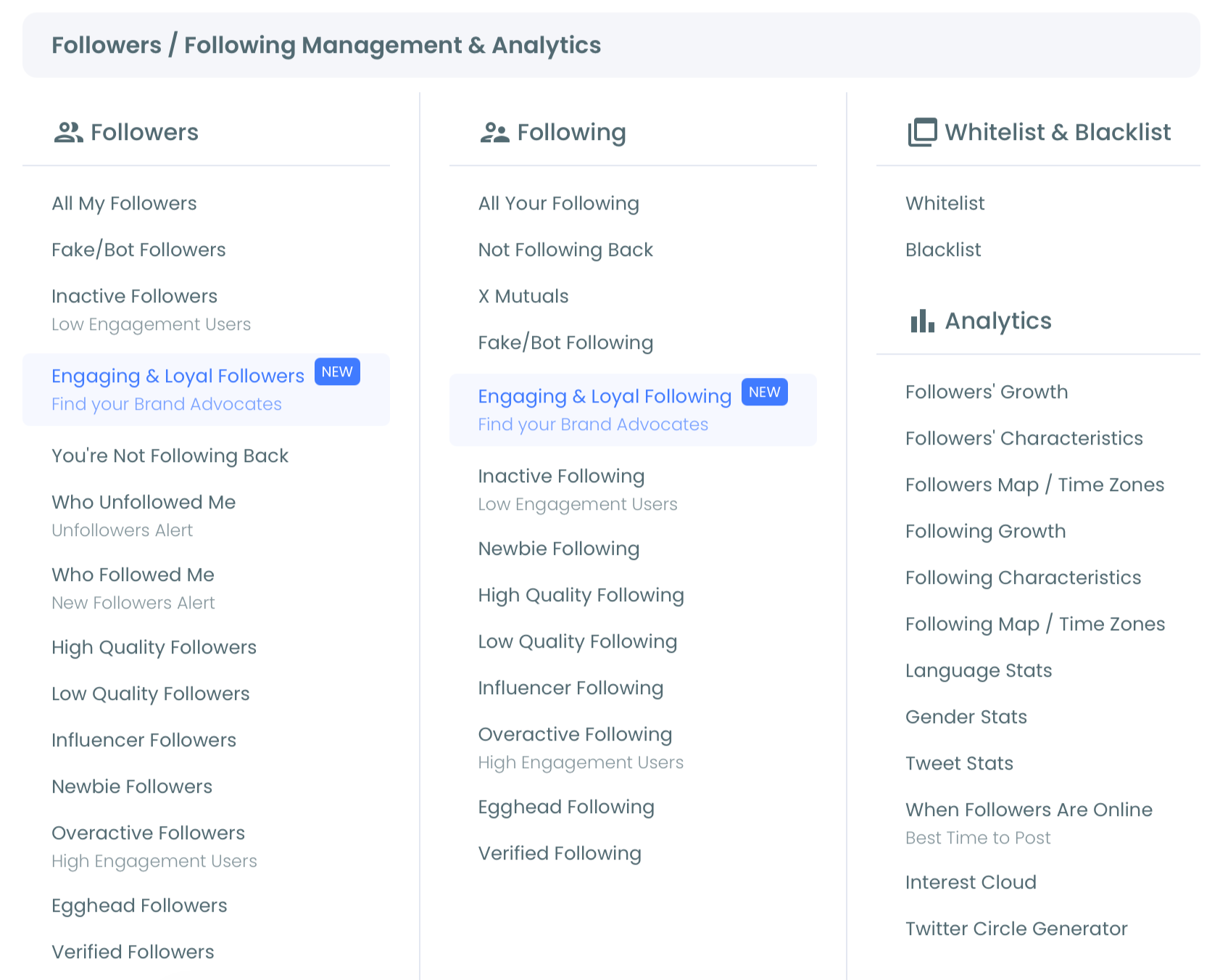
1. Connect your account and open Tweet Stats: Log in to Circleboom Twitter and authorize your account through OAuth. Navigate to Tweet Stats inside the Analytics section. The view defaults to the Performance tab.
2. Read the Performance tab for the overall shape: Look at the "Total Tweets Over Time" chart. A consistently rising line indicates regular posting across the period. Flat sections mark gaps where output stopped. Steep rises mark short bursts of unusually high volume.
3. Switch to Daily Change for the day-level detail: Click the Daily Change tab to see "Daily Changes in Your Tweet Activity" as a bar chart. Look for patterns: recurring low-activity days, high-volume bursts followed by quiet stretches, or any correlation with follower growth you may be tracking elsewhere.
4. Use the time frame selector and export if needed: Use the scrollable time frame control below the chart to zoom into a specific period, a campaign month, a content experiment, or the weeks after a strategy change, and compare it against other periods. Export the current view as PNG, JPG, or PDF through the three-dot menu if you need it for a report.
That sequence moves from a general shape to specific, comparable periods, giving you an actual baseline instead of a remembered impression of how often you post.
What knowing your actual frequency changes
A real baseline changes what a new posting schedule is built on. Instead of setting a target based on what feels achievable, the Performance and Daily Change charts show what your actual output has been, which makes any new cadence goal grounded in real behavior rather than aspiration.
It also separates two explanations that often get confused. If overall results shifted recently, Tweet Stats tells you whether that came from a genuine change in volume or whether your posting frequency stayed flat while something else moved. Pairing this with timing data helps isolate whether a quiet period was a volume problem or a timing problem, two issues that require very different fixes.
For anyone building or revising a structured content calendar, the Daily Change view is the most honest starting point available. It shows the gaps that actually happened, not the schedule that was supposed to happen, which is the more useful number when deciding how ambitious a new plan should realistically be.
X never aggregates what it already has
X has every timestamp for every tweet you have ever posted. The platform technically has everything needed to show you a frequency trend. It simply never builds the aggregation layer that would turn that raw timestamp data into a chart anyone could read.
This is consistent with how X treats most of its own data: available in raw form, rarely summarized into something usable. The same gap that hides your posting frequency also hides plenty of other patterns sitting in account history that nobody ever surfaces without a tool built specifically to chart it.
The mistake to avoid
The most common mistake is treating Tweet Stats as a performance metric instead of a volume metric. The Performance and Daily Change charts show how many tweets went out, not how those tweets performed in likes, impressions, or engagement rate.
A high-volume period and a high-performing period are different things, and confusing the two leads to the wrong conclusion about what is actually working. Use the dedicated Post Analytics features when the question is about engagement, not Tweet Stats.
The second mistake is misreading negative bars in the Daily Change view as a bug. A bar below zero on a given day means more tweets were deleted than published that day, a real net change, not an error in the chart. Treat it as accurate information about what happened to your tweet count that day, not a glitch to dismiss.
Common questions
Does Tweet Stats show how my tweets performed, or just how many I posted?
Just how many. Tweet Stats tracks posting volume, the cumulative count and the daily activity, not engagement metrics like likes, impressions, or retweets. For performance data on individual posts, use Post Engagement Analytics instead.
Why does the Daily Change chart show bars below zero?
A negative bar means more tweets were deleted than published on that specific day, which produces a net decrease in your total tweet count. This is a real reflection of that day's activity, not a display error.
Does this include tweet activity from before I connected my account to Circleboom?
No. The historical range Tweet Stats can show begins at the point your account was connected to Circleboom. Activity from before that connection was not recorded and will not appear in either chart.
Can I use the chart in a client report or performance review?
Yes. Export the current view, Performance or Daily Change, as PNG, JPG, or PDF through the three-dot menu. Export each tab separately if a report needs both the overall trend and the day-level detail. Best time to post data pairs well alongside these exports when a report needs to show both consistency and timing strategy together.
Your next move
Your actual posting frequency is sitting in your account history whether you have looked at it or not. Pull up the trend, read the overall shape, zoom into the period that matters, and use what you find as the real starting point for whatever schedule comes next. Read it, zoom in, plan from it.