Creating a stylish and coherent Instagram feed necessitates design talents that you may not have. Furthermore, Instagram's algorithm prioritizes brands that post at least once a day, which may be adding to your stress.
If that is the case with your Instagram account, there are ways to make pre-made templates for Instagram post design, so you always have a supply on hand. You will also have a way more efficient time building a cohesive and aesthetically beautiful feed if you utilize the same layouts for different postings.
How to design Instagram posts?
Would you like to save time when it comes to creating and scheduling Instagram posts?
We will show you how we use Canva for Instagram to produce and plan a month's worth of posts in this post, along with some creative Instagram post design ideas. Creating a batch of content relieves our stress and allows us to focus on other aspects of our business. In this case, scheduling your prepared posts can be the next best move.
You can effortlessly document your experiences and share your new ones through amazing images with only a few clicks.
Canva
Canva has dozens of Instagram post templates that you can customize. To make an Instagram post with Canva, go to the Create a Design page, select "Instagram Post," and then follow the steps below:
1. On the left side of the creating design tab, you will see various template alternatives, some of which are paid while others are free to use.
2. After you have chosen a template, type something in the text field. And it is possible to change the color of your text; there are colors at the top; you can also play a bit with the font, size, and width.
When you have completed your content, click the image's backdrop (outside the text box). You can use this to filter your background, change the image's brightness and contrast, and more.
In the top right corner, click "Share."
- Besides templates, Canva also inspires with Instagram photo ideas to encourage more creative Instagram post design.
How to create Instagram post designs and manage social media calendars too?
Let's face it, fueling your creative side and running the account, publishing, and monitoring cannot go smoothly and as easily as you imagined. But you don't have to undergo it all alone; get some help today!
And to this end, here we offer both Canva's Instagram design tool and Instagram scheduling within one tool, Circleboom Publish.
The Circleboom Publish tool has the ability to schedule an Instagram post as well as other features. So, you can work on your Instagram post design, schedule for days ahead and forget about a week's worth of Instagram content since Circleboom will take care of it!
With this tool, you will find the ease of the creative Instagram post design process, designing templates through Canva integration, and posting or scheduling them in advance.
If you are opting to find an easy way out to solve Instagram post design work waiting for you, we have some good news. Start with choosing the Instagram post size and then continue your Instagram post design without any room for error.
Along with the social media post sizes, there is the Design On Canva option.
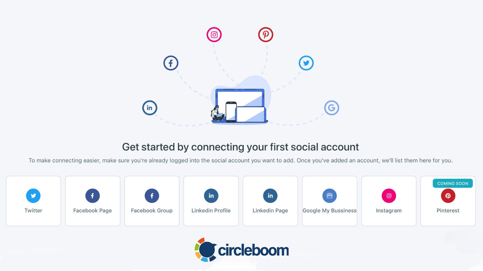
As you will see below, you can start using beloved Canva Instagram templates in the same dashboard after logging into your account and then post the account you want.
When you integrate your Canva account, you can easily work on Canva like you do at the app and create Instagram post designs with templates, graphics, stickers, filters, and animations offered.
After that, you can also schedule that Instagram post design you created as writing captions.
You can specify the date and time you wish to publish the post using the schedule option.
10 Creative Instagram post design ideas
Let's be inspired with our Instagram post design list if you're already stuck in a content drought. This list will show you how to begin creating eye-catching social media content creation right away.
We bet our collection of fascinating social media content ideas can come in handy!
1. Theme with a line in the center
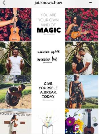
On a white background, the line in the center is commonly made up of quotes. It is, on the other hand, can be any color or theme you like. As your viewers scroll, the line will direct them.
2. The row design
This design makes it appear as if you're reading a magazine. You can get really imaginative and tell a story from start to finish. The user uses one row to submit photographs from a single photoshoot or outfit.
3. Three-Photo for a theme without splitting
After you have figured out your strategy, you can start thinking about what kind of content you would like to share. Do you have three (or six, nine, or twelve) separate photographs that you would like to share together? Then, to make a gigantic square on your Instagram account, divide your photographs into 1:1 square.
4. Theme of white and black borders
One of the clean and clear methods to start an Instagram post design theme is to use a white border on your photographs.
Even if you share a variety of photographs in various hues, your overall feed will appear consistent. White borders help to separate your photographs. They allow your feed to breathe.
White and black borders are also great for making your photographs stand out on Instagram's Explore and Hashtag Pages.
Dark borders complement dark themes such as grunge and moody. Black borders would also look great on photographs with strong color pops and simple backgrounds.
5. Applying the same filter
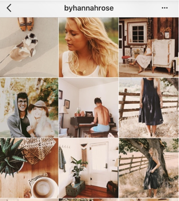
If you are not so confident about where to begin, start with this Instagram post design theme: use the same filter on all of your photographs all of the time. Your filter will become synonymous with your personal style. If you consistently apply the same filter on all of your photos, people will instantly recognize them.
The simplest method to create a theme is to use the same filter all the time. When someone looks at your feed for the first time, it makes it look more unified. In addition, the same filter lends your entire feed a mood.

6. Using Colors that pop
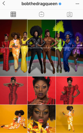
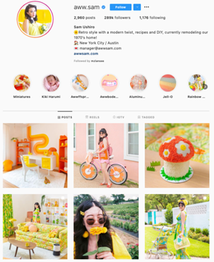
If you want your company's brand to convey playfulness or fun, a feed filled with bright colors is perhaps the best way to go when choosing an Instagram post design.
Bright colors are eye-catching and cheerful, making them great for engaging a younger audience.
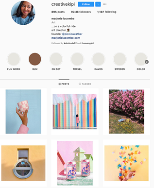
7. Going for Only Pastels
Like the one-color idea, using a single-color palette for your feed, such as pastels, may be beneficial. Pastels, in particular, which are frequently used to decorate Easter eggs or cupcakes, have a childish and cheery appearance. They are also enthralling and unexpected.
8. Using Only text
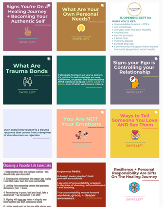
We all appreciate that a thousand words are worth a thousand pictures, but how many photos is a well-designed quote worth? Text-only design can work for you if you want to use Instagram post design ideas to spread information most effectively and easily possible.
This Instagram post design idea is appealing in the Instagram grid structure and as a one-off post on the feed, thanks to the vivid colors and highlighted text. Even with this rigid text-only motif, a type-treated font and textured background can help to break up the monotony. Also, you can make your Instagram posts more engaging by applying multiple creative techniques. For instance, you can use the text reverse method to create posts that may spark curiosity. Similarly, you can play with different font styles to communicate the message effectively.
9. Theme with white background
Simple can be stunning. It's important to understand that sticking to a white theme is a way of life. A lot of light is required (natural light is the best). To make your images pop, you should surround yourself with white. If you already have a lot of white in your home, this theme will be a breeze to put together.
10. Repetition Style
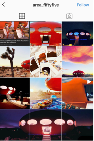
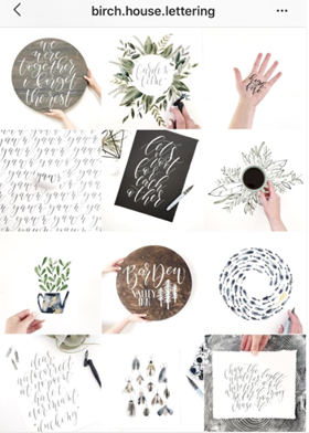
This style of Instagram post design with repetition appears clean and interesting, and it means that users will always recognize one of your posts as they scroll through their feed. Consider how you may use similar repetition in your posts to establish a distinct brand image.
Wrap Up
As brands seek ways to make photographs stand out, fine-tuning Instagram post design for creativity has increased expectations.
When building an Instagram theme, you will need to plan posts ahead of time to see how they'll fit together, just like puzzle pieces. Each piece of content should complement the overall theme.
Use an Instagram planner with a built-in design tool like Circleboom to schedule posts in advance and visualize how they fit into your overall theme.
It's critical to schedule your Instagram posts ahead of time for many reasons, including ensuring that you upload a diverse range of content and at a convenient time. Please do not waste time and start discovering Circleboom and its Canva design tool for creative Instagram post designs today.


