
X does not give you a per-day record of how many posts your account published, but Circleboom's Tweet Stats does, with a bar for every day since you connected. Reading it well means telling four shapes apart.
Your daily tweet count history lives in Circleboom's Tweet Stats, on the Daily Change tab, where each bar is one day of posting. Circleboom tracks how many tweets your account publishes on X each day over X's official Enterprise APIs and keeps the running total on a second tab.
→ Daily tweet count history on X
Below: the steps to open it, then the four shapes the bars take and the move each one calls for.
Why X has no per-day posting history for your account
X shows your profile's total post count, a single running number with no dates attached. There is no native view that lays out how many posts you published on each day across past weeks and months.
Search for tweet counts per day and the results mostly cover the whole network: how many tweets everyone on the platform sends, and how that figure grew over the years. That is interesting history, but it tells you nothing about your own account.
The question most creators and account managers have is narrower. Did I post on the days I meant to? Did output fall in the weeks my numbers fell? Answering that needs a daily tweet count history for one account, the one you run.
Without it, people fall back on two weak signals. The first is memory, which keeps the busy days and loses the empty ones. The second is the total, which rises in the same way whether you posted daily or in two big pushes.
Neither can show a gap.
The cost of that blind spot shows up when you plan. A new target such as "two posts a day" is only realistic next to what the account has managed so far. Set it without a baseline and the first missed week feels like failure, when it may simply match your normal rhythm.
How Circleboom's Tweet Stats reads your tweet count on X
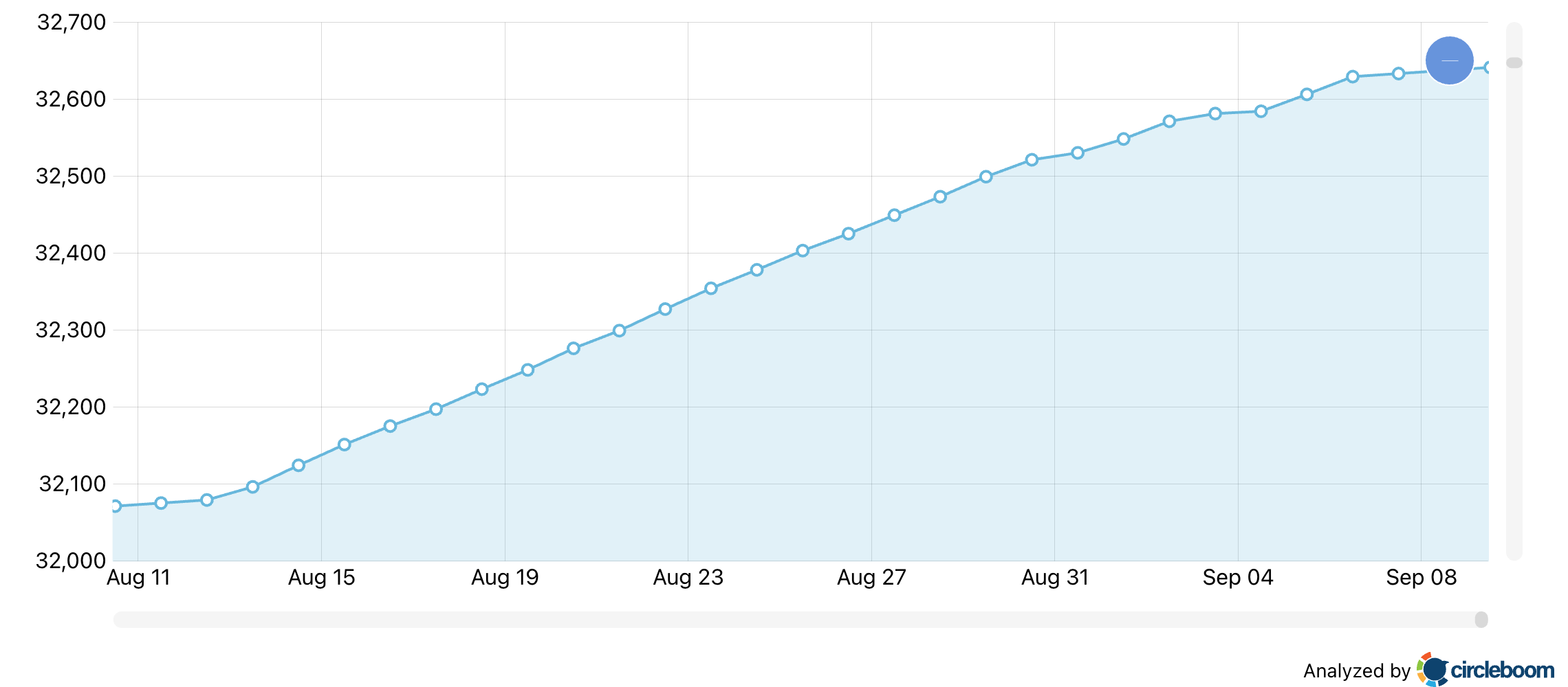
Circleboom's Tweet Stats records how many tweets your connected X account publishes each day and shows the result on two charts. The Performance tab carries "Total Tweets Over Time," a cumulative line. The Daily Change tab carries "Daily Changes in Your Tweet Activity," one bar per day.
The two charts answer different halves of one question. The line shows the trend: an even rise means regular posting, a flat section means a pause, a steep section means a burst. The bars pin that trend to specific dates.
Circleboom is an official X Enterprise Developer company, so your posting history is read through access X itself grants. Nothing is scraped, and you are not trading account safety for a chart.
Tweet Stats is activity analytics. It counts output and measures nothing about likes, impressions or replies, which belong to Post Analytics once you know the posts went out. I read the per-day tweet count before any engagement chart for that reason: it decides which question is worth asking next.
How to see your daily tweet count history on X
To see your daily tweet count history on X, connect your account to Circleboom, open Tweet Stats, and switch from the cumulative Performance chart to the Daily Change bar chart. Bars above zero show tweets published that day, and bars below zero show net deletions. The five steps below run in two phases.
Get into Tweet Stats
- Log in to Circleboom Twitter and connect the X account whose cadence you want to measure, since only that account's own tweets are counted.

- Navigate to the Followers and Following menu, then to Analytics, and click Tweet Stats.
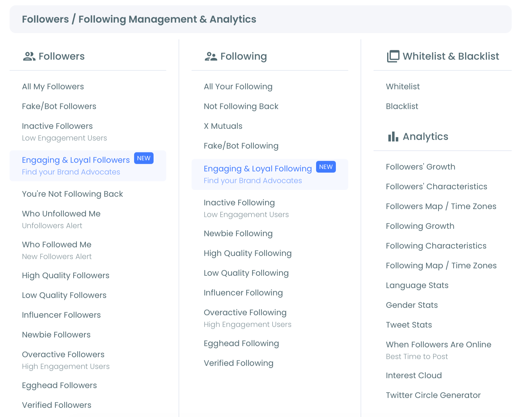
- Check the Performance tab that opens by default, where "Total Tweets Over Time" climbs with each published tweet.
Read the days behind the line
- Click the Daily Change tab to turn the same history into one bar per day.
- Set the time frame selector below the chart to the period you are judging, such as the last four weeks or a single campaign window.
Starting on the cumulative line gives you the trend in one glance, and the daily bars then pin it to dates you can act on. The line also tells you which weeks deserve a closer look, so you are not combing through every bar.
The short version: connect, open Tweet Stats, read the line, switch to Daily Change, set the window.
The four shapes of a daily tweet count on Twitter
Every daily tweet count history is some mix of four shapes. Each one means something different and calls for a different next move:
| Shape | What the bars look like | What it usually means | Next move |
|---|---|---|---|
| Steady | Similar bars on most days | Cadence is holding | Rule out volume, review performance |
| Burst | Tall bars bunched on a few days | Catch-up or launch-day posting | Spread the same posts over more days |
| Silent gap | A run of days with no bar | Nothing new went out | Queue drafts ahead of busy weeks |
| Deletion day | A bar below zero | More tweets removed than added | Confirm the cleanup, then read around it |
The table is the quick version. The notes below cover what each shape hides.
Steady: the shape that rules volume out
A steady run is the most useful shape to find, because it closes a line of inquiry. If reach or growth slipped during a stretch of even bars, posting volume is not the cause, and the investigation moves to the posts themselves, their timing and their topics.
Steady does not mean high. An account posting once a day, every day, is steady.
Judge steadiness by how even the bars are, not by how tall. A modest rate held for months usually tells you more about an account's habits than a high rate held for a fortnight.
Burst: towers standing next to empty days
A burst is a cluster of tall bars on one or two days, usually right after a quiet stretch or on a launch day. It feels productive while it happens, because the drafts finally go out.
If your chart shows towers after quiet stretches, you are likely posting in catch-up mode. The fix is not more posts but the same posts spread wider, which a queue handles better than willpower.
Silent gap: days with no bar at all
A silent gap usually has a plain cause: a busy week, a trip, an empty drafts folder. The last one is the easiest to fix ahead of time. Drafting from your own back catalogue is the fastest way to stock the queue, as covered in how can I generate my next tweet automatically.
When a gap lines up with a dip in your numbers, it is the first suspect, before any judgment about the writing.
Deletion day: the bar that drops below zero
A bar below zero means the account removed more tweets than it published that day. It records a net change and is not an error.
Before you read the surrounding weeks, confirm you ran a cleanup on that date, then judge cadence on the publishing days around it rather than letting one deep bar drag the period down.
How the same shapes look on the Performance line
The cumulative line shows all four shapes too, just less loudly:
- A steady run is an even slope.
- A burst is a sudden steep step.
- A silent gap is a flat stretch where the line stops climbing.
- A deletion day is a small drop, the only place the line goes down.
That makes the line a good first scan over a long window. Look for flat stretches and sudden climbs, then move to Daily Change for the dates.
Shapes rarely come alone
Real charts mix shapes, and the combinations say more than any single one. The most common pairing is a silent gap followed by a burst: the account goes quiet, then posts heavily to make up for it. Read the line alone and that pairing can pass for ordinary posting.
Another common mix is a steady run broken by a deletion day, usually after a profile cleanup. The steady run is the signal; the deletion day is a footnote.
When you describe a period, name the mix rather than the dominant shape. "Steady with one gap in week three" is far more useful to a team than "mostly consistent."
Comparing two periods of your X posting history
The time frame selector is what turns the chart into a before-and-after tool. Pull the window in to the weeks before a schedule change, note the shapes, then slide it to the weeks after and note them again.
The comparison is fair only when the two windows are the same length and neither one hides a big cleanup. If one does, judge both windows by their publishing days.
This is also the honest way to check a campaign. If the plan called for daily posting across the campaign weeks, the bars for that window show whether it happened, day by day, before anyone debates the results.
Putting a daily tweet count history into a report
A per-day chart is often the clearest proof of output in a client review or a monthly team update. The three-dot menu at the top right of the chart exports the current view as a PNG, JPG or PDF file, and each tab exports separately.
For a report, include three things:
- The window: the dates the chart covers, so nobody compares it with a different period.
- Both views: the running total for the trend and the daily bars for the specific days.
- One line per shape: a short note naming any gap, burst or deletion day the reader will see.
Keep performance numbers on a separate slide. Tweet Stats shows how much went out; how well it did belongs to Post Analytics, and mixing the two on one chart invites the wrong conclusion.
Can you see how many tweets another account posts per day?
Not with Tweet Stats, which counts only your connected account's own tweets. For another account's cadence, Circleboom's X Competitor Analysis & Benchmark Report covers posting behavior, including posts per day, for up to 5 accounts in one report.
That pairing answers a question your own chart cannot: are you being out-posted? Set your steady daily rate from Tweet Stats next to a rival's posts per day from the Twitter competitor analysis report. Then you know whether a gap in attention is a gap in output.
I use that comparison as a sanity check. Matching a rival's volume only makes sense if your team can sustain it, and your own bars are the honest measure of what you can sustain.
The comparison also works in reverse. If a rival posts far less than you and still draws more attention, volume is clearly not your constraint, and the next look belongs to the content and its timing.
For a lighter look at what other accounts are doing day to day, see how to track other people's activity on X.
What to post on the quiet days in your X calendar
Fill quiet days with drafts made from your own past tweets, scheduled ahead so the gap never opens. Generate My Next Post, inside Circleboom's X Post Planner, drafts the next tweet from your tweet history and writing style, so the posts sound like the rest of your feed.
You can try it from the page to generate your next tweet, then edit the draft before it goes anywhere. Drafts made in a calm week are what keep a hectic week from showing up as an empty run on your chart.
The second half is the queue. A draft only fills a gap if it is scheduled for the gap. For how queues work on X and how to set one up, see can you queue tweets and how to schedule Twitter posts.
Scheduling in practice: smart scheduling, bulk scheduling and auto retweet, three ways to keep quiet days covered on X.
Set the queue at the rate your steady weeks already prove you can keep, using the Twitter post planner, rather than at an ambitious target your chart has never shown.
Daily tweet counts on X, in one line
Most accounts argue about content quality without ever checking whether the content went out.
The days you showed up are the cheapest evidence you have, so read them before you change anything else.
→ Read your tweet count by day
Questions about daily tweet counts, answered
Is my reach drop a posting problem or a content problem?
Check volume first. If your daily bars thinned out in the same weeks your reach fell, the cause is posting volume. If the bars held steady, the posts themselves need review, and which tweets are performing well is the place to start that review.
Are the deletion days on the chart exact?
Not always. Deleted tweets may not be fully reflected in Tweet Stats, so treat a deletion day as a close representation of the net change rather than an exact count of what you removed.
Is there a limit to how many tweets you can post in a day?
Yes. X caps how many updates an account can post per day and splits that cap into shorter windows through the day. The current figures are on X's account limits page.