
A Twitter posting frequency benchmark compares how many posts per day your account and its competitors publish, measured the same way on one date. The reading has two parts: the daily average, and how evenly that average is spread across the month.
Manual: a week of counting each rival's timeline, with a different method for every account. Circleboom: one dated report in which Circleboom measures posts per day and posting consistency for up to five accounts on X through official Enterprise APIs.
→ Twitter posting frequency benchmark
Each panel has its own unit, and the sections below explain both.
What a posting frequency benchmark on X measures
A posting frequency benchmark on X measures cadence in two panels, each with a different unit. Both sit in the Posting behavior section of Circleboom's X Competitor Benchmark Report.
- Posts per day / cadence. The unit is average tweets per day. Each account gets two bars: Lifetime Average and Last 30 Days Average.
- Posting consistency (steady vs burst). The unit is a coefficient of variation, shortened to CV. Each account gets a Steady or Burst label with the CV printed beside it.
The first panel says how much an account publishes. The second says how evenly it publishes.
A Twitter posting frequency benchmark needs named accounts because a platform-wide average hides an enormous spread. Pew Research Center's study Sizing Up Twitter Users found that the most active 10% of U.S. adult users produce 80% of tweets.
With a distribution that lopsided, a "typical" frequency describes almost no real account.
Circleboom places your X account beside up to four competitors and calculates the same cadence figures for every one of them. That gives you a posting frequency benchmark for the accounts you compete with, not for the platform as a whole.
Which X accounts can be measured
Any public X account can go into the set, whether or not you own it. Private accounts cannot be analyzed, and neither can accounts with more than 3,000,000 followers.
One report holds five accounts at most. Your own account is optional, so an agency can also benchmark five accounts in a client's category without adding its own.
The cadence panels are one part of a larger report. The same run also covers audience quality, engagement and reach for the same five accounts, which is what lets you check a frequency finding against results later.
How to run a Twitter posting frequency benchmark for five accounts
To benchmark posting frequency on Twitter, add your account and up to four competitors to one comparison, start the analysis, and read the Posting behavior section of the report. All five accounts are pulled in the same run, so every figure shares one date. The steps below cover setup in three actions and reading in three more.
Put all five accounts on one dated run
- Open Circleboom Twitter and connect your X account.

- Select Monitoring in the menu, then the benchmark report at the top of that menu.
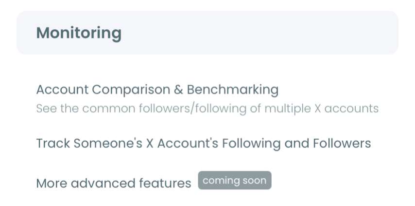
- Add the handles and click Start Competitor Analysis. The Account Handles panel takes one handle per @ field, five in total, and then asks whether you want one report or a monthly schedule.
Read cadence, consistency and posting hours in that order
- Find Posts per day / cadence in the Posting behavior section and note both bars for each account.
- Read the Posting consistency label next to it, including the CV number.
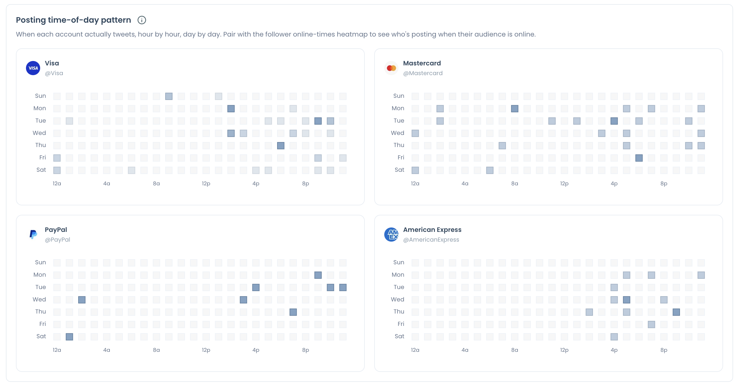
- Scroll to Posting time-of-day pattern, which draws a separate hour-by-day heatmap for each account.
Reading in this sequence keeps each number in context. Volume comes first, evenness explains how the volume is delivered, and hours only matter once the count is known.
In short: one login, one handle set, three panels read from volume to timing.
The finished report appears as a card under Your saved analysis, with its run date. Nothing is overwritten when the same handles are pulled again, so the first reading stays available for later comparison.
Lifetime Average versus Last 30 Days Average: what each bar means on X
Lifetime Average is an account's long-run posts per day, and Last 30 Days Average is its current pace. The panel prints them side by side so a change in output is visible at once.
| Bar | What it describes | Use it for |
|---|---|---|
| Lifetime Average | The account's long-run daily output | Background on its publishing history |
| Last 30 Days Average | Daily output in the most recent 30 days | The pace you are competing with now |
The gap between the bars is the finding. A large drop from lifetime to the last 30 days shows an account that used to publish far more. The account has slowed, and the chart is not saying it went silent.
That distinction changes the target. Benchmarking against a rival's lifetime bar means chasing a pace the rival may have left behind.
One account dropping versus all five dropping
The pair also tells a company problem from a market one. If only your account's 30-day bar has fallen, the change is yours. If every account in the set shows the same drop, the category has slowed, and matching the old pace would mean out-posting everyone for no clear reason.
Each figure is calculated from records that Circleboom retrieves as an official X Enterprise developer. For a cadence figure that sourcing is the point: the count is built from X's own records, not from a scraped timeline with gaps in it.
Compare the 30-day bars to set a target, and read the lifetime bars to understand how each account got there.
When you quote a cadence figure in a deck, name three things with it: the run date, the accounts in the set, and which bar the number came from. A posts-per-day figure without its bar is ambiguous, since the two bars can differ several times over for one account.
You can compare posting frequency across X accounts with both bars on screen for all five.
Steady versus Burst on Twitter: what a CV of 2 or 5 says
Steady means an account tweets at a fairly even daily pace, and Burst means it bunches tweets into spikes with quiet gaps between them. The label is based on the last 30 days, and the CV rises as posting gets more uneven.
The report prints the label in the form "Burst · CV 3.40." The documented examples run from CV 2.19 to CV 5.48, and all of them are labeled Burst.
The same 10 posts, spread out or stacked
Circleboom's own example for this panel is simple. Ten tweets spread over 10 days keep an account in timelines for 10 days. The same 10 tweets posted in one burst keep it visible for one day.
Both accounts average the same posts per day. Only the consistency panel separates them.
The CV puts a number on that difference. A coefficient of variation is the standard deviation divided by the mean. The report does not print its exact formula, so treat the table below as an illustration: it applies that definition to daily post counts over 30 days, with posts split evenly across the active days.
| Posting pattern over 30 days | Days with a post | Illustrative CV |
|---|---|---|
| 10 posts on 10 separate days | 10 | about 1.4 |
| 12 posts on 6 days | 6 | about 2.0 |
| 10 posts on a single day | 1 | about 5.4 |
Read the other way around, the number becomes a count of visible days. Under the same assumption, a CV near 2 fits an account that posts on roughly one day in five. A CV near 5 fits an account whose whole month lands on one or two days.
Two accounts with identical posts per day can be visible on ten days of the month or on one.
This is the reading I find most teams skip. They compare the averages, see a match, and conclude the routines are equal.
Why visible days can outrank volume
Here is how it changes a comparison. Suppose a rival averages two posts a day with a CV near 5, and your account averages one post a day at an even pace. The rival publishes 60 posts in the month and you publish 30. Yet the rival's 60 land on one or two days, while yours appear on all 30.
On volume the rival leads two to one. On days present in the timeline, you lead by a wide margin. A Twitter posting frequency benchmark that stops at the average would report only the first fact.
What the label does not tell you
A Burst label is a description, not a fault. A product launch or a live event produces a spike for good reasons, and an even routine is no guarantee of stronger results.
Use the label to ask a sharper question about your own calendar. Does your account show up through the whole month, or does it appear around announcements and then go quiet?
Can you check your own tweet frequency without a competitor?
Yes. Circleboom's tweet statistics covers your own account's posting volume with no rival involved.
The two tools answer different questions:
- The Tweet Stats page shows your posting volume over time: tweet count history, cadence, gaps and consistency.
- The benchmark report shows your cadence against named accounts on the same date.
The boundary is worth knowing before you open either one. Tweet Stats is for volume only. It does not say which posts performed best, and a performance question belongs to the post analytics features.
For a dated report on your own account's overall progress, Circleboom routes that need to its Account Analysis Report, the single-account counterpart of the benchmark.
A sensible order is own account first, then the set. Confirm your pace is what you think it is, then place it next to your competitors.
Which hours do rivals leave open on X?
Rivals leave open any hour where their posting heatmaps are empty and your audience is still active. The Posting time-of-day pattern panel shows when each account publishes, hour by hour and day by day.
Circleboom's guidance gives a clear example. If three competitors all post between 09:00 and 11:00, and your audience is also active at 20:00, the evening slot is a less contested window for your tweets.
Two cautions keep this reading honest:
- Compare the heatmaps in the same time-zone context, or a gap may be an artifact of the clock.
- Treat an empty hour as a candidate until your own audience data confirms people are online then.
The report also overlays posting times on audience activity for each account. That panel has no numeric score. Its output is the visual overlap between two curves.
An open hour is where extra posts should go once you raise your cadence. This article explains how to determine your best time to post on Twitter from your own account's data.
Before you fill that hour, confirm your own followers are online then with Circleboom's Twitter best time to post page.
Turning an X cadence target into a publishing plan
A cadence target becomes a plan when each post has a date and a slot. The benchmark supplies the number, and a calendar holds you to it.
Start from the 30-day bars of your direct peers and pick a pace your team can keep. Circleboom's guidance is to support a sustainable cadence that matches your content resources, with room left for timely posts.
Map the count onto dates. This walkthrough shows how to create a Twitter content calendar that spreads posts across the week, which is what moves an account from Burst toward Steady.
Load the slots in the tweet planner so the pace does not depend on someone posting by hand each day.
Tweet planner in use: the screen where a daily post count becomes dated, scheduled slots.
If the target is high, a separate article covers how to schedule more than 10 posts a day.
Keep the plan honest about bursts. A launch week will still spike, and that is fine. The aim is a baseline of regular posts under the spikes, so the account does not go quiet between campaigns.
Raise volume only after one check. Extra posts lift monthly totals whether or not the typical post gets any better, so look at per-post results in the Engagement section before committing to more.
Twitter cadence benchmark checklist
A posting frequency benchmark is finished when it has produced a target and a schedule. Work through these five actions:
- Run one report with your account and up to four direct peers.
- Record both cadence bars for every account, and set your target from the 30-day bars.
- Note each Steady or Burst label and CV, then count how many days a month your own account is visible.
- Mark the hours your rivals leave empty, and build a social media calendar based on follower activity around them.
- Switch the set to a monthly schedule so the next reading arrives without a reminder.
The exercise ends with a posts-per-day target that has a source behind it: five accounts, one date and one method.
→ Compare posts per day across five X accounts
What people ask about posting cadence on X
How many posts does the benchmark read for each X account?
Circleboom retrieves up to about 3,200 recent posts per account. For an X account that posts many times a day, that sample reaches back a few months, and for a quiet account it can reach back years. For most accounts the 30-day bar sits well inside the sample, which makes it the fairer bar to compare.
Is counting a competitor's tweets by hand accurate enough?
No. A hand count cannot hold the basis constant, because each account ends up measured over a different period with different rules for replies. A Twitter profile shows recent posts and no rate, while Circleboom calculates every account's cadence the same way on one date.