

Your Twitter followers by location is the single piece of audience data that drives the most operational decisions: when to post, what content to write, which markets to expand into, and which time zones to schedule around. X's native dashboard doesn't surface this view cleanly.
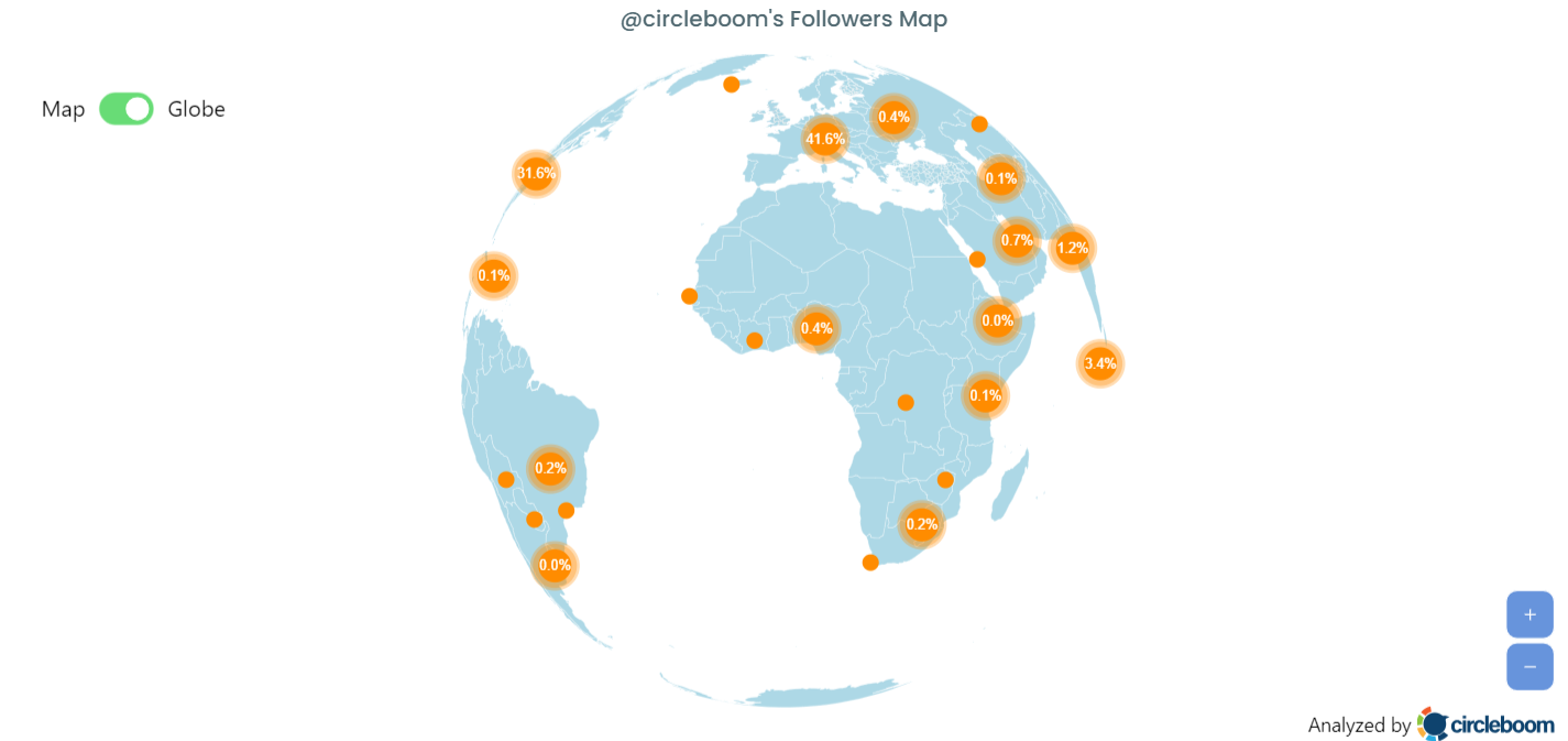
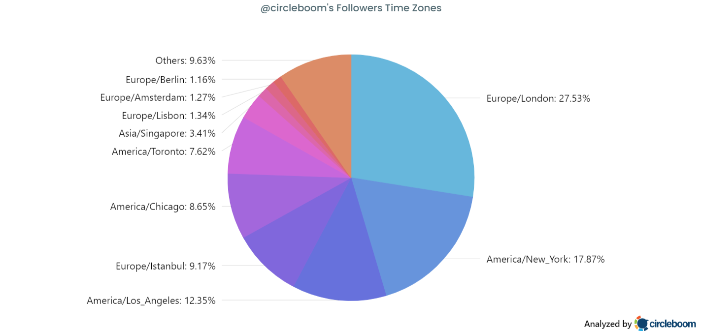
Circleboom's Twitter Followers & Friends Map produces a geographic distribution of your audience through official X Enterprise APIs, broken down by country and overlaid with time-zone density.
The five-minute audit reveals follower clusters most accounts didn't know they had.
Circleboom analyzes each follower's profile location through official X Enterprise APIs and produces a country-level distribution plus a time-zone heatmap. The result is a clear picture of where your audience lives, which markets are underserved, and which time zones you should schedule against. Exportable as PNG, JPG, or PDF for reporting.
→ find where your Twitter followers are from
The rest of this guide explains the three operational decisions geographic data unlocks and the exact workflow.
Why X Doesn't Surface This Natively
X's native analytics show aggregate-level follower counts and some basic demographic estimates inside the X Premium analytics tab. What it doesn't show is a per-country distribution or a time-zone density map. Account-level dashboards on desktop now sit behind X Premium, and even there the location view is shallow. Many creators have asked is it possible to see Twitter followers by country and discovered the native answer is "not really, not at scale."
The gap is why third-party tools exist. Circleboom is listed in X's enterprise customer directory, so the per-follower location data is read through authorized API access, not scraped or inferred. The data comes from each follower's profile location field where they've filled it in (most users have); accounts that haven't filled in location are excluded from the visible map. The sample is usually large enough to produce a clear distribution for any account with more than 500 active followers.
A useful complement to the map is the Twitter follower demographics view, which adds gender, language, and verification breakdowns on top of geographic data. Most accounts that run the location audit also run the demographic audit in the same session, because the two together describe the audience comprehensively.
The Three Decisions Geographic Data Actually Unlocks
Most accounts treat geographic data as interesting trivia. The decisions it should actually drive are operational.
The first decision is posting timing. If your audience clusters in three time zones (say, 60% US Eastern, 25% European, 15% Asia-Pacific), a single posting time misses two of the three clusters. The right approach is to schedule against each cluster's peak window independently, which only works if you know the geographic distribution. The most engaged time zones on Twitter overview maps this pattern explicitly: time-zone scheduling derives from geographic distribution, not the other way around.
The second decision is content localization. If 20% of your audience is in a non-US English-speaking market (UK, Australia, India), occasional content references aligned to those markets (rather than always US-centric references) signal that you understand the audience composition. The lift is small per tweet but compounds across the calendar. The Twitter friends demographics view extends this analysis to who you follow, which often reveals you're consuming a different geographic mix than your audience expects.
The third decision is expansion. The map often surfaces "ghost geographies": markets where you have an unexpectedly large follower bump given that you've done nothing to target them. These are usually the easiest expansion opportunities because the audience is already partially built. Posting more deliberately into those windows or producing content for those markets pays back quickly. Anyone wondering about the best way to view the location of Twitter followers is usually trying to answer this third question, often without realizing it.
Video walkthrough: how the Twitter Followers & Friends Map surfaces geographic distribution and time-zone density in one view.
How Circleboom Maps Your Followers by Location
The full flow runs in about 5 minutes.
Connect your X account to Circleboom
- Log in to Circleboom Twitter and authorize with official OAuth.
- Open the Follower & Following Management menu from the sidebar.
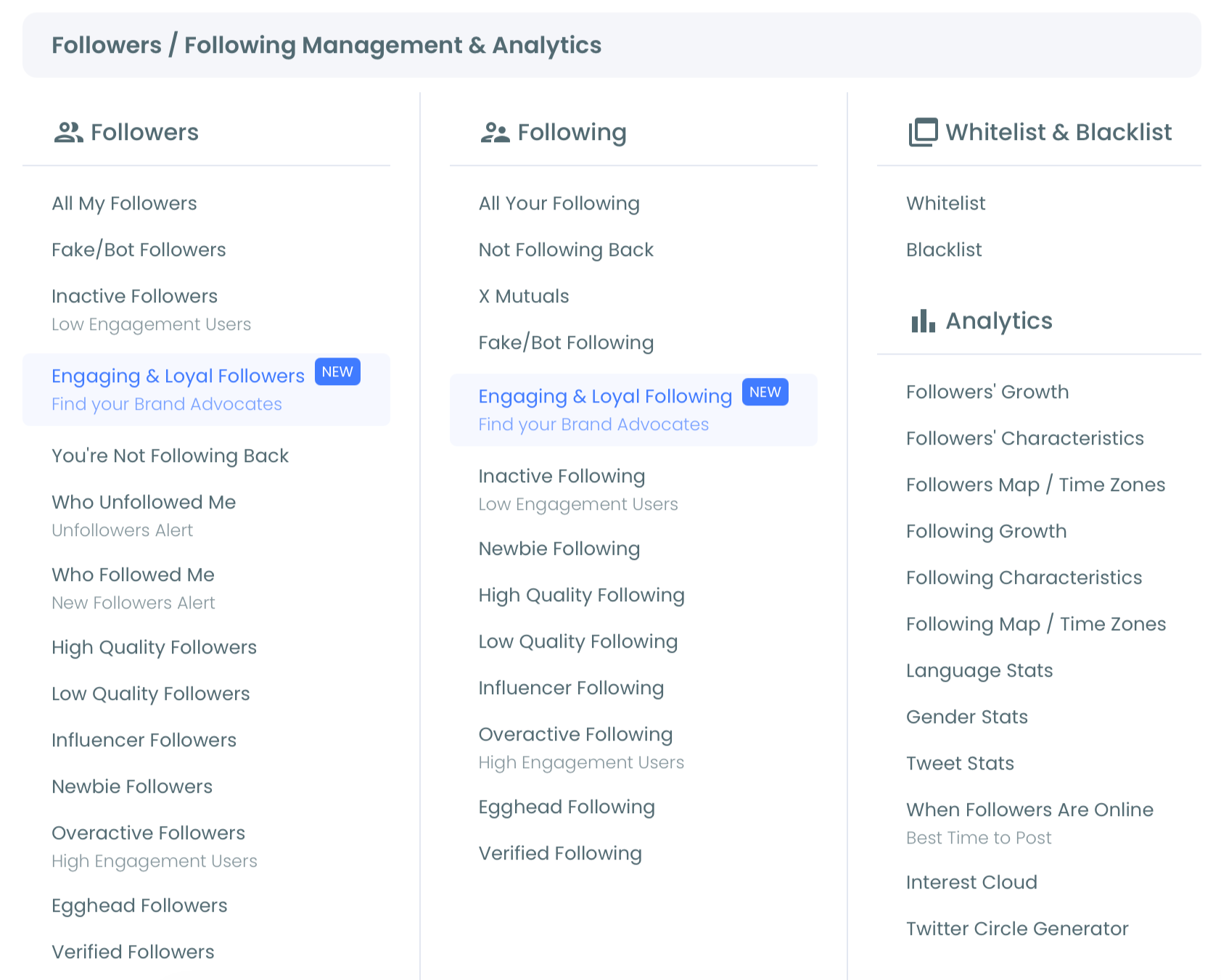
- Select Followers Map & Time Zones under the Analytics section. Circleboom loads the country-level distribution and the time-zone heatmap for your follower base.
- Review the top 5 countries, the top 3 time zones, and any unexpected geographic clusters. Export the map as PNG or PDF if you want a record for reporting. The three takeaways (posting times, localization opportunities, expansion markets) come from reading the distribution.
That sequence is what makes the workflow useful. Login earns official Enterprise API access first, the menu navigation gets you to the analytics surface, the map reveals geographic distribution and time zones, and the export option preserves the audit for cross-team sharing. You can pull your follower-location map in 5 minutes and convert it into three operational decisions in the next 15.
What Changes When You Schedule Against Geographic Reality
Three changes typically show up within 30 days of switching from generic-timing scheduling to geo-aware scheduling.
Engagement rate rises measurably. Posting into multiple time-zone peaks instead of a single window catches audience clusters you were previously missing. The first-sample engagement signal on each cluster's tweet is stronger because it's hitting active audience instead of sleeping audience. Most accounts see a meaningful relative improvement in engagement rate within a month of geo-aware scheduling.
Audience analytics become legible. The follower-stats view inside Circleboom (which is what the broader Twitter analytics tools landscape competes against) starts producing distributions that make decisions easier rather than just describing what already exists. Once you know your audience is 30% European, the right LinkedIn, Bluesky, and Instagram strategies for that audience cohort become legible too. The cross-platform consistency between the Twitter Followers and Friends Map and your other-platform demographics is usually high, but worth confirming per platform.
Expansion opportunities surface. The map almost always reveals at least one "ghost geography": a country or region where you have unexpected follower density given you've done nothing to target it. These are the easiest growth opportunities because the audience already exists; you just need to acknowledge them with timing and content. Most accounts find one to three ghost geographies on their first audit, and acting on them produces visible growth in the first quarter after the audit.
The Bottom Line
Your Twitter followers by location is not trivia; it's the audience data that drives posting timing, content localization, and expansion strategy. X's native analytics don't surface this view cleanly because the per-country distribution and time-zone density are operational data, not engagement data.
Circleboom's Twitter Followers & Friends Map produces both views through authorized X Enterprise API access in 5 minutes. The three operational decisions (timing, localization, expansion) follow from the audit; the audit doesn't need to be repeated more than quarterly for most accounts.
Stop guessing where your audience lives. Pull the map, identify the three takeaways, and adjust your calendar accordingly.
One last refinement worth naming: the geographic audit should pair with your engagement-rate dashboard. The two together tell you not just where your audience is but where the engagement is actually landing. Most accounts find that the geographic distribution and the engagement distribution don't perfectly overlap, which surfaces both expansion opportunities (high-audience-share, low-engagement clusters) and retention opportunities (low-audience-share, high-engagement clusters worth doubling down on).
→ Map your Twitter followers by location
Frequently Asked Questions
What if many of my followers haven't filled in their location?
Followers without a location field are excluded from the map, but the visible sample is usually large enough to produce a clear distribution for any account with more than 500 active followers. For very small accounts, the sample may be noisy; for accounts above 2,000 followers, the patterns are usually clean.
How accurate is the geographic data?
The data comes from each follower's self-reported profile location field, which is accurate for the followers who fill it in honestly. Some accounts use placeholder text ("Earth," "everywhere," etc.) which the system excludes from the country-level rollup. The aggregate distribution across the sample is typically representative of the actual follower base.
Can I export the map for reports or social sharing?
Yes. Circleboom supports PNG, JPG, and PDF export of the map view, which makes it easy to drop into a deck, a quarterly report, or a social-media share. The export preserves the country labels and the time-zone overlay.
How does this differ from X's native location analytics?
X's native dashboard, where available, shows aggregate country counts in a list view, often gated behind X Premium. Circleboom's view adds a geographic map, time-zone density overlay, and exportable graphics, and works without an X Premium subscription. The underlying data source is the same X API; the visualization and accessibility differ.
How often should I re-run the geographic audit?
Quarterly for most accounts. Geographic distribution shifts slowly; major changes usually happen only after viral moments that pull in a new follower cohort or after deliberate market-expansion campaigns. Re-running quarterly catches the gradual shifts without burning time on overly-frequent audits.