People file follower location under "nice to know," a vanity stat next to a pin on a map. That is a mistake. Where your followers live is the most actionable audience data you have, because it directly controls the one lever that decides whether anyone sees your posts: timing. Seeing your Twitter followers by country on a location map is not a novelty; it is how you stop wasting half your reach.
Vanity read: a colorful map you glance at once. Actionable read: Circleboom shows your Twitter followers by country and time zone on X, so you post when your audience is awake.
→ map your Twitter followers by country
Location is not a decoration. It is a schedule.
Location Isn't a Vanity Stat, It's a Schedule
The reason follower location gets dismissed is that people stop at the map. A picture of bubbles on a globe does feel like a vanity graphic if you never act on it. But the map is just the visible layer; the value sits in the time-zone data underneath.
Reframe location as timing and it becomes the most practical stat you own. Every follower lives on a clock, and the distribution of those clocks decides when a post has its best shot at being seen. That is not decoration; that is your posting schedule, hiding in plain sight.
Once you see location as a schedule rather than a souvenir, ignoring it stops making sense. You would not skip checking when your audience is online any more than a shop would ignore its opening hours.
Why Timing Beats Almost Everything
Here is the uncomfortable math. A great post that lands while your audience sleeps reaches fewer people than a mediocre post that lands when they are awake, because few users scroll back hours to find what they missed. Timing gates reach before content quality even enters the picture.
That makes follower location uniquely high-value. You can spend weeks improving your writing for marginal gains, or you can move your posting time to match your audience's clock and lift reach immediately. The location map is what tells you where to move it.
This is why timing is the rare optimization that pays off the same day you make it. Better writing compounds slowly; a better posting time works on your very next post. For an audience spread across continents, that single adjustment can do more for your reach than a month of content tweaks, and it costs nothing but a glance at a chart.
And the bigger your audience, the more this matters, because a global following means a real share is always asleep when you post. X is a worldwide platform, and aligning even your own country settings to your reality is part of taking that global spread seriously.
What the Map Actually Tells You
A follower location map answers three questions a follower count cannot. Where is your audience concentrated, so you know your primary market. How spread out is it, so you know whether to post once or twice. And which time zones dominate, so you know exactly when to publish.
The interactive map handles the first two: bubbles sized by region, zoomable, switchable between flat and globe views. The time-zone pie chart handles the third, which is the one that rewrites your schedule. Two distant countries can share a clock, so the time-zone view often gives a sharper answer than geography alone.
How to See Your Twitter Followers by Country
Turning the idea into a usable view takes four steps. The flow runs from login to a readable map.
- Log in to Circleboom Twitter and connect your X account with secure OAuth.
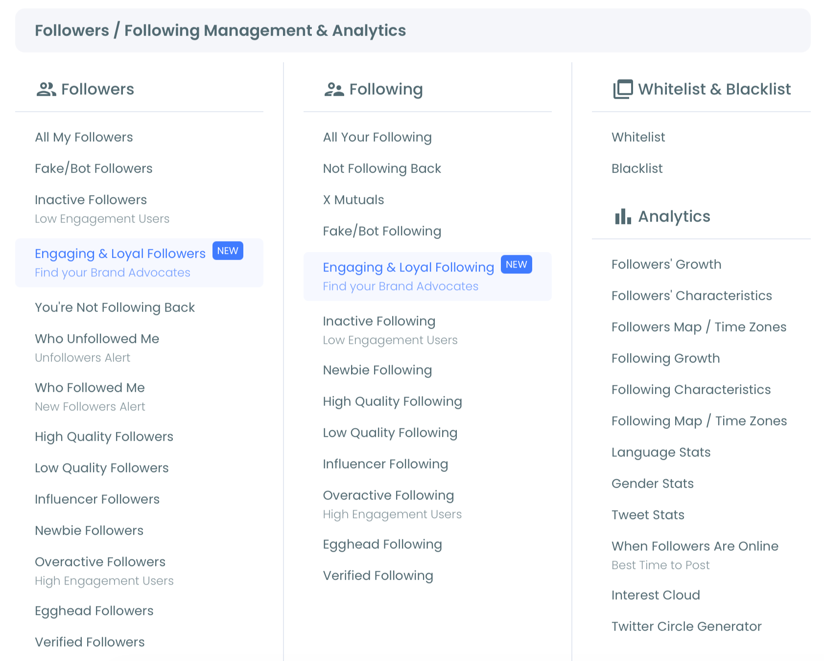
- Open the Follower and Following menu and open the Followers Map and Time Zones view.
- Read the map for clusters, then the time-zone chart for posting windows.
- Export or share the result, and reschedule your key posts to match.
The step people skip is the last one. Seeing the map feels like the work, but the work is acting on it, moving your posting times to where the time-zone chart points.
Watch how follower demographics and location sharpen your audience picture:
Read-Only, So Looking Costs Nothing
There is no risk in checking. Circleboom is an official X Enterprise Developer company, and the map is read-only, reading only the public location data your followers already share. Plotting it changes nothing on your account.
So the cost of finding out where your audience lives is two minutes and zero downside. The only action that follows is yours: deciding when to post based on what the map reveals, which is exactly the kind of low-risk, high-payoff move worth making.
The Map Reveals Opportunities, Not Just Constraints
It is easy to read the map defensively, as a list of audiences you are mistiming. Read it the other way and it is a map of opportunities. A strong secondary cluster is an audience you are already reaching by accident and could grow on purpose.
Many accounts discover a real following in a country they never targeted, which can reshape content, timing, and even partnerships. The deeper walkthrough in mapping your Twitter followers shows how to read those clusters, and pairing the map with a tweet mapper or a network map adds depth. To act on timing, determining your best time to post and the case in best time to tweet and why turn zones into slots, while identifying your followers' languages handles the content side.
What to Do With Your Map
Your next move depends on what the map shows:
- If your audience is concentrated in one region, pick its prime window and post there consistently.
- If it spans two distant clusters, post important content twice to catch both hemispheres.
- If it is truly global with no dominant cluster, write more universally and aim for broad waking hours.
Whichever you find, the principle holds: location is a schedule, not a souvenir. Reading it is the highest-payoff two minutes you can spend on your reach.
→ Turn your follower map into a schedule
Common Questions About Follower Location
Is follower location really actionable, or just interesting?
Highly actionable. The time-zone breakdown tells you exactly when most of your audience is awake, which is the single biggest controllable factor in how many people see a post. Treated that way, location is a scheduling tool, not a curiosity.
What if my audience is spread across many countries?
Then the time-zone view matters even more. A scattered audience means someone is always asleep when you post, so you use the chart to find the window that catches the largest share, and post important content twice when two big clusters sit far apart.
Does the map use private location data?
No. It reads only the public location field that followers choose to fill in, through sanctioned access. Nothing private is involved, and plotting the data changes nothing on your account, so checking your map carries no risk.
How is this better than a generic best-time-to-post chart?
A generic chart averages everyone; your map reflects your actual audience. Best-time charts can be wildly wrong if your followers cluster differently from the average, so reading your own time-zone distribution gives you a posting window built for your people, not a global mean.
Can the map help me grow in a new region?
Yes. Seeing where you already have an unexpected cluster shows you where deliberate growth is easiest, since you have a foothold there. You can then time content and outreach for that region instead of hoping to expand into it blind. Growing where you already have traction is almost always faster than starting from zero in a region the map shows you have never reached.