

You post into a feed that spans the globe, but you probably have no idea where your audience actually lives. A third could be in another hemisphere, asleep while you tweet your best material. To see which countries your Twitter followers are from, you need a location map that reads every follower's region and plots it, instead of guessing from the handful of profiles you happen to recognize.
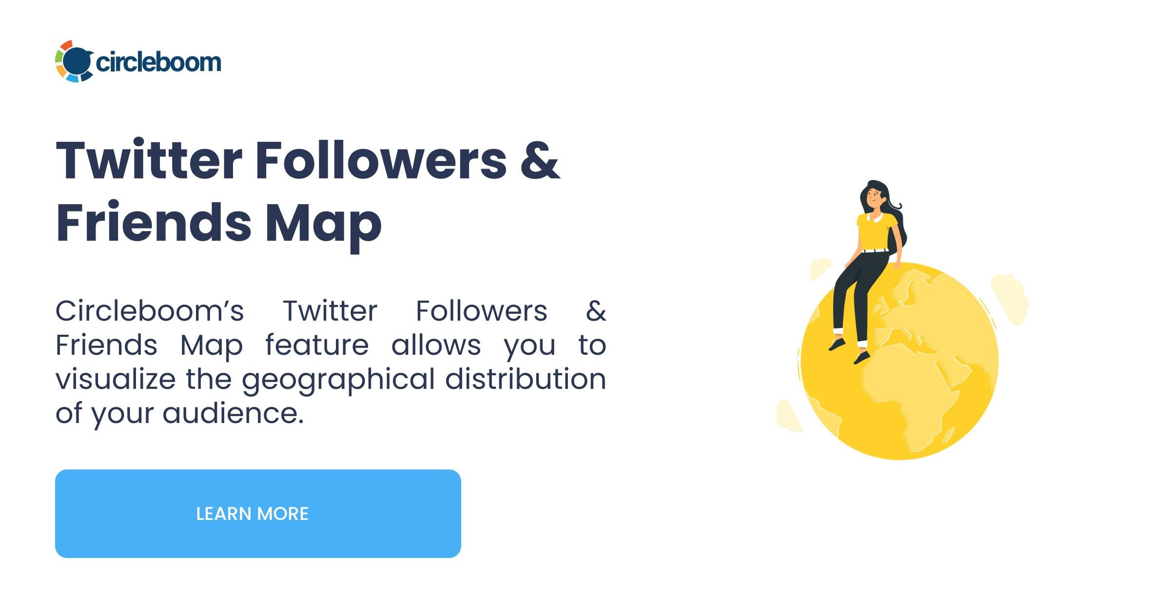
Circleboom maps your Twitter followers by country on an interactive world map and breaks them down by time zone on X, so you can see exactly where your audience lives and when it is online....
→ map your Twitter followers by country
Below: what the map shows, and how to turn geography into better timing.
What a Follower Location Map Shows You
A follower location map turns a scattered audience into a clear picture. Circleboom reads the location field on each of your followers' profiles, resolves it to a region, and plots the whole audience as bubbles on an interactive world map. Bigger bubbles mean more followers in that place, so your audience's geographic center jumps out at a glance.
Alongside the map sits a time-zone breakdown, shown as a pie chart of where your followers fall across the world's clocks. That second view is often the more useful one, because it answers the question that actually changes your posting: when is my audience awake.
Together, the two views replace assumption with data. Instead of guessing that your audience mirrors your own location, you see the real spread, which is frequently more international than people expect.
Why Knowing Follower Location Matters
Location is not a vanity stat; it drives timing, language, and strategy. The single biggest lever is posting time. If a large share of your audience sits eight time zones away, your carefully crafted morning thread lands in their middle of the night, and reach suffers for reasons that have nothing to do with the content.
It also shapes language and relevance. An audience concentrated in one region rewards local references and the local language; a globally spread one rewards clearer, less region-specific writing. And for anyone running campaigns, knowing where followers cluster is the difference between targeting broadly and targeting where your people actually are.
X itself is a deeply global platform, with large user bases concentrated in particular countries, as data from DataReportal's X stats shows. Your slice of that global audience has its own shape, and the map is how you finally see it.
Why X Won't Show You This
X gives you a follower count and a list of names, but no geographic breakdown. There is no native map, no time-zone chart, no way to see what percentage of your audience sits in which region. The location data exists on individual profiles, but the platform never aggregates it for you.
Trying to assemble that picture by hand is hopeless. You would have to open every follower's profile, read the location field, and tally the regions yourself, which is not realistic past a few dozen accounts. The information is public and scattered; the missing piece is a tool that collects it.
That is exactly the gap a follower map closes. It reads what is already public across your whole audience and turns it into a single, legible view.
How Circleboom Maps Your Followers
Circleboom is an official X Enterprise Developer company, so it reads your followers' public location data through sanctioned access rather than scraping. Your account stays safe, and the map is built from complete, authorized profile data instead of a partial sample.
From there, the tool does the aggregation. It extracts each follower's location, resolves it to a geographic region, estimates the time zone, and renders two views: an interactive map with orange bubbles you can zoom and switch between flat and globe modes, and a time-zone pie chart. You can export the location data or share the visualization straight to X.
Watch how the followers map plots your audience's geography:
How to See Which Countries Your Twitter Followers Are From
The whole process takes a couple of minutes. Follow the steps in order.
- Log in to Circleboom Twitter and connect your X account with secure OAuth.
- Open the Follower and Following management and analytics menu to reach the audience tools.
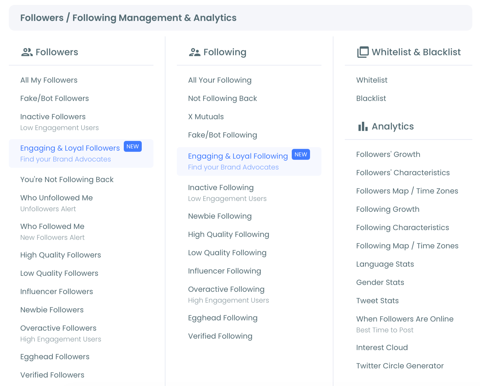
- Open the Followers Map and Time Zones view to plot your audience by region.
- Switch between the map and time-zone tabs, then export or share the result.
Because the map is built from live profile data, re-running it as your audience grows shows how your geographic center shifts, which is useful before you plan a campaign aimed at a particular region.
Turn Geography Into Better Timing
A map is only useful if it changes when and how you post. The first move is timing: read the time-zone chart, find the hours when the largest share of your audience is awake, and schedule your most important posts there. A globally spread audience often has two good windows, not one.
Pair the map with your other timing tools to sharpen it further. The location view tells you the time zones; finding when your followers are online and determining your best time to post on Twitter turn those zones into specific posting slots. The case for timing is laid out in best time to tweet and why.
Geography also informs content. If the map shows a large non-English-speaking segment, identifying the most common languages among your followers tells you how to reach them, and a follower demographics view adds the who to the where.
Read the Map Beyond the Biggest Bubble
The largest cluster is obvious, but the real strategy lives in the rest of the map. A strong secondary cluster in another region is an opportunity, an audience you are reaching almost by accident that you could serve deliberately with the right timing and references.
Watch for surprises, too. Many accounts discover a meaningful following in a country they never targeted, which can reshape everything from posting times to partnership ideas. A scattered map with no dominant cluster tells its own story: a truly global audience that rewards universal content over local. The deeper walkthrough in mapping your Twitter followers and the best way to view follower location helps you read each pattern.
The Bottom Line
Your audience is more spread out than you think, and X gives you no way to see it. A follower location map plots every region and time zone in one view, so you can stop guessing where your people are and start posting when they are actually awake.
Map your followers, read the time zones, and let geography guide your timing.
→ See where your Twitter followers live
Questions Readers Ask
Where does the map get follower location data?
From the public location field on each follower's profile. Circleboom reads that field through sanctioned access, resolves it to a region, and plots it, so the map reflects what your followers have chosen to share publicly about where they are.
What if many followers leave their location blank?
The map plots the followers who do share a location, which is usually enough to reveal the overall shape of your audience. A large sample still shows clear regional clusters and time-zone concentrations, even when some profiles leave the field empty.
How is the time-zone view different from the map?
The map shows where your followers are geographically; the time-zone chart groups them by clock, which is what you actually need for scheduling. Two regions can share a time zone, so the time-zone view is often more directly useful for deciding when to post.
Can I use this to schedule posts at better times?
Yes. Once you know which time zones hold most of your audience, you can schedule your key posts for when that segment is awake. Pairing the map with a best-time-to-post tool turns the geography into specific, high-reach posting slots.
