
Twitter follow analytics is really three separate questions wearing one name: how the count moved, who your followers are, and what your own following list looks like. Circleboom tracks follower count as a dated time series, classifies both lists by quality and activity, and delivers all three through official X Enterprise APIs.
→ track your Twitter follow analytics
The one people skip is the third, and it is the one that shapes what they see every day.
Most people mean "did my follower count go up" and stop there. That number answers less than almost anyone assumes.
Why the count on its own is nearly useless
A follower count is a cumulative total of everyone who ever pressed follow and has not pressed unfollow. It conflates several things that need separating.
It hides churn completely. An account that gained 200 and lost 190 in a month shows the same net movement as one that gained 10 and lost nothing, and those are entirely different situations with different causes.
It hides composition. Ten thousand followers where four thousand are dormant or inauthentic is a different account from ten thousand active ones, and the number is identical.
And it hides timing. A count tells you where you are, never when the movement happened, which means it cannot be connected to anything you did.
A follower count is a running total. Almost every useful question is about the rate, the mix, or the date.
The analytics that matter are the ones that break the total back apart into those three dimensions.
That is the practical reason to run X follower growth analytics rather than checking the profile number. Same underlying data, separated into questions you can answer.
The export route matters once you want the numbers outside the dashboard, and how to export Twitter analytics covers getting them into a spreadsheet.
For the account-level summary sitting above all three views, Circleboom's Twitter account analysis collects them in one place.
For a broad survey of what the category covers, best Twitter analytics tools maps the landscape.
View one: growth as a time series
The first view records your follower count at regular intervals and stores each reading with a date, which turns a number into a trend with daily net change attached.
That structure is what makes causal investigation possible. A spike on a particular date can be checked against what you posted that day, who mentioned you, or what happened externally. A sustained decline over several weeks can be checked against a change in posting frequency, a shift in topic, or a platform-wide cleanup.
Without dates, none of that is available. You know the count is different and have no way to find out why.
The second use is benchmarking. Before a campaign, the existing trend establishes a baseline. Afterwards, the difference against that baseline, accounting for normal churn, is the campaign's actual contribution rather than its apparent one.
One constraint worth knowing before you start: the time series begins when the account is connected. Follower counts from before that date are not retroactively available, because nobody was recording them.
That has a practical implication people discover too late. The best time to start tracking is well before you need the data, since a baseline cannot be created after the fact.
The growth-focused version of this is covered in how can I get more followers with Twitter analytics.
View two: who your followers actually are
The second view classifies your follower list rather than counting it, grouping accounts by activity level and quality signals.
What the breakdown surfaces is the gap between nominal and effective audience. Dormant accounts sit in your total while seeing nothing. Inauthentic accounts sit there while contributing nothing. Both inflate the denominator of every engagement rate you calculate.
The categories worth reading:
- Active accounts that post and engage, which is your real reachable audience.
- Inactive accounts that stopped using the platform entirely.
- Fake or spam signals, flagged on combined rather than single indicators.
- Verified and high-reach accounts, which are a small group with disproportionate value.
Reading the proportions matters more than reading any single number. An account where active followers are 40 percent of the list behaves very differently from one at 80, even with identical totals, and the same posting strategy produces different results on each.
This view also sets the baseline for cleanup. Knowing the fake proportion before a removal pass is what lets you measure whether the pass achieved anything.
The wider read is covered in Twitter scarecrows, the silent engagement killers.
View three: the list you built yourself
The third view is the one almost nobody runs, and it is the one with the most immediate effect on your daily experience.
Your following list is a set of choices you made. Its composition tells you something different from your follower composition: not what you attracted, but what you chose, which is a measure of how deliberately you built your own network.
A following list heavy with inactive accounts means you are following people who stopped posting, which quietly degrades your feed without ever announcing itself. You see less because a share of your follows produce nothing.
It also carries a public signal. The ratio between following and follower counts is one of the first things a visitor registers, and an account following fifteen thousand people reads differently from one following three hundred regardless of what either posts.
The same classification applies in both directions, so you can see what proportion of your following list is active, inactive, fake, or high quality, and use that as the diagnostic before any cleanup.
Your follower list is what you attracted. Your following list is what you chose, and it decides what you read.
How to check your Twitter follow analytics
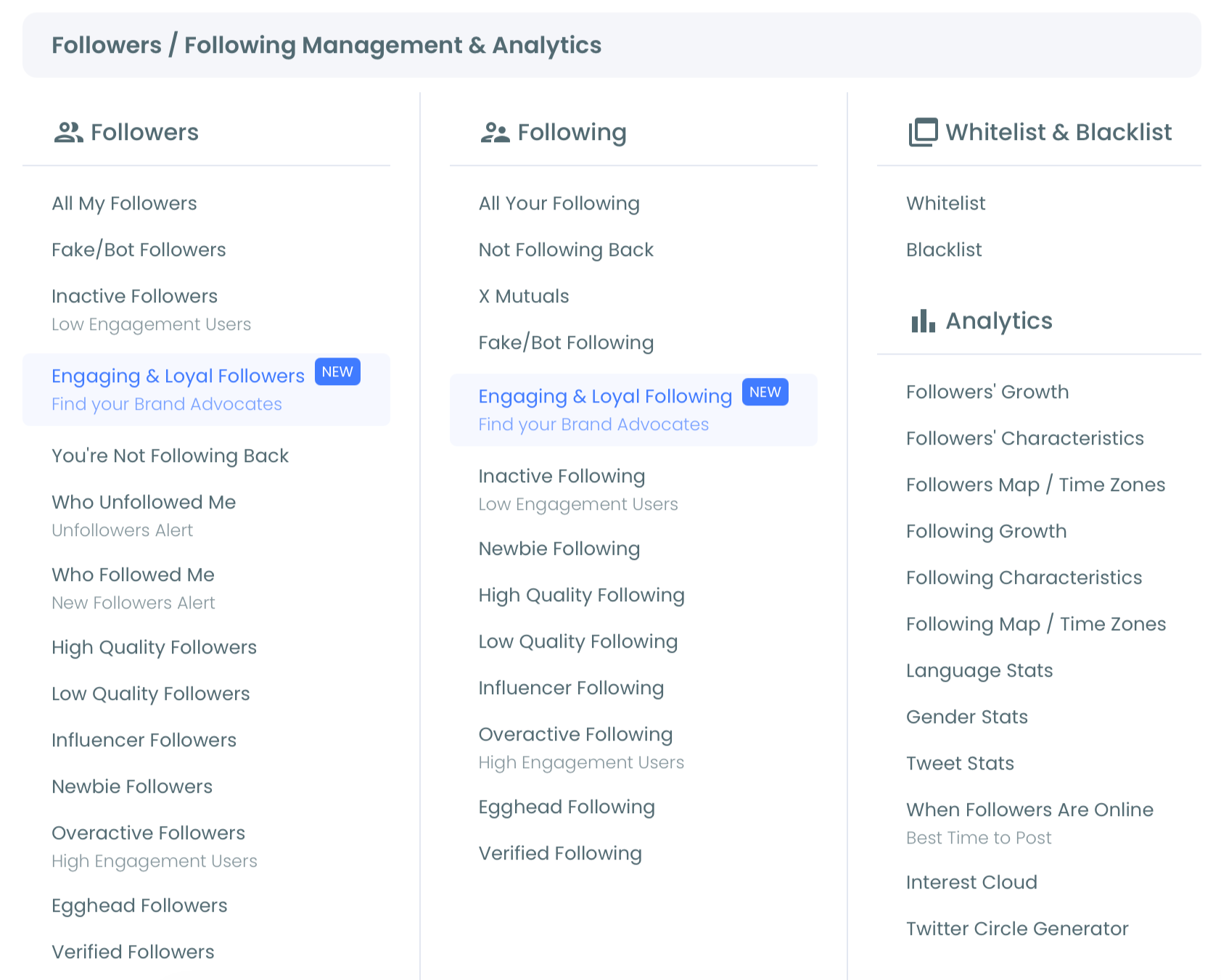
To check your Twitter follow analytics, connect the account in Circleboom, open the analytics views under the Follower and Following menu, and read the growth chart, the follower breakdown, and the following breakdown in that order. Growth tells you what moved, the breakdowns tell you what it was made of.
Five actions, moving from the trend to its composition.
Connect and read the trend
- Log in to Circleboom Twitter and connect the X account you want tracked. The time series starts from this moment.

- Open the Follower and Following menu and select the growth view to see the count plotted over time with daily net change.
- Mark the dates where the line moves sharply and check what you published or what happened around each one.
Break the number apart
- Open the follower characteristics breakdown and record the active, inactive, and flagged proportions. The active share is your effective audience size.
- Run the same breakdown on your following list and compare. A following list in worse condition than your follower list explains a feed that feels empty.
That order works because each step explains the one before it. The trend tells you something changed, the follower breakdown tells you what kind of accounts arrived, and the following breakdown tells you whether your own choices are shaping what you see.
At a glance: trend for when, follower mix for what you attracted, following mix for what you chose.
Watch the trend view: how a follower count becomes a dated series with daily change rather than a single number.
→ open your X follower growth stats
Churn is the number the count conceals
Net change is the difference between two numbers you cannot see, and the hidden pair is usually more informative than the result.
An account that gains 200 and loses 190 nets ten. So does an account that gains twelve and loses two. Identical on the chart, completely different underneath, and they call for opposite responses.
High gross movement with low net movement means you are attracting people and then losing them. Something is working at the top of the funnel and failing shortly afterwards, which is a retention problem rather than a reach problem, and posting more will make it worse rather than better.
Low gross movement in both directions means stability, which is fine but also means nothing new is happening. Growth here requires reaching people you are not currently reaching, which is the opposite prescription.
Where unfollows actually come from
Three causes account for most of it, and they are worth distinguishing because only one is a problem.
- Natural decay, as people leave the platform or prune their own lists.
- Topic drift, when an account changes what it posts about and loses the audience attracted by the old subject.
- Frequency shock, where a sudden increase in posting volume reads as noise.
The second is the one people misdiagnose most often. Losing followers after a genuine change of direction is not a failure, it is the old audience correctly recognizing that you are now doing something else. The right response is usually to continue rather than to revert.
Frequency shock is the most fixable. A jump from two posts a day to fifteen produces unfollows almost immediately, and the cure is simply to moderate rather than to change anything about the content itself.
Watching the two directions separately is what makes any of this visible. A single net line averages away the entire diagnosis.
Net change tells you the score. Gross movement tells you the game.
The churn side has its own tooling, and how to mass unfollow Twitter accounts covers managing your own list rather than watching theirs.
Reading movement without inventing causes
The failure mode with a growth chart is over-explaining it, and it is very easy to fall into.
Follower movement is noisy. A day down 12 and a day up 30 are both ordinary variance on most accounts, and building a theory around either one produces a change made for no reason.
What is worth investigating is a sharp departure from your own baseline, which means you need the baseline first. A useful rule is that a day has to break your normal range substantially before it deserves an explanation.
Three patterns that genuinely mean something:
- A sharp spike, usually traceable to one post or one mention.
- A sustained multi-week decline, which points at something structural rather than incidental.
- A large gain with poor quality signals, which is a bot campaign rather than success.
That third case is worth catching early, because the count moves in the direction everyone wants while the audience gets worse. Cross-checking a growth spike against the follower quality breakdown is what separates the two, and it takes about thirty seconds.
Circleboom is an official X Enterprise Developer company, so both the counts and the classifications come through authorized API access rather than estimation.
For the comparative angle, Twitter analytics for another account covers running this read on someone else.
Start the series before you need it
Twitter follow analytics is three views, and the count most people check is the least informative of them. The trend tells you when things changed, the follower breakdown tells you what your number is actually made of, and the following breakdown explains the feed you look at every day.
The one thing that cannot be done retroactively is the time series. Connect the account now, even if you have no intention of looking at the chart for months, because the baseline only exists going forward.
→ start tracking follower growth on X
Questions about Twitter follow analytics
Can I see follower history from before I started tracking?
No. The time series begins at account connection, since the counts are recorded going forward rather than reconstructed from platform history.
What is the difference between follower growth and follower quality?
Growth is the count over time. Quality is what the count is made of, and a rising count with falling quality is a common and misleading combination.
Why analyze my own following list?
Because it shapes your feed and your public ratio. A following list full of inactive accounts produces a feed with less in it and a signal you did not intend.
How much daily movement is normal?
Enough that most single-day changes mean nothing. Establish your own baseline range first, then investigate only the days that clearly break it.
Does a follower spike always mean success?
No. Check the spike against your quality breakdown, since a burst of inauthentic follows looks identical to real growth on the count alone.