

Twitter video watch rate is the percentage of viewers who continue watching past specific milestones in a video, typically tracked at the 25%, 50%, 75%, and 100% marks. The total view count tells you how many people started watching; the watch rate tells you how many kept watching.
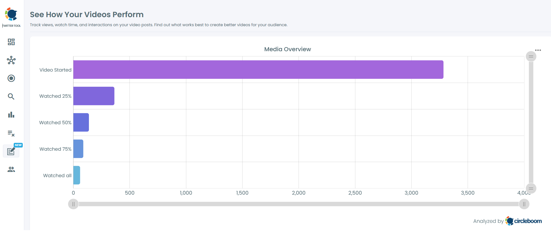
Circleboom Twitter's Video Analytics feature measures these milestones for each of your video tweets and visualizes the drop-off as a horizontal bar chart, exposing where viewers lose interest. The full measurement runs through authorized X Enterprise API access and works on standard accounts without X Premium.
Twitter video watch rate is measured at five stages: video started, 25%, 50%, 75%, and 100% completion. Circleboom Twitter's Video Analytics extracts these retention percentages from your video tweets and displays them as a horizontal bar chart, making drop-off points visible at a glance. The metric is the upstream signal of video engagement quality, not the raw view count.
→ Measure my Twitter video watch rate
The rest of this guide explains why watch rate matters more than total views, how the retention milestones work, and how to read drop-off patterns.
Why View Counts Tell You Almost Nothing About Video Performance
A Twitter video with 50,000 views looks impressive in absolute terms and tells you almost nothing about whether the video actually worked. View counts on Twitter trigger at low play thresholds (a fraction of a second of autoplay is enough), which means most "views" are not engaged viewing.
The video could have 50,000 views and a 4% completion rate, which means 48,000 of those viewers tapped through within the first second or two without absorbing any of the content.
Watch rate splits the view count into stages that actually represent engagement. The video-started count is the baseline. The 25% mark is the first real engagement signal: viewers who watched 25% have given the video a meaningful chance. The 50% mark indicates moderate engagement. The 75% mark indicates strong engagement. The 100% mark indicates full completion, which is the highest-quality engagement signal a short-form video can produce.
The shape of the drop-off across these stages is more informative than any single number. A video that drops from 100% (started) to 40% (25%) has a hook problem; viewers are leaving in the first quarter, which is when the hook is supposed to be working.
A video that holds 60% to the 75% mark and drops to 30% at completion has a closing problem; the conclusion isn't earning the final commitment from viewers who stayed engaged through most of the content. Anyone asking how to get more impressions on Twitter videos is often actually asking a watch-rate question; impressions follow retention because Twitter's algorithm weights engaged viewing.

What the Five Retention Stages Actually Measure
Each retention stage corresponds to a specific viewer behavior pattern.
Video Started counts every viewer who triggered the video play threshold. On Twitter, autoplay means this number is often inflated relative to genuine engagement; many "starts" are passive scrolls past the video, not deliberate plays. This is the baseline against which the other stages are normalized.
25% Watched is the first quality filter. To reach this stage, the viewer either stopped on the video deliberately or stayed long enough that the platform registered sustained attention. The Started-to-25% drop-off rate measures hook effectiveness; videos with strong opening seconds preserve more of the Started cohort into the 25% bucket.
50% Watched indicates the viewer is genuinely watching, not just paused on the post. Most viewers who reach 50% will continue to 75% unless the video has a clear mid-point weakness (a slow stretch, a transition that confuses the narrative). The 25%-to-50% drop-off measures the content's ability to hold attention past the initial hook.
75% Watched indicates the viewer is committed and will likely finish unless the video is significantly longer than expected or develops a closing weakness. The 50%-to-75% drop-off is typically small for well-paced videos.
100% Watched is full completion. Completion rate is the strongest single-number indicator of video quality and is the metric that most directly correlates with how Twitter's algorithm rewards the video with additional impressions. The 75%-to-100% drop-off measures closing strength. Anyone wondering how to see total impressions on Twitter without X Premium often finds that the upstream lever on impressions is watch rate; the platform decides how much to distribute partly based on retention signals.
Circleboom is listed on X's enterprise customer directory, so the video metrics retrieval runs through authorized Enterprise API access. This is what makes the watch-rate data available without X Premium; the Enterprise API exposes the retention data that the native interface gates behind the paid tier.
Video walkthrough: how to see Twitter analytics, including video watch rate metrics, without X Premium.
How to Measure Twitter Video Watch Rate
Four steps from login to retention chart.
Step-by-step watch rate analysis
- Log in to Circleboom Twitter and authorize with official OAuth.

- Open the X Post Planner menu from the sidebar.
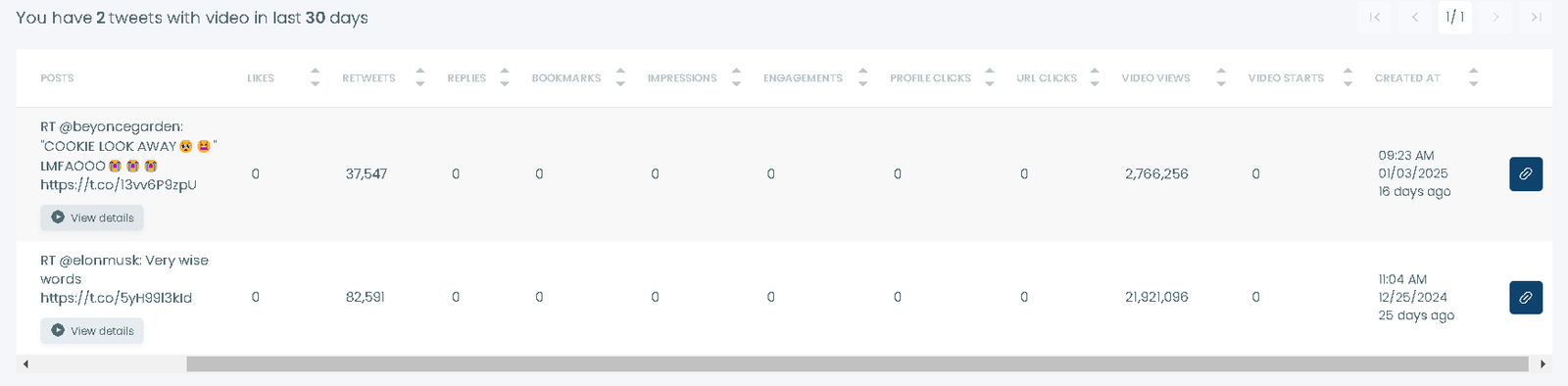
- Navigate to Post Analytics and select Video Analytics. The feature lists your recent video tweets with watch-rate data for each. Click any video to see the horizontal bar chart showing retention at each milestone.
- Compare watch-rate patterns across multiple videos to identify which content types preserve retention best. Cross-reference with timing data from the post analytics overview to see whether watch rate varies by posting time, day of week, or video length.
That sequence is the full operational core. The retention chart is the primary output; the cross-comparison across videos is where strategy decisions get made.
How to Read the Drop-Off Patterns
Four patterns appear most often, and each has a different implication.
Steep early drop-off (Started to 25% loses >70% of the cohort) signals a hook problem. The opening seconds aren't earning the viewer's attention; viewers are bouncing before the content has a chance to engage them. The fix is in the first 1–3 seconds: a stronger visual, a clearer promise of value, or a faster pace.
Mid-video collapse (25% to 50% loses a large cohort) signals a pacing problem. The hook worked, but the middle of the video isn't holding attention. Common causes include slow transitions, low-density information, or content that delivers its main point before the 50% mark and then meanders. Anyone seeing patterns like the impressions drop seen by some accounts sometimes finds that mid-video collapse is upstream of the impression decline; the platform sees the retention pattern and reduces distribution.
Strong middle, weak close (75% to 100% loses a large cohort) signals a closing problem. Viewers were engaged through most of the video but bailed before the end. The fix is usually a tighter conclusion, an earlier payoff, or an explicit close that signals "the video ends here" so viewers commit to the final seconds.
Flat strong retention (high percentages across all stages) signals a video that's working. Replicate the structure, study what made it work, and build a template. Whether this kind of retention is driven by an organic reach reduction or a structural shift in platform distribution, strong retention is what reliably earns distribution back.
The patterns aren't mutually exclusive; some videos have both early and late drop-offs, which usually means structural rework rather than a single fix. Reading the chart deliberately, not just glancing at the completion number, is what turns Video Analytics from a metric tool into a content improvement tool.
The Bottom Line
Twitter video watch rate is the metric that separates videos that look like they performed from videos that actually performed. Total view counts are inflated by autoplay and tell you almost nothing about engagement quality. The retention milestones (25%, 50%, 75%, 100%) reveal where viewers drop off and what part of the video needs work. Circleboom's Video Analytics surfaces all five stages in a visual format that takes seconds to read, available without X Premium.
Stop optimizing for view counts that don't correlate with engagement quality. Measure watch rate on every video you publish, identify the drop-off patterns, and iterate on the part of the video the data points to. Retention is the upstream lever; impressions and reach follow downstream.
→ Analyze Twitter video completion rates now
Frequently Asked Questions
Why do view counts on Twitter look so high if watch rate is the real metric?
Twitter triggers a view at a very low play threshold, so most views are not engaged viewing. Watch rate splits the view count into stages that reflect actual engagement. A video with high views and low watch rate is technically being shown to many people but isn't holding any of them; that's a content problem masquerading as a distribution win.
Do I need X Premium to see retention data?
No. Circleboom Video Analytics provides the watch-rate breakdown through authorized Enterprise API access, which exposes the retention milestones that the native Twitter interface gates behind X Premium. The data is the same; the access path is different.
How recent does a video need to be for the data to show?
Video Analytics works on videos that are recent enough for the API to expose retention data. Older videos may have incomplete retention data depending on when they were posted. For most actively posted accounts, the recent few months of video content show full retention data.
Can I compare watch rates across multiple videos?
Yes. The feature lists all your video tweets and lets you click into each one for the retention chart. Comparing the charts across videos surfaces patterns (which video lengths perform, which content types hold attention, which days post videos with the best retention) that drive strategy decisions.
Is the watch-rate measurement consistent over time?
The data point can fluctuate as more viewers watch the video, especially in the first few hours. After about 48 hours, the retention numbers stabilize and reflect the video's true performance pattern. For most analysis purposes, waiting 48–72 hours before drawing conclusions is appropriate.


