
Most accounts diagnose weak reach by rewriting. New hooks, a rewritten opening line, a punchier ending. Every one of those experiments changes the draft, and none of them changes the condition the draft was published into.
What determines Twitter feed placement is measured in the first hour a post is live, in front of whoever happened to be there.
Your posts compete for a slot in other people's timelines, and the score X assigns depends heavily on how fast real people react in the first minutes after publication. Circleboom charts the days and hours your own X followers are active, using official X Enterprise API access rather than scraped estimates, so the schedule stops being a guess. The audit below takes about twenty minutes and touches none of your content.
→ when your followers are online
Start with the times you already publish, not with the times you wish worked.
Why do your posts vanish from other people's Twitter feeds?
A post that nobody sees early rarely recovers later. X scores each candidate post against a prediction of how the reader will respond, and the strongest evidence available in the first hour is how the people who already follow you responded.
Thin early reaction reads as a weak candidate. The post gets capped before it ever reaches an out-of-network audience.
That creates a failure mode that looks exactly like a content problem and is not one.
Publishing habits form around the writer's schedule rather than the audience's. You draft when you have a free half hour, and the free half hour becomes the posting slot by accident.
If your followers cluster in a different set of hours, every post starts its life in an empty room. It never earns a place in a Twitter feed beyond the few people scrolling at that moment, and no amount of rewriting changes the arithmetic.
Audience geography makes this worse than it sounds. Pew Research Center's 2025 study of American social media use found daily X use sitting well below platforms like Facebook and YouTube. The active window for any given follower base is therefore narrower than the platform's raw user count implies.
A narrow window is easy to miss entirely.
The diagnostic question is not whether your content is good. It is whether your content has ever been tested in front of an awake audience. If you have never checked your best time to post on Twitter against your own follower data, that test has not run yet.
Reach questions stack on top of each other. Timing and audience composition are two halves of one measurement. That is why how to know if your tweets are reaching the right audience pairs directly with the audit below.
How to audit what determines your Twitter feed timing
Circleboom reads the follower base on your connected X account and builds the activity chart from it, rather than from platform-wide averages.
Every follower's activity pattern feeds an aggregate distribution, rendered as a bubble chart with days of the week on one axis and hours of the day on the other. The area of each bubble tells you what share of your audience was active in that particular slot.
The credential behind that read matters more here than on a lighter report. An audit like this queries the whole follower base, which is exactly the kind of volume that gets unofficial tools throttled or banned, and the account paying that price would be yours.
Circleboom is listed on X's Enterprise customer directory, so the data behind the chart is licensed rather than harvested. Open what determines your Twitter feed's engagement window to begin.
Hands-on demo: how the follower activity chart reads when peak windows sit hours away from an account's habitual posting time.
https://www.youtube.com/watch?v=hEITdKivOf8
The process, in order.
Connect the account and pull your own activity data
- Log in to Circleboom Twitter and authorize the X account whose schedule you want to audit.

- Open the Follower and Following management and analytics menu, which holds every audience-level report for the connected account.
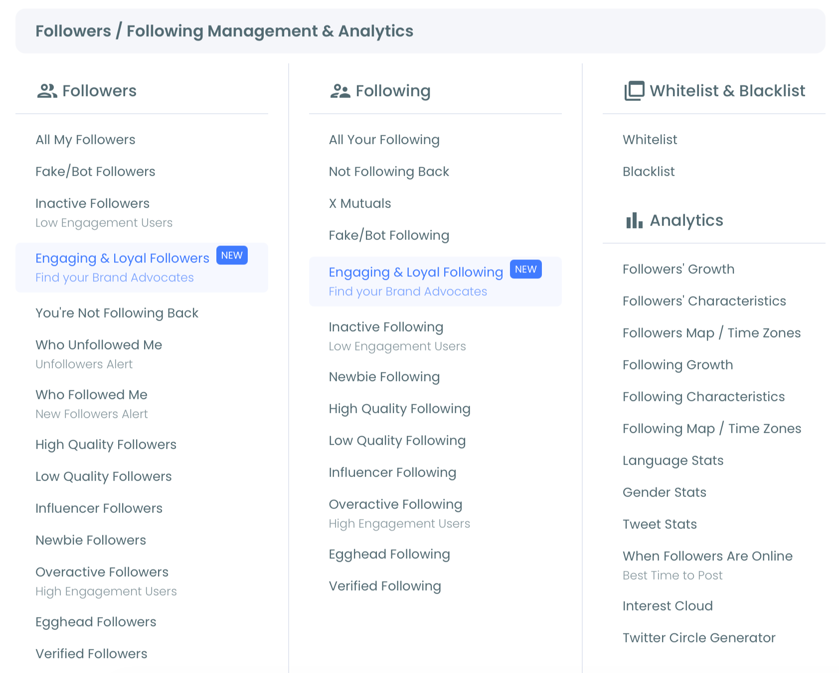
Read the chart against the schedule you already run
- Open When Followers Are Online and study the bubble chart. Scan for the largest bubbles. Large bubbles at the same hour across several days mark a daily peak; large bubbles clustered on one or two days mark a weekly peak.
- List the publish times of your last twenty posts and mark which ones fall inside a peak window. This is the step most people skip, and it is the one that converts the chart from interesting to actionable. If most of your recent posts landed outside every peak, you have found a mechanical problem rather than a creative one.
Move the schedule and keep it current
- Click "Pick All Best Times: Add to My Posting Queue Now!" to move the identified peaks into the queue as live entries, then open the queue and confirm nothing was already booked into those slots.
- Export the chart as a PNG, JPG, or PDF from the three-dot menu and store it with your content calendar, so the next schedule review starts from evidence instead of memory.
The sequence works by retiring one assumption per stage. Connecting first earns audience-specific data instead of an average. The twenty-post comparison tells you whether timing is even your problem, and the export leaves a paper trail your future self can check against a changed audience.
Quick recap:
- Connect the X account with official OAuth.
- Open the follower analytics menu.
- Read the peaks on the bubble chart.
- Compare them against your last twenty publish times.
- Queue the winning slots and export the chart.
Working out your own peak hours is a small enough job that guessing has no upside. How to determine your best time to post on Twitter walks through the reasoning behind those windows in more depth.
What X scores before your post reaches a Twitter feed
Ranking on X is a prediction, not a tally. The model estimates how likely you are to reply, to open the conversation, to stay inside it, or to repost, then orders your Twitter feed by those predictions. X's own documentation on For you home timeline recommendations describes this candidate-and-ranking structure directly.
Conversation-shaped predictions carry the most weight by a wide margin. A reply that the author then engages with counts for far more than a like, and time spent inside a conversation counts for more than a passive scroll past.
Every one of those actions requires a person, awake, with the app open.
That is the connection ranking explainers rarely make explicit. The scoring model is not indifferent to your audience's clock; it is entirely dependent on it.
A post published into a dead hour is not scored harshly, it is scored on a thin sample, and a thin sample almost always loses to a dense one.
The asymmetry runs one way. A dense window cannot make a weak post travel, but a dead window can stop a strong one from ever entering a Twitter feed outside your own following, because the model never collects enough evidence to promote it.
That is why timing is worth auditing before anything else in the pipeline: it is the only step that can silently cancel every step after it.
How to read your X follower activity chart without over-fitting it
Treat the chart as a hypothesis rather than a verdict. Two to four windows beat a single "best hour," because a schedule aimed at one slot serves whichever segment of your audience happens to live there and quietly writes off the rest. Multiple windows spread coverage across the activity curve.
Sample size deserves a look before you commit. A chart drawn from a few hundred engaged followers describes a real pattern; a chart drawn from a few dozen mostly describes three people's habits. The larger and more geographically mixed the base, the flatter and more trustworthy the curve tends to look.
Weekday and weekend behavior often separate too. If your largest bubbles sit Monday to Thursday and the weekend rows go pale, that is a signal about what kind of audience you built, not a gap to fill with more posts. A quiet Saturday row means your Twitter feed placement on Saturday was never going to be strong, whatever you published.
Every window you keep is a window in which your posts can enter somebody's Twitter feed while that person is present to react.
The displayed hours follow the time zone on your Circleboom account, so an account left on a default zone will misread a correct chart. Check that setting before you trust a single bubble.
Then confirm the windows against real performance. Twitter impression analytics tells you whether posts inside the new windows collected more early reach than the ones outside them. That comparison turns the audit into a closed loop rather than a one-time adjustment.
General benchmarks still have a place before your own data accumulates. The best times to post on Twitter baseline is a reasonable placeholder for a brand-new account with too few followers to chart.
Three timing mistakes the audit usually finds
Most accounts that run this audit hit one of three patterns, and each has a different fix.
The writer's clock. The schedule was built around when the person publishing had time, and it never got revisited. This is the most common finding and the easiest to correct, because the content is already fine. Moving the same posts into charted windows is a calendar edit, not a strategy change.
The single-slot stack. Everything fires into the one largest bubble on the chart. Reach improves at first, then plateaus, because the audience segment inside that bubble has already seen everything you publish while the segments outside it have seen none of it. Splitting across two to four windows fixes the ceiling.
The stale chart. The windows were correct at some point and never rechecked. An account that gained followers from a new region, ran a campaign that pulled in a different audience, or cleaned out a large block of inactive accounts is working from a distribution that no longer matches its base. Pulling the chart again is the entire fix.
The stale-chart case is the one that hides longest, because nothing visibly breaks. Reach drifts downward slowly while the schedule sits exactly where a correct analysis once put it.
A chart is a snapshot of the audience you had on the day you pulled it.
What moving your posting times actually fixes
The first change is diagnostic. Before the audit, a flat post is ambiguous by construction: the writing and the hour are tangled together in one number. After it, posting time is a controlled variable, so a flat number points at the writing and nowhere else.
The second is efficiency. Accounts that suspect a reach problem usually respond by posting more, which multiplies effort without touching the underlying issue. Extra posts dropped into quiet hours raise your output and leave your reach untouched. Moving existing posts into active windows costs nothing extra at all.
The third is planning. Once the peak windows are known, the X Post Planner becomes the place the schedule actually lives. Drafts get written in batches and fired into the slots the chart identified, rather than whenever someone remembers to publish.
There is a repetition trap worth naming here. Filling every peak slot with recycled variations of one message costs more than it gains. How often to post duplicate content on social media is a useful check before you commit to filling all four windows every day.
Why timing beats another content rewrite
The most common objection to a timing audit is that it feels too small to matter. Content is the thing you control, content is where the craft lives, and adjusting a schedule sounds like moving deck chairs.
The objection has the causality backwards. Timing does not compete with content quality. It decides how many Twitter feeds the content reaches, and therefore how many people ever get the chance to judge it.
A strong post in a dead hour and a weak post in a dead hour produce similar numbers, which is exactly why reach data is unreadable until the schedule is fixed.
There is also an order-of-operations argument. A rewrite takes hours and produces one more data point in the same broken conditions. The audit takes twenty minutes and repairs the conditions for every post after it, which is why what determines Twitter feed placement is worth settling before the next draft.
Fix the cheap variable first. Then the expensive one becomes measurable.
→ your audience's active hours
What to know before you start
How many followers do I need before the activity chart is useful?
Enough that the distribution is not driven by a handful of accounts, which in practice means a few hundred followers rather than a few dozen. Below that, the chart still renders but reads noisy, and general posting benchmarks are the safer starting point until the base grows.
Will moving my posting times get my account flagged?
No. Scheduling posts at different hours is ordinary publishing behavior, and Circleboom sends them through licensed API access that stays inside X's own limits. Nothing about a schedule change looks unusual to the platform.
How often should I recheck my peak windows?
Recheck after anything that changes who follows you: significant growth, a large audience cleanup, or a campaign that pulled in followers from a new region. What determines your Twitter feed timing is the audience you have now, not the one you charted last year. Activity distributions follow audience composition, so a shift in geography moves the chart even when your posting habits stay identical.
Does this replace looking at my post analytics?
No, it feeds them. The activity chart tells you when to publish; analytics tells you whether publishing there worked. Using one without the other leaves you either guessing at timing or unable to explain the numbers you are looking at.