

Pew Research Center found that 49% of U.S. adults on Twitter average fewer than five tweets a month.
That single number reframes the complaint behind my Twitter account stopped growing: most of the people already following you were never going to appear in your replies, and a plateau can arrive without one person leaving.
A flat follower line is two numbers canceling out, not one number stalling. Before you rewrite your content, find out whether the audience you already have is even on X at the hours you publish. Circleboom reads your own followers' activity patterns through sanctioned X data access and plots the days and hours when most of them are active.
→ see why my Twitter account stopped growing
What follows is the check in order, plus a plain account of what that chart can and cannot tell you.
How to check why my Twitter account stopped growing, step by step
The check runs in three passes, and the order matters.
Connect the account so the timing data comes from your own followers
- Log in to Circleboom Twitter first. Whichever X profile you connect is the one every number below describes, so pick the one that flattened.

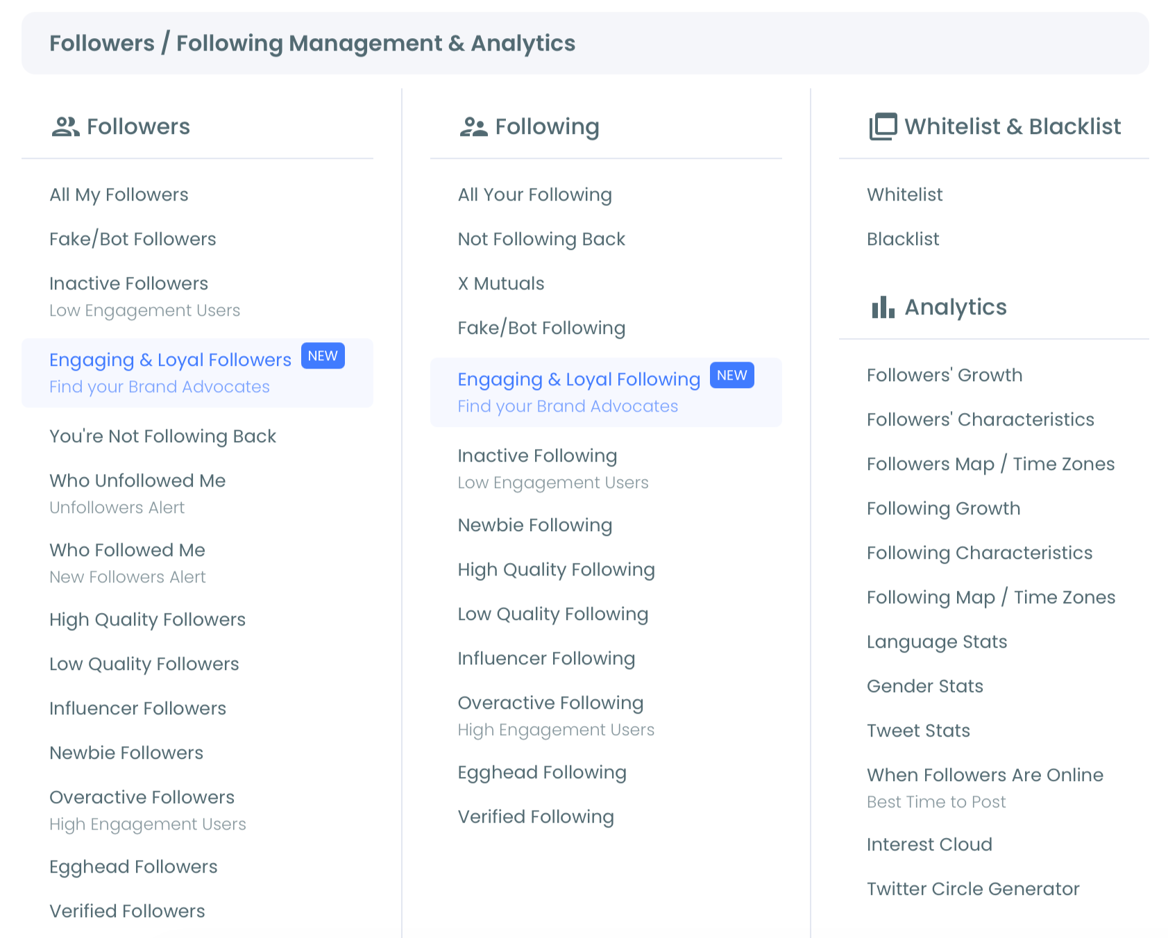
- Select Follower & Following Management and Analytics on the dashboard.
- Select the When Followers Are Online tool and wait for the bubble chart titled "When Followers Are Online: Best Times To Post" to finish loading.
Read the bubble chart as a map of reachable hours
- Scan for the largest bubbles. Days sit on the Y axis, Sunday through Saturday, and hours run along the X axis from 12am to 11pm. Bubble size is the concentration of follower activity in that day and hour.
- Mark two to four windows rather than one. Large bubbles at the same hour across several days point to a daily peak. Large bubbles clustered on one or two days point to a weekly one.
- Confirm the time zone before you trust any single hour. The chart renders in the time zone set on your Circleboom account, so check the offset if your audience mostly sits somewhere else.
Separate the followers you can reach from the ones you only count
- Open the Inactive Followers view in the same menu and read the page title, which reports how many of your followers carry the inactive classification out of your total.
- Export both views before you change anything. The three-dot control in the chart's top right corner exports PNG, JPG or PDF. The Export button on the follower list writes your selected accounts to a CSV, with the remaining export tokens shown on the button itself.
That order holds because each pass narrows the question the next one answers. The connection makes the data yours instead of a platform average, the chart tells you which hours are worth spending, and the inactive count tells you how much of your follower number was ever going to respond.
Quick recap:
- Authorize the profile through official OAuth.
- Open the Follower & Following menu and load the best-times chart.
- Mark two to four windows and confirm the time zone.
- Read the inactive count, then export both views.
Screen recording: the bubble chart loading, and the peak windows being read straight off it, which is the first pass in the check above.
https://www.youtube.com/watch?v=RVf9Pk5pgIk
A plateau and a follower drop are different problems
A drop is an event with a date on it. A plateau is a condition with a duration, and the difference decides which instrument you reach for. When people say my Twitter account stopped growing, they mean the second one.
Flat means inflow and outflow are close to equal, or that very little is moving in either direction at all.
An event sends you looking backward for a cause. What went out that day, who saw it, what changed in the hours around it, all of which is dated work on a dated problem.
A condition sends you looking sideways instead, at the things that have been quietly constant for months while the line stayed level. Your posting hours are the most constant thing you own, and they are almost never the thing anyone examines.
Twitter follower growth stats give you the dated view, which is what an event needs. The plateau reading only makes sense against that shape, because the shape is what confirms the line is genuinely level rather than briefly paused.
Read the best times to post on Twitter chart before you conclude you have an acquisition problem.
Accounts that climb from nothing to a real audience tend to fix reachability first. This walkthrough of how to grow an X audience from 0 to 10,000 follows that order.
What the best-times chart is actually built from
X does not publish a schedule of when your followers are online. Nothing on the platform hands you that view, which is why the chart has to be inferred from behavior rather than read from a setting.
Circleboom analyzes the publicly available activity signals of your own followers through the official X Enterprise API. It looks at when they post, when their posts pick up engagement, and when they are otherwise active on the platform.
Those signals are aggregated across your whole follower base into an activity density per day of the week and hour of the day.
Two things follow from that method, and both are worth saying out loud.
The chart is specific to your account, not a platform average. A founder with developers across the US and Europe reads a completely different chart from a creator whose audience sits in Southeast Asia. That is exactly why generic advice like "post at 9am Tuesday" fails so often.
The chart is weighted toward followers who do things in public. Pew Research Center's survey of Twitter lurkers counted 49% of U.S. adult users averaging fewer than five tweets a month.
A quiet reader still sees your post, but leaves a much thinner activity trail for any tool to read.
So treat it as a strong map of when your visible followers are around, not a census of every human attached to your follower count.
That is still far better than guessing. It also matters that Circleboom is an official X Enterprise Developer company rather than a scraper, because the signals come from access X actually permits.
If you want the reading in isolation, this breakdown of how to determine your best posting time on Twitter covers the chart on its own.
The hours you post are usually the hours that suit you
Most posting schedules are built around the writer, not the reader. People publish when they have a free moment, when a generic article told them to, or simply when they always have, and none of those three inputs knows anything about the audience.
That is a comfortable habit right up to the point where the account stopped growing. Then the schedule becomes the cheapest thing you own to test.
A multi-time-zone audience makes the problem sharper, because there is no single perfect hour. What the chart gives you instead is the shape of the distribution, so you can pick the window that covers the largest combined share of your followers rather than serving one region perfectly and the rest not at all.
Circleboom turns that reading into a schedule in one move. The blue "Pick All Best Times" button at the top of the page drops every identified peak slot into your Circleboom posting queue.
One caution on that button, since it is easy to misread: those slots land in the queue, not directly on your calendar. Open the queue immediately afterwards and confirm the new slots did not collide with anything you had already scheduled.
The timeline control below the chart adjusts the visible date range, which is useful when you want to see whether a window has held for months or only showed up in the last two weeks.
Then treat the windows as hypotheses rather than settings. Announcements, threads, replies and video do not all behave the same way, so test two or three windows against your own post analytics before you rebuild the whole calendar around one hour.
How long does a flat stretch have to last before it means anything?
Long enough to outlast your own posting rhythm, which for most accounts means three or four weeks rather than one bad stretch.
A flat day is noise. A flat week is usually just a slow week. A month that will not move is a measurement.
Setting that threshold before you look is worth the thirty seconds it takes, because a plateau called too early sends you hunting a fix for something that had not happened yet.
It also protects you from the opposite mistake, which is far more expensive. An account can sit level for a full quarter while its owner keeps deciding it is too soon to worry, and a quarter is long past the point where the schedule should have been checked.
I have watched accounts respond to a single flat month by doubling their output, which raises volume without touching the number of people who see any individual post. Publishing more educational tweets that build authority on X helps only once those posts land in hours when somebody is there.
Posting into an empty window does not cost you growth you might have had. It wastes reach you already owned.
What holds a flat line level besides arrivals and departures
A third input holds a follower line level, and it never appears in either column. Followers who are still counted, still yours, and simply were not there when you published.
They are not churn and they are not acquisition. They are reach you already earned and did not collect.
That makes them the only one of the three inputs you can move this week without writing anything new, which is why they are worth separating out before you touch your content.
There are two kinds inside that group, and the distinction is the whole point.
Some of your followers cannot see a post at any hour, because they stopped using X entirely. Others can see a post at some hour, just not the one you have been using.
No schedule reaches the first kind. Every schedule reaches the second kind, at exactly one time of day, and finding that time is what the activity map does.
Circleboom does separate the genuinely dormant part of your count from the merely absent part, and unfollow inactive Twitter accounts covers that read and what to do about it. The plateau question does not need the cleanup, only the knowledge that the two groups are not the same group.
Timing comes first in this order for a practical reason rather than a principled one. It has the shortest path between reading a chart and changing an outcome, and it costs you no content, no cleanup and nothing you cannot undo.
Pull the best posting times for a Twitter account that stopped growing first. Then decide whether the composition read is worth a second pass.
The case for that order is laid out in this piece on the need to unfollow inactive Twitter accounts.
Start here this week
You do not need a content overhaul, a bigger budget or a new niche to begin. You need one chart and twenty minutes.
Load your activity map, write down the two or three windows where your followers actually cluster, and compare them against the hours you have been publishing. That comparison is the whole test for an X account that stopped growing.
If the two lists barely overlap, you have found something you can fix this week without writing a single new post.
If they overlap well, that is useful too. It rules timing out and points you at content, audience quality or acquisition instead, which is a much better place to stand than guessing.
Anyone who has said my Twitter account stopped growing has usually skipped this step, not because it is hard, but because it is invisible until somebody plots it.
→ Start with your own best posting times on Twitter
Questions worth answering before you change the schedule
Will posting at the best time make my Twitter account grow again after it stopped growing?
Not on its own. Better timing raises the chance that the followers you already have see a post while they are on X, which is a reach amplifier rather than a replacement for content people want. If the writing is not landing, a perfect hour will not rescue it.
How often do the best posting times change?
They shift whenever your audience shifts. The distribution is built from whoever sits in your follower base at the time of analysis, so recheck it after real follower growth, after a large cleanup, or after a campaign that pulled in followers from a new region.
How long should I give a new posting window before judging it?
Long enough to cover the same weekday more than once, which in practice means three or four weeks. A single post in a new window tells you almost nothing, because the variation between two individual posts is wider than the difference most window changes produce. Compare the window against your post analytics over a run of posts rather than against your memory of the last one.




)
