

A follower list is data; a network map is understanding. X gives you the first and never the second.
You can scroll thousands of followers and still have no sense of how your audience is structured, who sits at its core, or whether a real community exists inside the count.
The fastest way to close that gap is to turn the list into a picture. A circle generator arranges your audience by activity and engagement so the structure becomes visible in seconds.
This guide covers why the visual matters, how to generate it, and how to read what it shows.
Circleboom's Twitter Circle Generator visualizes your network by scoring each follower and following account on activity, then arranging them in a spring-circle layout, most active at the center, quieter accounts toward the edge. It reads public data through official API access.
→ visualize your Twitter network with the circle generator
Below: how to generate the map and read its shape.
Why a List Hides Your Network's Shape
A list is one-dimensional, and a network is not. Sorted by follower count or join date, a list ranks accounts but never shows how they cluster, who is central, or how dense your core is.
That missing dimension is exactly what matters for community. A dense core of active accounts and a scattered crowd of passive followers can produce the same follower number while representing completely different audiences.
Without a visual, you cannot tell which one you have, which is why questions like how influence is distributed across a network are nearly impossible to answer from a list alone.
A visualization restores the missing dimension. When you visualize your Twitter network, structure that a list flattens becomes immediately readable.
How the Circle Generator Builds the Map
Circleboom's Circle Generator scores each account in your audience on activity and engagement signals, then places it in a spring-circle layout. The most active accounts sit at the beginning of the spring, with engagement decreasing as you move outward.
The result is a structural read, not a ranked list. As an official X Enterprise Developer company, Circleboom builds this from public data through sanctioned access, so the map is accurate and the process compliant.
It renders the same idea behind a classic Twitter circle generator, but tied to your live audience data.

Video walkthrough: generating and sharing your Twitter circle visualization.
How to Visualize Your Twitter Network (Step by Step)
Here is the flow, start to finish.
- Log in to Circleboom Twitter and connect your X account with official OAuth.
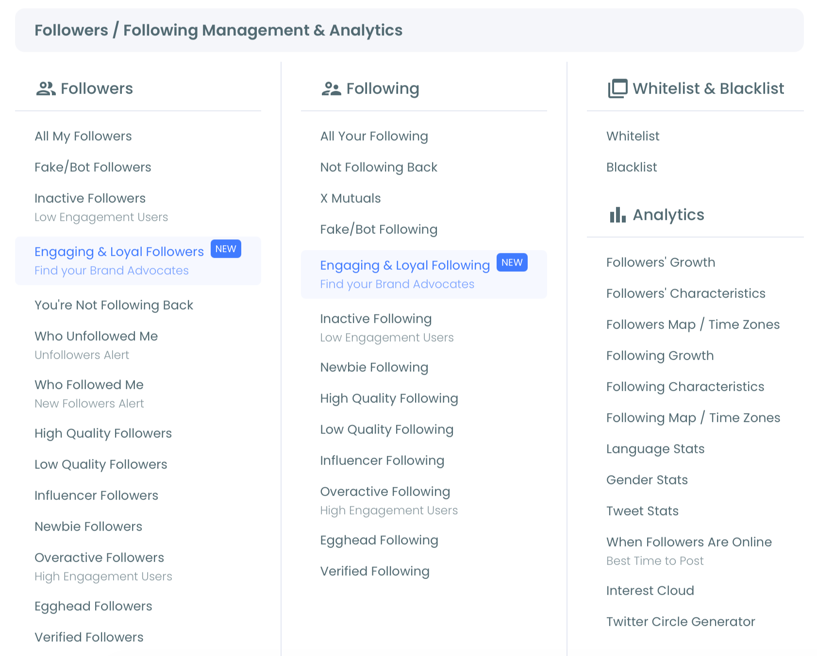
- Open the Follower & Following menu and select the Twitter Circle Generator.
- Read the spring layout, noting how dense the inner section is and which active accounts sit near the center.
- Share or export the visualization with the direct X share button or as a PNG, JPG, or PDF.
That order works because the map builds from your live data: you connect once, the generator scores and places every account, and you read the structure rather than interpreting a table. Review the image before using the share button, since it posts immediately.
How to Read the Shape
The visualization rewards a specific way of looking. The single most important signal is the density of the inner spring.
A packed, dense center means a tight core of highly active accounts, a genuine community that interacts constantly. A sparse center with most accounts trailing to the outer edge means a broad but loosely connected audience, lots of reach without a strong core.
Reading that density takes seconds and tells you more about your community health than a follower count ever will. It is the visual equivalent of identifying your engaging and loyal followers, shown as structure instead of a list.
A second signal is clustering. Recognizable accounts grouped near the center are your real community anchors, the people worth engaging deliberately. Spotting them in the picture is faster than digging through analytics.
Turn the Map Into Decisions
A visualization earns its place only if it changes what you do. The circle is read-only by design, so its job is to point you toward action, not perform it.
Use the central accounts it reveals as a shortlist: engage them more deliberately, add them to a list, or protect them from cleanup. Cross-reference the structure with deeper data, since the spring scores general activity rather than engagement with you specifically, so a busy account near the center may not actually interact with your posts.
Pairing the map with your high-quality followers and friends view and the broader account analytics suite turns a picture into a plan.
The discipline is to treat the circle as a discovery layer. It shows you where to look; the other tools tell you what to do.
Use It as Content, Too
Beyond analysis, the circle is genuinely shareable, and that is a real use, not an afterthought. A visual of your community lands better than a follower-count milestone because it shows the people rather than the number.
Sharing it works as community recognition, a spotlight on the accounts in your core, or a milestone post with substance behind it. The export options also make it useful in pitches and reports, where a network map communicates audience structure to someone who would never read a spreadsheet.
Built from a meaningful segment, like your engaged or most active connections, it doubles as social proof of a real community.
That dual role, private diagnostic and public showcase, is what makes the generator worth returning to.
Read the Center Over Time
A single visualization is a snapshot; the real value comes from watching the center change. Generate the circle now and again, and the density of your inner spring becomes a running measure of community health.
This is where the map beats a follower count for tracking progress. A follower number can climb while your engaged core stays flat or even thins, which feels like growth but is not the kind that matters.
The density of the center tells the truer story: it rises when your relationships deepen and flattens when you are merely accumulating distant followers.
Treat it as a periodic check rather than a one-off. After a campaign, a community push, or a stretch of consistent engagement, regenerate the circle and compare.
If the center has tightened, your strategy is building real connections; if it has not, the growth is shallow. That feedback loop, faster and more honest than a full analytics review, is what turns the visualization from a novelty into a habit worth keeping.
The Bottom Line
X shows you a follower count and hides the network behind it. A circle generator turns that hidden structure into a readable map, revealing whether you have built a tight core or a loose crowd.
Generate it, read the density of the center, act on the accounts it reveals, and share it when it tells a story worth telling.
→ Visualize your Twitter network now
Common Questions About the Twitter Circle Generator
What do the positions in the circle mean?
Positions reflect activity and engagement. The most active accounts sit near the center of the spring, with less active accounts placed toward the outer edge, so the layout maps your audience by how active each account is.
Does generating the circle change my account?
No. The circle generator is read-only. It does not follow, unfollow, or alter your audience; it only renders a visualization of it.
Can I share or download the visualization?
Yes. There is a direct button to post it to X and export options for PNG, JPG, and PDF, so you can use it as content or in a report or pitch.
Does a central account definitely engage with me?
Not always. The spring scores general activity, not engagement with your specific posts, so cross-reference with engagement data before assuming a central account is a true supporter.
What does the density of the center tell me?
A dense center means a tight, highly engaged core community. A sparse center with accounts pushed outward means a broad but loosely connected audience without a strong core.